Synonyms: Accessibility interface, interoperability with assistive technology, compatibility with assistive technology, platform support for accessibility services for assistive technology, programming interface for assistive technology
See also: Element status, changes of context, contrast adjustment
Assistive technology such as screen readers, screen magnifiers, Windows Contrast Adjustment and voice input software do not generally interact directly with the software or the browser, but using an interface for the accessibility which is made available by the operating system, for example: the Accessibility API (Application Programming Interface). The software and/or browser sends all the relevant information to the Accessibility API in standardized form, and the assistive technology accesses the information which is made available in the Accessibility API. However, the assistive technology only uses the information from the Accessibility API, which is relevant based on the needs of the user. If applications are operated using assistive technology, to a certain extent the operation does not take place directly, but is also conveyed using the Accessibility API.
The best-known Accessibility APIs on Microsoft Windows are:
- IAccessible2,
- MSAA (Microsoft Active Accessibility, Standard 1997-2005),
- UIA (Microsoft UI Automation, Standard seit 2005).
Windows applications should use the current Accessibility API UIA.
Software which does not use the Accessibility API of the operating system can implement its own interfaces for the communication of information to the assistive technology. In this context, Java applications use the Java Accessibility API (JAAPI).
The following information, for example, is communicated by the software and/or the browser to the Accessibility API and read out by the assistive technology if required:
- Role of an object (e.g. heading, check box, table cell),
- Status of an object (e.g. focused, focusable, disabled, open),
- Labeling of an object,
- Description of an object,
- Value of an object (e.g. for form fields),
- Possible values (e.g. maximum and minimum values in the case of specific form fields),
- Position in the object hierarchy (e.g. parent and child objects, amount of sibling objects, position relative to sibling objects),
- Spatial size and location in terms of the current screen area,
- Events (e.g. change of object properties).
Please note:
- Most programming languages which are usable for software development purposes support an Accessibility API. This applies to browsers as well.
- In this respect, the Accessibility API is usually supported automatically as long as the default elements of the programming language or markup language (e.g. HTML) are used. For example, if the language provides input fields as a control element, then the role, value, status, position in the object hierarchy, size, and location of the input field will be communicated correctly to the Accessibility API. In most cases, it is necessary for the visible label to be linked to the input field correctly so that it is also communicated to the API as the label of the input field.
- This applies in the same way to the standard characteristics of the programming language or markup language, which are communicated to the Accessibility API automatically. If an input field is provided with the “disabled” characteristic for example, the “disabled” and “not keyboard focusable” characteristics are communicated to the API automatically. 05.15.2023 Page 20 of 317
- Depending on the programming language or markup language used, it may be the case that certain characteristics of the object that are to be communicated to the Accessibility API must be explicitly specified (i.e. in text form), as otherwise they cannot be communicated.
- Unless a default element of the programming language or markup language is used, the developers are required to ensure that all the relevant object information is communicated to the Accessibility API correctly. If the language does not provide a possibility to explicitly define this information, only default elements should be used.
- If a programming language does not support an Accessibility API or it does not offer an alternative form of access to the required information through the various assistive technology, it should not be used, or the software must then meet the requirements detailed in Section 5.1 (closed functionality) of EN 301 549.
Programming/interfaces
Permalink "Programming/interfaces"| No. | Property | Description | Classification | Reference |
|---|---|---|---|---|
| 31 | Desktop: General | Applications must use the existing Accessibility APIs of the operating system, insofar as the requirements in this table can be met with their use. If the Accessibility API is not sufficient to meet the following requirements, other methods must be used. | Must | EN 301 549: 11.5.2.3 |
| 32 | Syntax | Applications which use a markup language, and with which the Accessibility API or the assistive technology are able to access the markup language, must comply with the following rules regarding the marking:
Note: This does not apply if the markup language allows for deviations from these rules. | Must | EN 301 549: 9.4.1.1, 11.4.1.1.1 |
| 33 | Role | The role of the elements must be communicated to the Accessibility API. Note: The role of the elements may not be changed during operation. | Must | EN 301 549: 9.4.1.2, 11.4.1.2, 11.5.2.5 |
| 34 | Status | The status of the elements must be communicated correctly to the Accessibility API (see also Element status and Operability status). | Must | EN 301 549: 9.4.1.2, 11.4.1.2, 11.5.2.5 |
| 35 | Value | The value of the elements must be communicated to the Accessibility API. In the case of elements that have a defined range of values, the minimum and maximum values must also be communicated to the Accessibility API. | Must | EN 301 549: 9.4.1.2, 11.4.1.2, 11.5.2.7 |
| 36 | Orientation | If the orientation of the element has an influence on the operation, the orientation must be communicated to the Accessibility API. Note: Horizontally oriented elements can be operated with the RIGHT/LEFT ARROW, vertically oriented elements can be operated with the UP/DOWN ARROW, for example. | Must | EN 301 549: 9.4.1.2, 11.4.1.2 |
| 37 | Name | The name and description of the elements must be communicated to the Accessibility API as the Accessible Name and Accessible Description. | Must | EN 301 549: 9.4.1.2, 11.4.1.2, 11.5.2.5, 11.5.2.8 |
| 38 | Keyboard shortcut, shortcut key | If the element has a visually perceptible keyboard shortcut or a visually perceptible shortcut key, these must be communicated to the Accessibility API. | Must | EN 301 549: 9.1.3.1, 11.1.3.1 |
| 39 | Desktop: Element hierarchy | The parent / child relationships of the elements must be communicated to the Accessibility API. Note: Among others, this allows the assistive technology to correctly output the following information:
| Must | EN 301 549: 11.5.2.9 |
| 40 | Web: Element hierarchy | The elements must be marked so that the browser is able to communicate the parent / child relationships of the elements to the Accessibility API correctly. Note: This can be achieved with the following methods:
| Must | EN 301 549: 9.1.3.1, 11.1.3.1 |
| 41 | Desktop: Operation | All the control options of the element must be communicated to the Accessibility API. | Must | EN 301 549: 11.5.2.11 |
| 42 | Web: Operation | The control options of the element must correspond to the role used. Note: Different or additional operating options should be documented in the application and the Help option. | Must | EN 301 549: 9.4.1.2 |
| 43 | Operation | It must be possible to implement all the control options of the element with the assistive technology. Note 1: This applies, for example, to the enabling of elements, value and status changes, as well as changes of position for the focus and text cursor. Note 2: This does not apply to security-related applications for intelligence or military services, or to encryption software for the purposes of national security. | Must | EN 301 549: 9.4.1.2, 11.4.1.2, 11.5.2.12, 11.5.2.14, 11.5.2.16, 11.5.2.17 |
| 44 | Update | If an element characteristic which has been communicated to the Accessibility API is updated, this update must also be communicated to the Accessibility API. | Must | EN 301 549: 9.4.1.2, 11.4.1.2, 11.5.2.15 |
| 45 | Update | In applications, Status messages must be marked so that they are output by the assistive technology without receiving the focus. | Must | EN 301 549: 9.4.1.3, 11.4.1.3.1 |
| 46 | Desktop: Position | The spatial size and position of the elements must be communicated to the Accessibility API (see Fokusindikator). | Must | EN 301 549: 11.5.2.5, 11.5.2.10 |
| 47 | Position | The focused element, the position of the text cursor and the selected entry within an element must be communicated to the Accessibility API. | Must | EN 301 549: 9.4.1.2, 11.4.1.2, 11.5.2.13 |
Practical tip: Accessibility API with desktop applications
Permalink "Practical tip: Accessibility API with desktop applications"The default elements of the platform software or the framework used typically communicate the correct information to the Accessibility API automatically. They should therefore be used with preference.
Example 1:
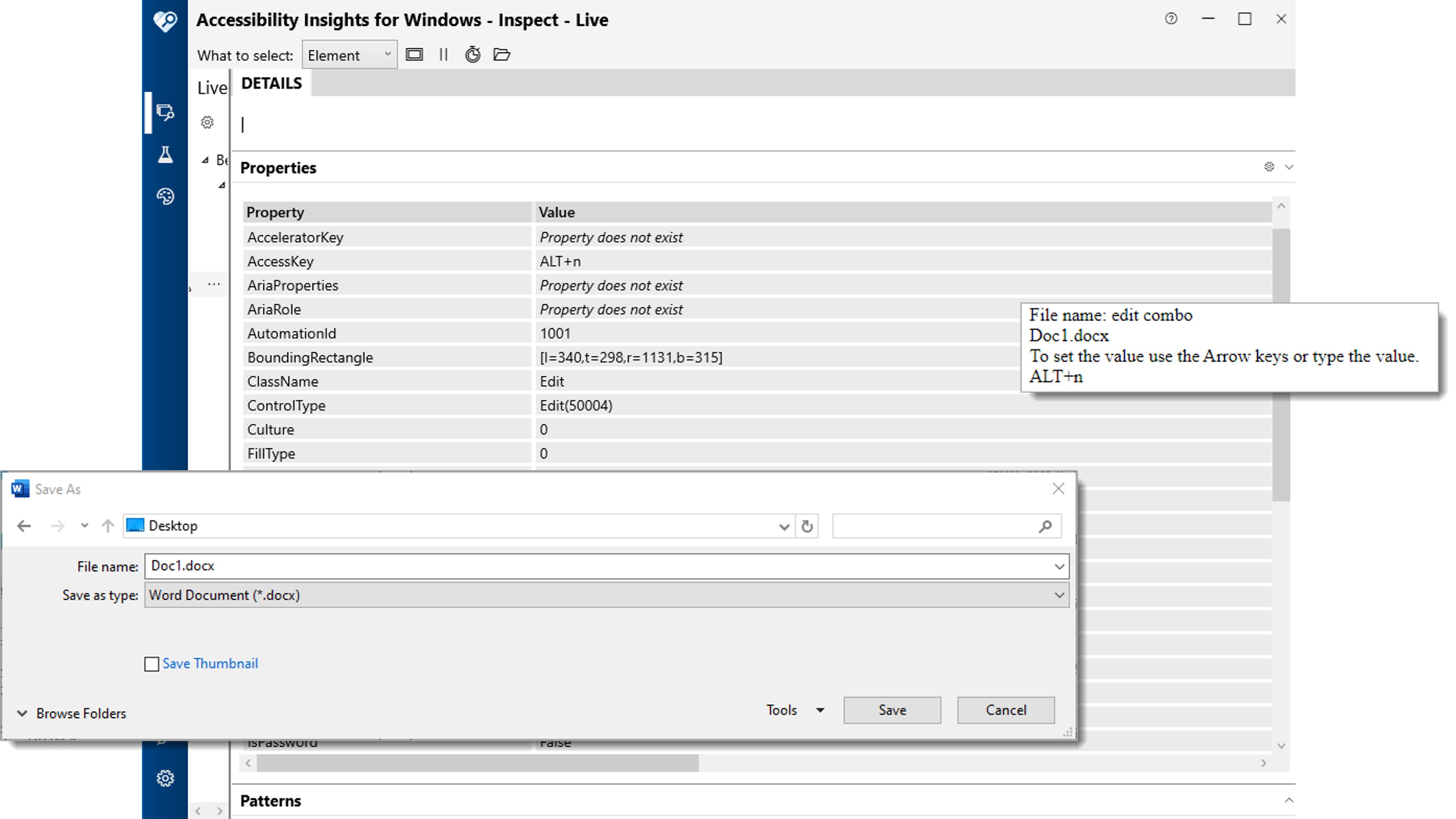
- The following figure shows the “Save as” dialog of the “Windows Fax and Scan” application.
- A complete list of the information which is communicated to the Accessibility API for the “file name” input field which is located in this dialog (read out with Accessibility Insights for Windows) is also shown.
- In addition, the text-to-speech output of the screen reader JAWS is displayed during the focusing of the “file name” input field. For the acoustic output, JAWS only uses the Accessibility API information which is relevant in the current context (e.g. label, role, value, keyboard shortcuts), partially translates this information into the application language (e.g. the “Edit(50004)” role into “input field”), and supplements this information with its own operating instruction (“add text”), which is derived from the communicated role.

If custom elements are used, attention should be paid to the following in particular:
- the communicated role corresponds to the visual presentation and operation (in particular the use of the keyboard),
- the value and status should be communicated to the Accessibility API,
- the label is communicated to the Accessibility API as the Accessible Name,
- if available, the keyboard shortcuts, description) (as Accessible Description) and labels of the groups are also communicated to the Accessibility API,
- Updates concerning the value, status, label, etc. are communicated to the Accessibility API (note: the role of an element should not be changed).
If a custom element is implemented, it is often recommended that a related default element is used and customized accordingly, as it is then possible to use the basic functionality of the default element.
The corresponding characteristics of the Accessibility API should be used for the communication of the information. If there is no corresponding characteristic for sending the information in the Accessibility API or if the framework used does not support this characteristic, the information must be communicated in text form (i.e., as part of the Accessible Name or the Accessible Description).
For example: Disabled elements
- Disabled elements can usually be marked as disabled with an attribute. In the Accessibility API UIA, this corresponds to the IsEnabled:false characteristic. Assistive technology detects that the element is disabled due to this characteristic.
- If a programmatic marking as disabled is not possible, alternatively, the following options can be applied:
- The element is removed.
- The element is not designed as focusable (as long as it does not send any information and is not located within a range which can be read with the virtual cursor).
- The element is named as “disabled” in the Accessible Name or Accessible Description.
For example: Button with value
- A button can have no value by default. Using Windows, however, it is possible to create a “button with value” custom element, which is based on the default button element. The value is then communicated to the Accessibility API UIA as the value of the Value characteristic.
- In HTML and ARIA, it is not possible to assign a value to a button. If the “button with value” is to be used in a hybrid application which is based on Web technologies, the value must be communicated in text form as part of the Accessible Name or the Accessible Description.
The communication of information about the corresponding characteristics of the Accessibility API is always to be preferred over the communication of such information in text form (as part of Accessible Name or the Accessible Description) for the following reasons:
- the assistive technology is able to output the characteristics which are communicated using the API in a way which is defined by the application or by the users,
- the assistive technology is able to translate the characteristics communicated using the API into the correct language,
- the assistive technology is able to output operating instructions or to offer operating modalities according to the characteristics which are communicated using the API,
- the assistive technology is able to offer a specific form of presentation based on the characteristics communicated using the API (e.g. a specific color when using contrast adjustment),),
- the assistive technology is able to output the characteristics (such as role, status, value) in a specific sequence, which ensures that relevant information is output first and that users are able to identify which information belongs to which type of characteristic,
- if required, users can configure their assistive technology so that they do not wish to receive outputs for certain characteristics.
None of this is possible if the information is only communicated in text form.
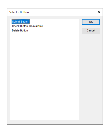
Example 2: The following figure shows three buttons with the label “Submit”, “Check” and “Delete”.
- The “Submit” button is visually identifiable as operable (black text color).
- The “Check” button is visually identifiable as disabled (gray font color). The button is programmatically marked as disabled. This implementation is to be preferred for disabled buttons.
- The “Delete” button is also visually identifiable as disabled (gray font color). The button is not programmatically marked as disabled, but only has one tooltip with the word “disabled”. This implementation may only be selected for disabled buttons if no programmatic marking as disabled is possible in the technology which is used.

The following figure shows the same buttons from the previous figure, but when using Windows Contrast Adjustment (Contrast no. 1).
- The “Submit” button is correctly visually identifiable as operable (white text color).
- The “Check” button is correctly visually identifiable as disabled (green font color).
- The “Delete” button is displayed as operable (white text color), although it is disabled. The reason for the incorrect presentation is that it was not programmatically marked as disabled, but only as disabled in terms of its color. The color information is lost when using Windows Contrast Adjustment, however, so that a different visual presentation must be used here for the identification of the “disabled” status (e.g. a strike-through).

The following figure shows the acoustic screen reader output of the three buttons from the previous figure (with the example of the JAWS element overview).
- The “Submit” button is correctly output as operable (“button” role).
- The “Check” button is correctly output as disabled (“not available” status).
- The “Delete” button is incorrectly output as operable (“button” role), as the “disabled” status is only communicated by tooltip, and the tooltip content is only output by the screen reader with certain navigation methods.

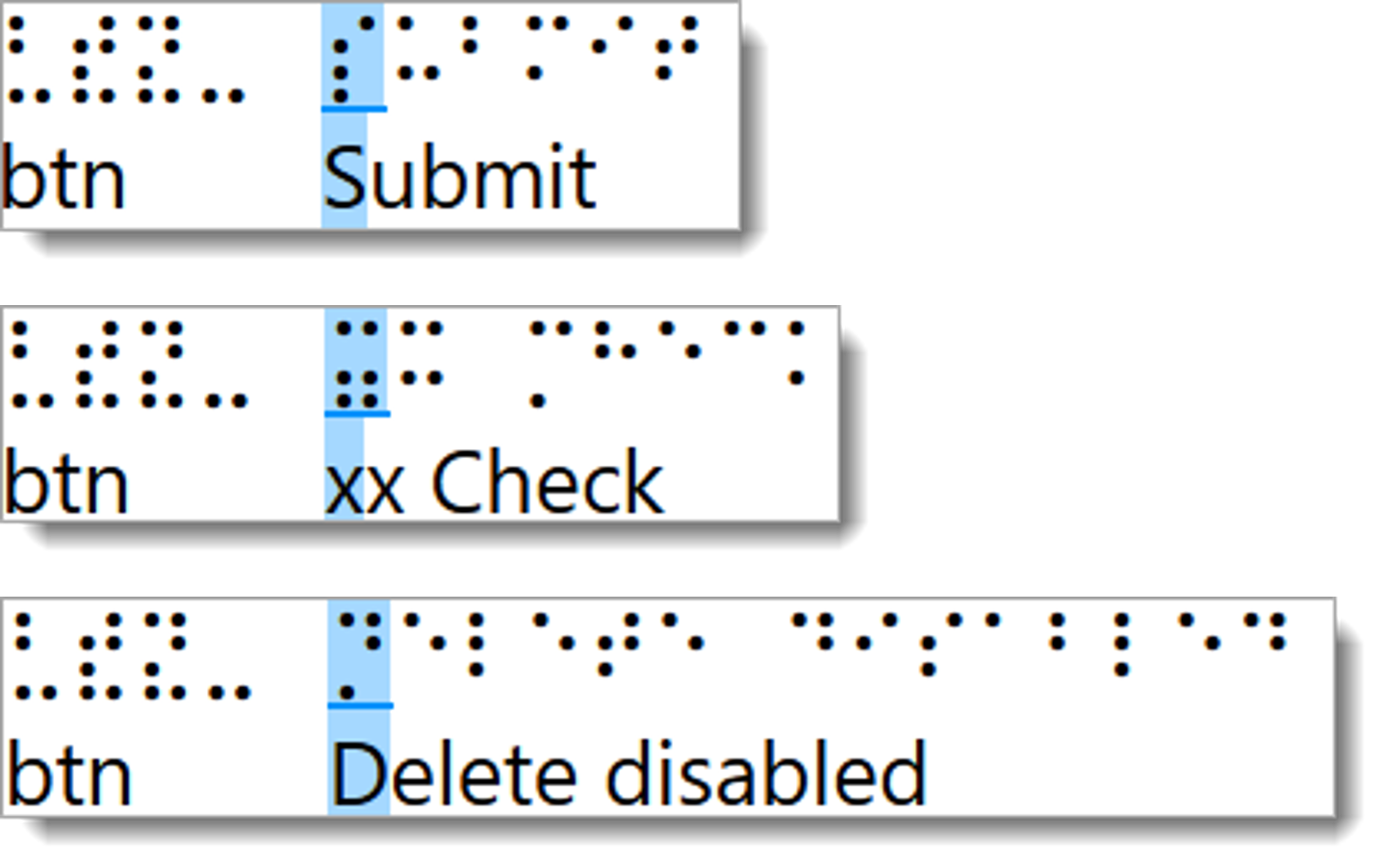
In the three following figures, the output of the three buttons from the preceding figures is shown on the Braille line (with the example of JAWS).
- The “Submit” button is correctly output as operable (“button” role) which is shown with the abbreviation “sltr”).
- The “Check” button is correctly output as disabled (“not available” status, which is shown with the abbreviation “xx”).
- The “Delete” button is shown as disabled (“disabled” description), but the output is not in the abbreviated form, not at the expected position, and is not translated into the language of the user.

Information about this article
You are welcome to send feedback by email about our handout!
