Synonyms: Focus, focus frame, focus appearance
See also: Use of the keyboard, text cursor
The focus indicator displays which element currently has the keyboard focus (see DIN EN ISO 9241-161: 8.37).
The focus indicator is usually displayed with a border around the focused element. Other focus indicators are also permitted, provided that they meet the requirements, e.g.
- Inverting of foreground and background color,
- Changed background color,
- Changing the size of the element,
- Superimposing of a graphical element, such as a side bar.
In certain cases, several focus indicators can be displayed:
- Example 1: When a selection list receives the focus, a focus indicator can be displayed around the entire list. A focus indicator must also be displayed with the current list entry.
- Example 2: With a combined input field, the focus can be on the input field as well as on the selection list.
- Example 3: If an interactive element receives the focus within a page area, then the page area can also be shown as focused.
- Example 4: The title bars of all application windows that do not have the focus are shown grayed out.
In some cases, the focus indicator can be identical to the selection marker (i.e. the marking of the selected option, see Element status), if the focused element is identical to the selected element:
- Example 1: A selection list without multiple selection has a focus indicator on the focused list entry. This indicator can serve as a selection marker at the same time, as the focused list entry is identical to the selected list entry. If this selection list does not also have a focus indicator for the entire list, however, to be able to detect whether the selection list is focused, it is necessary to ensure that the selection marker in the focused state of the selection list differs clearly from the selection marker in the non-focused state of the selection list (e.g. minimum contrast ratio 3:1).
- Example 2: A selection list without multiple selection has a focus indicator on the focused list entry, e.g. a border. This focus indicator is not used simultaneously as a selection marker. A different background color, for example, is used as the selection marker. When navigating through the list entries, both the focus indicator and the selection marker are moved. In this case, an additional focus indicator for the entire list or a differentiation of the selection marker in the focused and non-focused state is not necessary, as the focusing and selection can be perceived independently of each other.
- Beispiel 3: A multiple selection list has a focus indicator that surrounds the entire list. Since the focused list entry does not match the selected list entries in the case of the multiple selection list, the focus indicator and selection marker must be marked separately for the list entries (e.g., as shown in example 2 with a border and a different background color).
Presentation
Permalink "Presentation"| No. | Property | Description | Classification | Reference |
|---|---|---|---|---|
| 186 | General | The focus indicator must be visible at each navigation step. | Must | EN 301 549: 9.2.4.7, 11.2.4.7 |
| 187 | Contrast | The focus indicator must have a contrast ratio of at least 3:1 with respect to the background. | Must | EN 301 549: 11.1.4.11 |
| 188 | Contrast | The elements must also have a contrast ratio of at least 4.5:1 for text and at least 3:1 for the content of graphics in the focused status. | Must | EN 301 549: 9.1.4.3, 11.1.4.3, 9.1.4.11, 11.1.4.11 |
| 189 | Consistency | The focus indicator should be clearly assignable to the focused element. | Must | EN 301 549: 9.2.4.7, 11.2.4.7 |
| 190 | Visibility | The element must be scrolled into the visible area on receiving the focus so that both the element and its focus indicator are visible. Note: This also applies when navigating the arrow keys through the list entries of a selection list, for example. | Must | EN 301 549: 11.2.4.7 |
| 191 | Size | The area of the focus indicator shall be at least as large as:
| Should | WCAG 2.2 |
Operation
Permalink "Operation"Use of the keyboard: focus indicator
Permalink "Use of the keyboard: focus indicator"The change of the focus indicator between the elements is described in the use of the keyboard and navigation sequence sections. By default, the navigation takes place with the TAB key.
The change of the focus indicator within an element is described at the respective elements. The navigation within elements often takes place with the arrow keys.
Use of the pointing device: focus indicator
Permalink "Use of the pointing device: focus indicator"| Action | Key | Classification |
|---|---|---|
| Placing the focus | Left click | Required |
Programming/interfaces
Permalink "Programming/interfaces"| No. | Property | Description | Classification | Reference |
|---|---|---|---|---|
| 192 | Position | The focused element must be communicated to the Accessibility API. | Must | EN 301 549: 9.4.1.2, 11.4.1.2, 11.5.2.13, 11.5.2.15 |
| 193 | Desktop: Position | The size and position of the focused element must be communicated to the Accessibility API. Note: This is important, for example, to ensure that screen magnifiers can display the focused element in the visible area and a focus highlighting. | Must | EN 301 549: 11.5.2.5, 11.5.2.13 |
| 194 | Operation | It must be possible to position the focus with assistive technology (see Use of the keyboard). | Must | EN 301 549: 9.4.1.2, 11.4.1.2, 11.5.2.14, 11.5.2.16 |
Practical tip: focus indicator
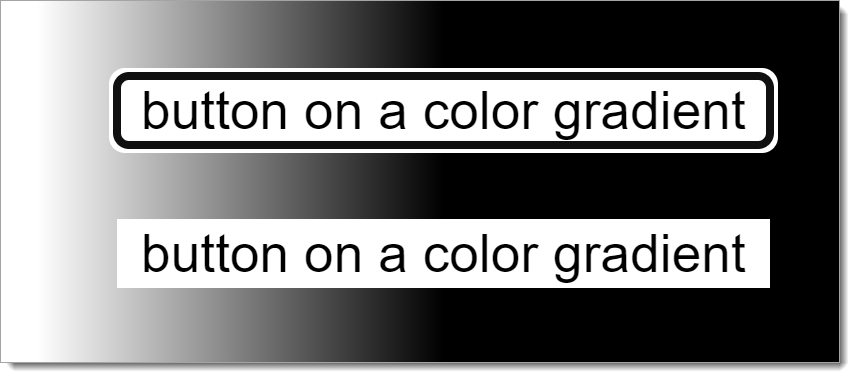
Permalink "Practical tip: focus indicator"The focus indicator must have sufficient contrast, and should be designed consistently at the same time. With applications that have different background colors, this can be achieved by using a two-color border (e.g. black and 05.15.2023 Page 68 of 317 white) that has sufficient contrast against each background. A two-color focus indicator is also useful with control elements on gradients or graphics.
For example: Two buttons on a color gradient from white to black. The top button is currently focused. The focus indicator consists of a black border (inside) and a white border (outside), which means that it always easy to see, regardless of the background color. It is the standard focus frame offered by Google Chrome.

Information about this article
You are welcome to send feedback by email about our handout!
