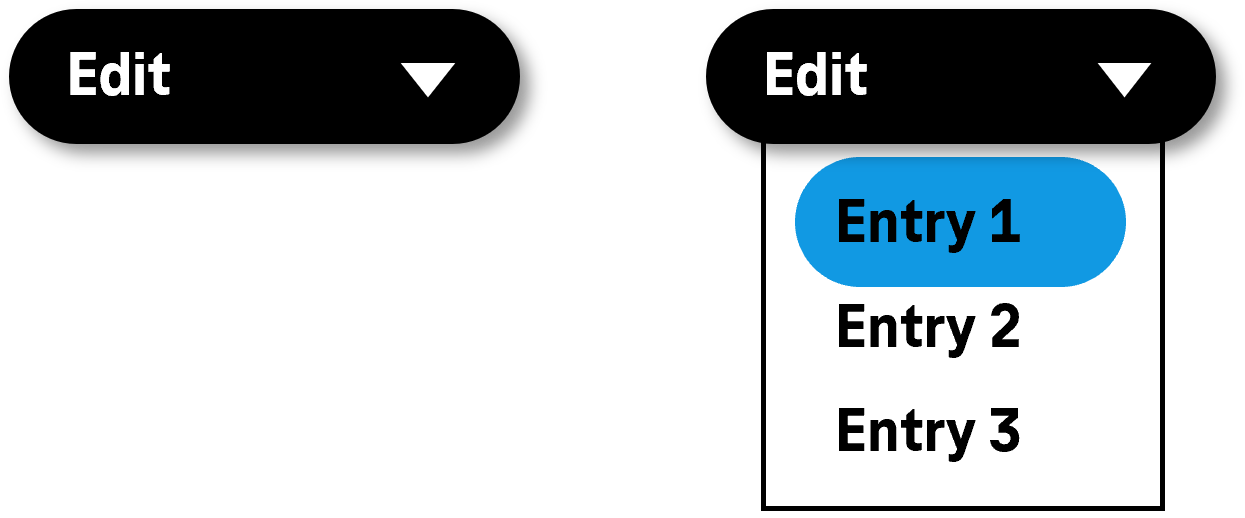
Synonyms: Switch with menu, list button
See also: Split button, drop-down list, menu, context menu, button
Menu buttons are for showing a menu (see DIN EN ISO 9241-161: 8.25).
A menu button consists of a text or graphic label and a visual indicator in order to identify the menu button as such (usually a border). The menu button also has a visual indicator which makes reference to the possibility for showing a menu (arrow icon).

Presentation
Permalink "Presentation"The requirements concerning the button and the menu are described in the “button” and/or “menu” section. Here, only the additional requirements are described which result from the fact that a menu can be opened with the button. The requirements concerning the menu and the menu items that it contains only apply if the menu is open.
| No. | Property | Description | Classification | Reference |
|---|---|---|---|---|
| 556 | Contrast | The arrow icon for opening and closing the menu must have a contrast ratio of at least 3:1 with respect to the neighboring color. | Must | EN 301 549: 9.1.4.11, 11.1.4.11 |
| 557 | Contrast | If the selected menu item only differs from the unselected menu item in the open state due to its color (e.g. foreground or background color), the colors must have a contrast ratio of at least 3:1. Note: The selected menu item does not have to be color coded or marked with color only. It can be marked with a check box, for example. In this case, the contrast requirements for the color coding are eliminated as long as the check box has sufficient contrasts. | Must | EN 301 549: 9.1.4.11, 11.1.4.11 |
Operation
Permalink "Operation"The requirements concerning the button and the menu are described in the “button” and/or “menu” section. Here, only the additional requirements are described which result from the fact that a menu can be opened with the button. The requirements concerning the menu and the menu items that it contains only apply if the menu is open.
Use of the keyboard: menu button
Permalink "Use of the keyboard: menu button"| Action | Key | Classification |
|---|---|---|
| Opening the menu | SPACE ENTER ALT+DOWN ARROW | Required |
| Opening the menu | DOWN ARROW UP ARROW | Recommended |
| Closing the menu | ESC SPACE ENTER | Required |
Use of the pointing device: menu button
Permalink "Use of the pointing device: menu button"| Action | Key | Classification |
|---|---|---|
| Opening the menu | Left click on the menu button (label or arrow) | Required |
| Closing the menu | Left click on the menu button (label or arrow) | Required |
| Closing the menu | Left click on a menu item inside the open menu | Required |
| Closing the menu | Left click outside the menu button and the menu | Required |
Programming/interfaces
Permalink "Programming/interfaces"The requirements concerning the button and the menu are described in the “button” and/or “menu” section. Here, only the additional requirements are described which result from the fact that a menu can be opened with the button. The requirements concerning the menu and the menu items that it contains only apply if the menu is open.
| No. | Property | Description | Classification | Reference |
|---|---|---|---|---|
| 558 | Role | The menu button role must be communicated to the Accessibility API (see (Accessibility API)). | Must | EN 301 549: 9.4.1.2, 11.4.1.2, 11.5.2.5 |
| 559 | Status | The status of the menu button must be communicated to the Accessibility API (see Element status). Note: This also applies to the “open” or “closed” status. | Must | EN 301 549: 9.4.1.2, 11.4.1.2, 11.5.2.5 |
Information about this article
You are welcome to send feedback by email about our handout!
