Synonyms: Dialog window, message, pop-up, dialog, dialog box
See also: Window, tooltip, error message
A modal dialog is used to display important information and control elements in a separate area. A modal dialog blocks the operation of the application window in the background (see DIN EN ISO 9241-161: 8.10).
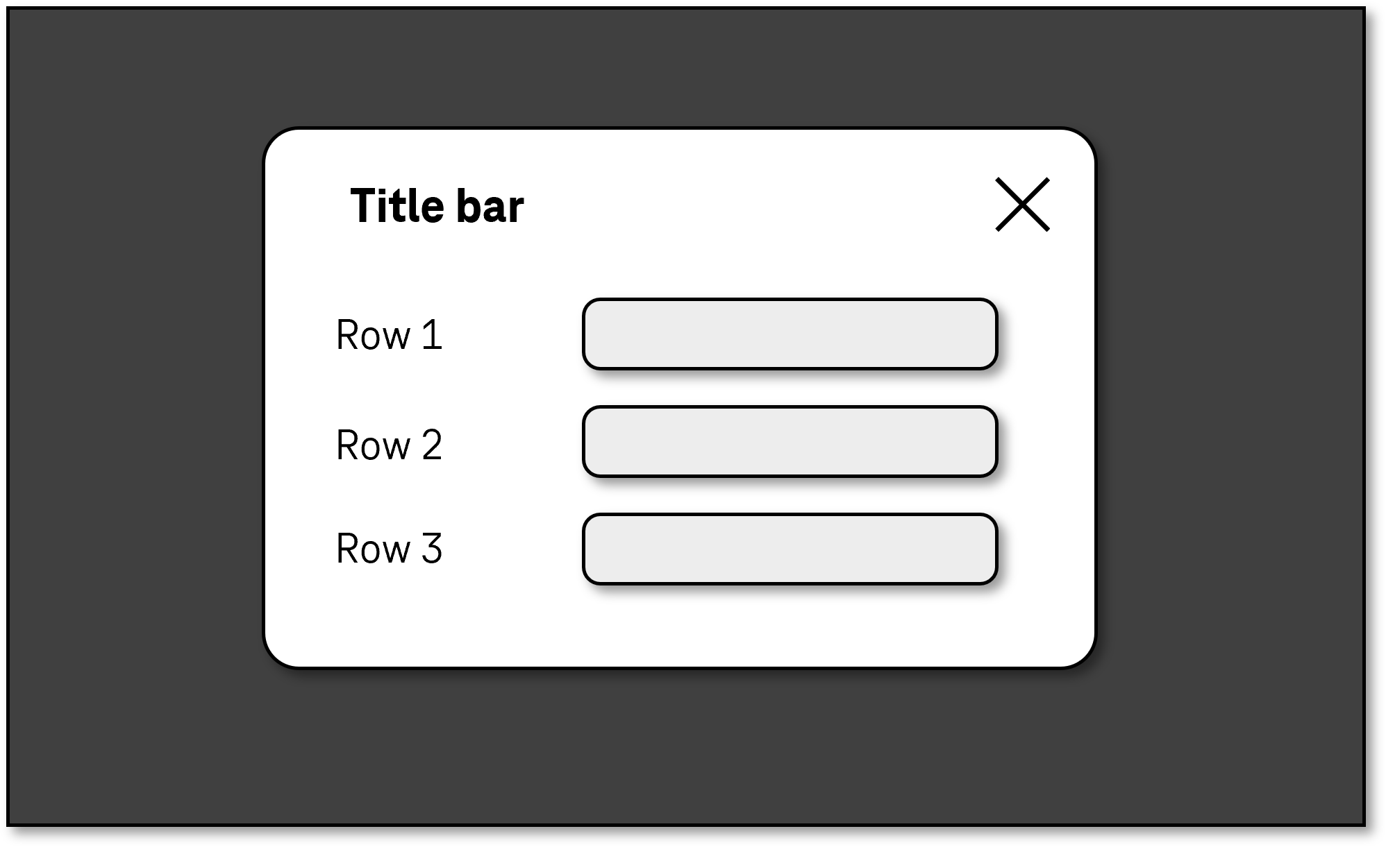
A modal dialog always contains a text and one or more buttons that can be used to close the dialog. The modal dialog can also contain a title bar and status bar as well as other control elements, graphics, etc.
The requirements regarding the content of the modal dialog are described at the respective element. Only specific requirements for modal dialog are described here.
Examples:

Presentation
Permalink "Presentation"| No. | Property | Description | Classification | Reference |
|---|---|---|---|---|
| 426 | Resizing | It must be possible to scale the modal dialog by up to 200%. During the scaling, no loss of content or functionality may occur (see Resizing). Note: Fixed headers and footers in the modal dialog should be avoided, as they cause the main vertical scrollable area to become too small. | Must | EN 301 549: 9.1.4.4, 11.1.4.4.1 |
| 427 | Resizing | The modal dialog must be displayed in full without horizontal scrolling at a screen width of 320 px. If the modal dialog contains two-dimensional content such as tables, these should be horizontally scrollable (see Resizing). | Must | EN 301 549: 9.1.4.10, 11.1.4.10 |
| 428 | Visibility | The dialog must stand out clearly from the background. Note 1: This can take place, for example, with a border around the dialog or the use of a gray background. Note 2: This also applies to the use of the Windows Contrast Adjustment. | Must | EN 301 549: 11.1.4.11; 9.1.4.11 |
| 429 | Web: Label | If the modal dialog is displayed in a separate browser window, it must have an expressive label. Note: For the label, the | Must | EN 301 549: 9.2.4.2 |
| 430 | Label | The modal dialog must have an expressive label. Note: The label can be located in the title bar. | Must | EN 301 549: 9.2.4.5, 11.2.4.6 |
Operation
Permalink "Operation"| No. | Property | Description | Classification | Reference |
|---|---|---|---|---|
| 431 | Use of the keyboard | It must be possible to open, operate and close the modal dialog with the keyboard (see Use of the keyboard table, below). | Must | EN 301 549: 9.2.1.1, 11.2.1.1 |
| 432 | Use of the keyboard | When the modal dialog is opened, the keyboard focus must be placed in the dialog. Note: Typically, the keyboard focus should be placed at the beginning of the modal dialog. For simple modal dialogs, the focus can also be placed on a button at the end (e.g. “OK” or “Cancel”), provided that it is ensured that the title and text of the dialog are automatically output by the screen reader when the dialog is opened. | Must | EN 301 549: 9.2.4.3, 11.2.4.3 |
| 433 | Use of the keyboard | As long as the modal dialog is open, the keyboard focus must remain within the dialog. | Must | EN 301 549: 9.2.4.3, 11.2.4.3 |
| 434 | Use of the keyboard | When the modal dialog is closed, the keyboard focus must be reset to the triggering element or to an element with which the work can ultimately be continued. Note: The resetting to the triggering element is not possible, for instance, if it has been removed due to the operation of the dialog. In this case, it is usually a good idea to place the keyboard focus on an element before or after the triggering element. | Must | EN 301 549: 9.2.4.3, 11.2.4.3 |
Use of the keyboard: modal dialog
Permalink "Use of the keyboard: modal dialog"| Action | Key | Classification |
|---|---|---|
| Navigating within the modal dialog | TAB | Required |
| Closing the modal dialog |
| Required |
Use of the pointing device: modal dialog
Permalink "Use of the pointing device: modal dialog"| Action | Key | Classification |
|---|---|---|
| Closing the modal dialog | Left click on the corresponding button | Required |
Programming/interfaces
Permalink "Programming/interfaces"| No. | Property | Description | Classification | Reference |
|---|---|---|---|---|
| 435 | Role | The modal dialog role must be communicated to the Accessibility API (see Accessibility API). | Must | EN 301 549: 9.4.1.2, 11.4.1.2, 11.5.2.5 |
| 436 | Name | If the modal dialog has a label or description, these must be communicated as the Accessible Name and/or Accessible Description (see Label and Description). Note 1: The title bar or main heading of the dialog should be used as the Accessible Name. Note 2: If the modal dialog contains only a small amount of text, this can be communicated as the Accessible Description. | Must | EN 301 549: 9.4.1.2, 11.4.1.2, 11.5.2.5, 11.5.2.8 |
| 437 | Desktop: Element hierarchy | The parent / child relationships of the elements within the dialog must be communicated to the Accessibility API. | Must | EN 301 549: 11.5.2.9 |
| 438 | Position | The size and position of the modal dialog must be communicated to the Accessibility API (see focus visibility). | Must | EN 301 549: 11.5.2.5 |
Information about this article
You are welcome to send feedback by email about our handout!
