See also: Button, tabs, carousel
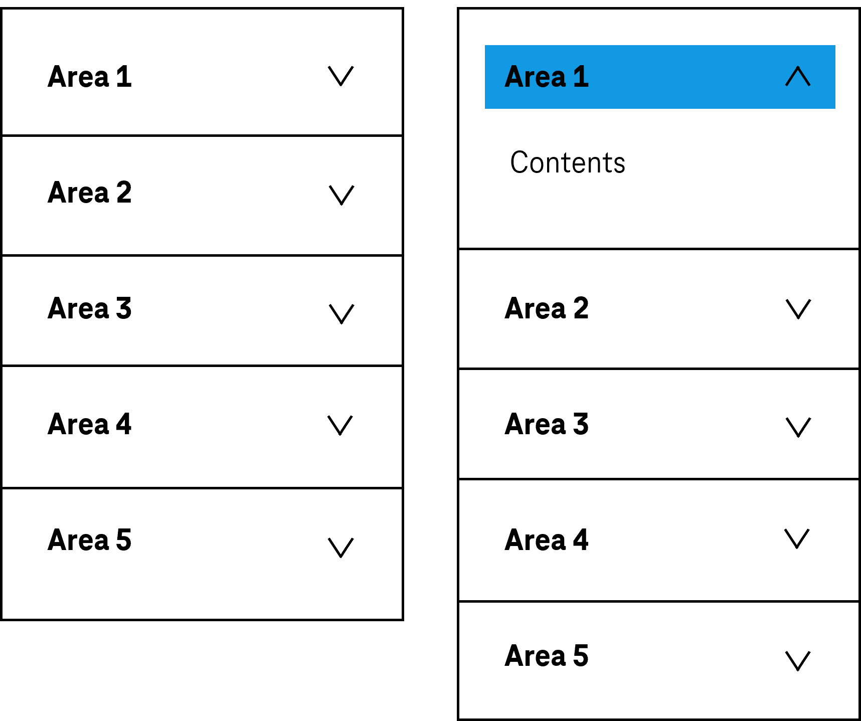
An accordion combines several areas which are arranged one beneath the other and which can be shown and hidden using buttons. In this respect, the labeling of the areas is visible at all times (see DIN EN ISO 9241-161: 8.1). The label usually has a visual indicator which refers to the status of the area (shown or hidden). For an accordion, different implementation variants are possible with respect to the minimum or maximum number of open areas, e.g.
- Initially, all the areas are closed and only one area can be opened at a time. If an area is opened, the previously opened area is automatically closed.
- At least one area is open at all times, and all areas can be opened.
Presentation
Permalink "Presentation"| No. | Property | Description | Classification | Reference |
|---|---|---|---|---|
| 827 | Contrast | The labeling of the areas must have a contrast of at least 4.5:1. | Must | EN 301 549: 9.1.4.3, 11.1.4.3 |
| 828 | Contrast | The visual indicator in the respective labeling of an accordion area which refers to the status of the area (open or closed) must have a contrast ratio of at least 3:1 with respect to the background. | Must | EN 301 549: 11.1.4.1; EN 301 549: 11.1.4.11 |
| 829 | Contrast | If the areas and the area labels are only identifiable as such on the basis of their color design, these colors must have a contrast ratio of at least 3:1 with respect to the neighboring colors. Note 1: The areas and area labels can be identifiable as such, for example, due to their borders or background colors. Note 2: The requirement does not apply if the areas and area labels are clearly identifiable as such, due to their position and spacing, for example. | Should | EN 301 549: 9.1.4.11, 11.1.4.11 |
| 830 | Label | The label of the areas must be expressive (see Label). | Must | EN 301 549 9.2.4.6, 11.2.4.6 |
| 831 | Focus visibility | If the area label receives the keyboard focus, the focus indicator must be visible (see Focus indicator). | Must | EN 301 549: 9.2.4.7, 11.2.4.7 |
Operation
Permalink "Operation"| No. | Property | Description | Classification | Reference |
|---|---|---|---|---|
| 832 | Use of the keyboard | It must be possible to access, operate and exit the accordion with the keyboard (see Use of the keyboard table, below). | Must | EN 301 549: 9.2.1.1, 11.2.1.1, 9.2.1.2, 11.2.1.2 |
| 833 | Use of the keyboard | The hidden areas and their contents must not receive keyboard focus. | Must | EN 301 549: 9.1.3.1, 11.1.3.1 |
| 834 | Updates | When focusing and operating the accordion, no unexpected change of context may occure. | Must | EN 301 549: 9.3.2.1, 11.3.2.1 |
| 835 | Updates | When operating the buttons for showing and hiding the areas, no loss of focus loss may occur. Note: The focus must remain on the button or be placed at the beginning of the shown area. | Must | EN 301 549: 9.2.4.3, 11.2.4.3 |
| 836 | Focus order | The focus order in the accordion must correspond to the visual presentation, i.e. the opened areas receive the keyboard focus immediately after the area label. | Must | EN 301 549: 9.2.4.3, 11.2.4.3 |
| 837 | Click area | The click area of the area labels should be at least 24 x 24 px (see Use of the pointing device). | Should | WCAG 2.2 |
Use of the keyboard: accordion
Permalink "Use of the keyboard: accordion"| Action | Key | Classification |
|---|---|---|
| Focusing of the area labels | TAB | Required |
| Exiting the area labels | TAB Note: If the corresponding area is closed, the next area label is focused using the TAB key. Otherwise, the focus is placed in the area. | Required |
| Operation of the area labels (opening | ||
| and/or closing the area) | ENTER, SPACE | Required |
| Navigating between the area labels | UP/DOWN ARROW | Recommended |
| Quick navigation between the area labels | POS1, END | Recommended |
Use of the pointing device: accordion
Permalink "Use of the pointing device: accordion"| Action | Key | Classification |
|---|---|---|
| Operation of the area labels (opening and/or closing the area) | Left click | Required |
Programming/interfaces
Permalink "Programming/interfaces"| No. | Property | Description | Classification | Reference |
|---|---|---|---|---|
| 838 | Role | For the area labeling, the button role must be communicated to the Accessibility API (siehe Accessibility API). | Must | EN 301 549: 9.4.1.2, 11.4.1.2, 11.5.2.5 |
| 839 | Desktop: Element hierarchie | The parent / child relationships of the elements within the accordion must be communicated to the Accessibility API. | Must | EN 301 549: 11.5.2.9 |
| 840 | Status | The status of the area labels must be communicated to the Accessibility API (see Element status). Note: This also applies to the „open“ or „closed“ status. | Must | EN 301 549: 9.4.1.2, 11.4.1.2, 11.5.2.5 |
| 841 | Name | The buttons with the area labels must have a concise and expressive Accessible Name. | Must | EN 301 549: 9.2.4.6, 11.2.4.6, 9.4.1.2, 11.4.1.2, 11.5.2.5 |
| 842 | Name | If the buttons with the area labels have a description, it must be communicated as an Accessible Description. | Must | EN 301 549: 9.4.1.2, 11.4.1.2, 11.5.2.5 |
| 843 | Operation | It must be possible to access, operate and exit the buttons with the area labels with assistive technology (see Accessibility API). | Must | EN 301 549: 9.4.1.2, 11.4.1.2, 11.5.2.12, 11.5.2.17 |
| 844 | Update | Updates concerning the Accessible Name, value or status of the area labels must be communicated to the Accessibility API (see Accessibility API). | Must | EN 301 549: 9.4.1.2, 11.4.1.2, 11.5.2.15 |
| 845 | Desktop: Position | The size and position of the area labels and areas must be communicated to the Accessibility API (see Accessibility API). | Must | EN 301 549: 11.5.2.5, 11.5.2.13 |
Practical tip: accordion in Web applications
Permalink "Practical tip: accordion in Web applications"Screen reader output for the accordion buttons for showing and hiding the areas
Permalink "Screen reader output for the accordion buttons for showing and hiding the areas"- JAWS: [Label] button [collapsed | expanded] [note on operation with the Enter key]
- NVDA: [Label] button [collapsed | expanded]
- Windows narrator: [Label] button [collapsed | expanded]
Note: When using the <details>-element without a label, the beginning and end of the page area are not perceptible with assistive technology. If the <details>-element is explicitly labeled (by )aria-label or aria-labelledby) the area is output as „group“ (JAWS) or „grouping“ (NVDA). Die Windows Narrator does not output labeled groups either.
HTML
Permalink "HTML"There is no element for accordions in HTML. Instead, several areas can be used which are shown and hidden using buttons. The areas are marked with <details> and the buttons with <summary>. The <summary> element is the first child element within <details>. The labels of the buttons are derived from the text content in the <summary> element. The initial state of the area (opened or closed) is set with the open attribute.
To make the coherence of the areas and buttons perceptible with assistive technology, they can be nested in a labeled group.
According to the HTML specification, the <summary> element may contain links, headings, input fields and many other elements – it is important to remember, however, that all the elements which are located within <summary> are imperceptible and cannot be operated with the screen reader, as the <summary> element is communicated to the Accessibility API as a button. Therefore, the <summary> element should only contain a concise and expressive label in text form.
Further information: 4.11.1 The details element - HTML Standard (whatwg.org) (External Link), 4.11.2 The summary element - HTML Standard (whatwg.org) (External Link)
ARIA
Permalink "ARIA"There is no role for accordions in ARIA. Instead, several areas can be used which are shown and hidden using Button. In this respect, the following should be taken into account:
- The buttons that have the purpose of showing and hiding areas should be marked with the
aria-expandedattribute.aria-controlscan be used to make reference to the ID of the area that is shown or hidden. - The labeling of the buttons should take place using text content or
aria-labelledby. - To make the coherence of the areas and buttons perceptible with assistive technology, they can be nested in a labeled group.
- The presentation of the accordion should be verified in Windows High Contrast mode. The areas should therefore have a border.
- The visible button and the programmatically focused element should have the same position and size.
Alternatively, a tab group can be used instead of an accordion.
Further information: aria-expanded state - Accessible Rich Internet Applications (WAI-ARIA) 1.2 (w3.org) (External Link), Accordion Pattern (Sections With Show/Hide Functionality) | APG | WAI | W3C
Information about this article
You are welcome to send feedback by email about our handout!