Synonyms: Bifurcated switch
See also: Drop-down list, menu button, context menu, button
Split buttons are for the execution of a command that can be configured using a menu, a selection list or a dialog window.
Alternatively, split buttons are used for grouping related functions, where the primary function can be initialized directly using the button and the secondary functions can be initialized using the menu at the button.
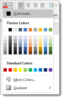
A split button consists of a text or graphic label and a visual indicator in order to identify the button as such (usually a border). The split button also has additional buttons (with arrow icon), with which the secondary functions can be shown and hidden.
Presentation
Permalink "Presentation"The requirements concerning buttons are described in the “buttons” section. Here, only the additional requirements are described which result from the fact that it is a button with primary and secondary functions. The requirements regarding the elements that can be shown are described at the respective element.
| No. | Property | Description | Classification | Reference |
|---|---|---|---|---|
| 519 | Contrast | The arrow icon for opening and closing the menu or similar must have a contrast ratio of at least 3:1 with respect to the neighboring color. | Must | EN 301 549: 9.1.4.11, 11.1.4.11 |
| 520 | Contrast | If the selected entry only differs from the unselected entry in the open state due to its color (e.g. foreground or background color), the colors must have a contrast ratio of at least 3:1. Note: The selected entry does not have to be color coded or marked with color only. It can be marked with a check box, for example. In this case, the contrast requirements for the color coding are eliminated as long as the check box has sufficient contrasts. | Must | EN 301 549: 9.1.4.11, 11.1.4.11 |
Operation
Permalink "Operation"The requirements concerning buttons are described in the “buttons” section. Here, only the additional requirements are described which result from the fact that it is a button with primary and secondary functions. The requirements regarding the elements that can be shown are described at the respective element.
| No. | Property | Description | Classification | Reference |
|---|---|---|---|---|
| 521 | Use of the keyboard | It must be possible to access, operate and exit the split button with the keyboard (see Use of the keyboard table, below). Note: The button for showing and hiding the secondary functions should not receive the keyboard focus separately. | Must | EN 301 549: 9.2.1.1, 11.2.1.1, 9.2.1.2, 11.2.1.2 |
| 522 | Updates | If the function of the split button can be configured, no unexpected change of context may occur during or after the configuration. | Must | EN 301 549: 9.3.2.2, 11.3.2.2 |
Use of the keyboard: split button
Permalink "Use of the keyboard: split button"| Action | Key | Classification |
|---|---|---|
| Enabling the split button |
| Required |
| Opening the menu or similar | ALT+DOWN ARROW | Required |
| Closing the menu or similar |
| Required |
Use of the pointing device: split button
Permalink "Use of the pointing device: split button"| Action | Key | Classification |
|---|---|---|
| Enabling the split button | Left click on the button label | Required |
| Opening the menu or similar | Left click on the arrow icon | Required |
| Closing the menu or similar |
| Required |
Programming/interfaces
Permalink "Programming/interfaces"The requirements concerning buttons are described in the “buttons” section. Here, only the additional requirements are described which result from the fact that it is a button with primary and secondary functions. The requirements regarding the elements that can be shown are described at the respective element.
| No. | Property | Description | Classification | Reference |
|---|---|---|---|---|
| 522 | Role | The split button role must be communicated to the Accessibility API (see Accessibility API). | Must | EN 301 549: 9.4.1.2, 11.4.1.2, 11.5.2.5 |
| 523 | Value | If the current configuration of the split button is visible in the closed state, it must be communicated as a value to the Accessibility API. Note: If this is not possible, the value must be communicated as part of the label or description. | Must | EN 301 549: 9.4.1.2, 11.4.1.2, 11.5.2.5 |
Practical tip: split buttons in Web applications
Permalink "Practical tip: split buttons in Web applications"HTML
Permalink "HTML"There is no element for split buttons in HTML. Instead, two buttons with expressive labeling (e.g. “Assign text color” and/or “Select text color”) can be used which receive the focus with TAB.
ARIA
Permalink "ARIA"There is no role for split buttons in ARIA. Instead, two separate buttons can be used as described above.
Information about this article
You are welcome to send feedback by email about our handout!