Synonyms: Dropdown, dropdown list field, combobox
See also: Selection list, combined input field, menu button, input field with autocomplete function
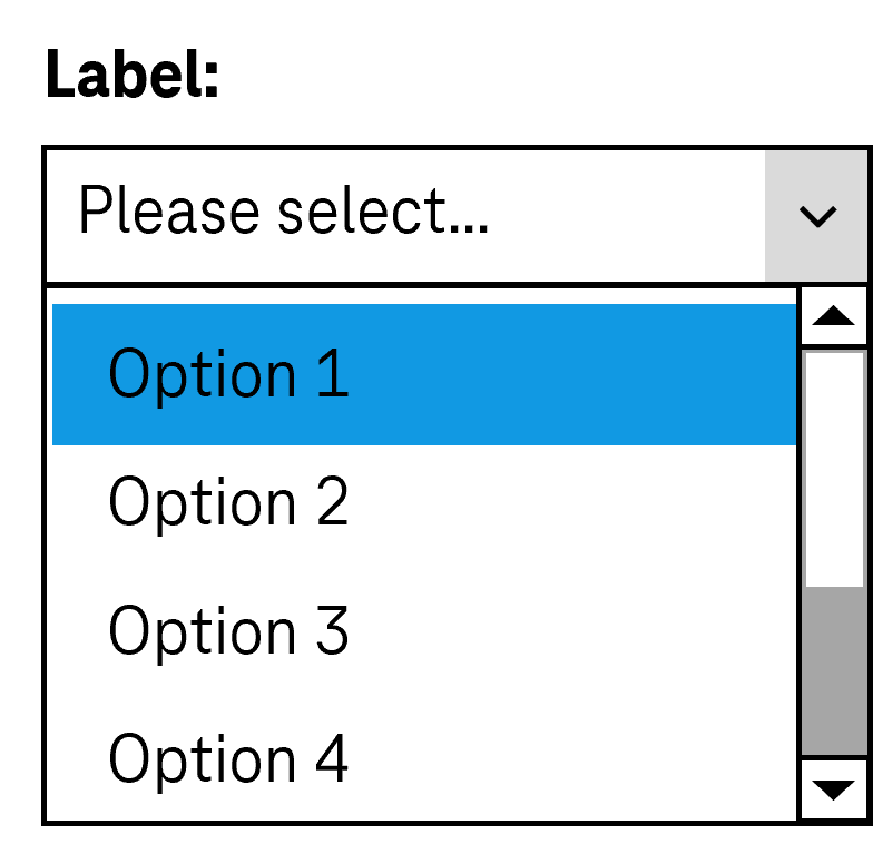
Drop-down lists allows for the selection of an option from a list, whereby the list can be opened and closed (see DIN EN ISO 9241-161: 8.11).
In the closed status, the current value (the selected option in the list) is displayed and to the right of it, a button (with arrow icon) for opening the list. In the open status, a selection list with all the options is also shown (possibly with a scrollbar). The current value is highlighted. The options can be grouped. The labeling of the groups cannot be selected.
Presentation
Permalink "Presentation"| No. | Property | Description | Classification | Reference |
|---|---|---|---|---|
| 716 | Contrast | The labeling of the options in the drop-down list must have a contrast of at least 4.5:1. Note 1: This applies to the opened and closed status of the drop-down list and to the selected and unselected options. Note 2: If the options are labeled with graphics rather than text, the contrast of the graphics with respect to the background and the content-bearing areas of the graphics with respect to each other must be at least 3:1. | Must | EN 301 549: 9.1.4.3, 11.1.4.3, 9.1.4.11, 11.1.4.11 |
| 717 | Contrast | If the selected list entry only differs from the unselected list entry in the open state due to its color (e.g. foreground or background color), the colors must have a contrast ratio of at least 3:1. Note: The selected list entry does not have to be color coded or marked with color only. It can be marked with a check box, for example. In this case, the contrast requirements for the color coding are eliminated as long as the check box has sufficient contrasts. | Must | EN 301 549: 9.1.4.11, 11.1.4.11 |
| 718 | Contrast | If the drop-down list is only identifiable as such on the basis of its color design, the color must have a contrast ratio of at least 3:1 with respect to the neighboring colors. Note 1: A drop-down list might be recognizable as an interactive element on the basis of its border or its background color, for example. Note 2: The requirement does not apply if the drop-down list is clearly identifiable as such, because of its position or labeling, for example. | Must | EN 301 549: 9.1.4.11, 11.1.4.11 |
| 719 | Contrast | The arrow icon for opening and closing the list must have a contrast ratio of at least 3:1 with respect to the neighboring color. | Must | EN 301 549: 9.1.4.11, 11.1.4.11 |
| 720 | Label | The drop-down list must have a visible label (see Label). | Must | EN 301 549 9.3.3.2, 11.3.3.2 |
| 721 | Focus visibility | If the drop-down list receives the keyboard focus, the focus indicator must be visible (see Focus indicator). | Must | EN 301 549: 9.2.4.7, 11.2.4.7 |
| 722 | Focus visibility | When navigating through the list entries, the current option must be displayed in the visible area and as focused. | Must | EN 301 549: 9.2.4.7, 11.2.4.7 |
| 723 | Options list | The options should be formulated in such a way that the information that serves the purpose of differentiation is at the beginning. | Should | DIN EN ISO 9241-143: 9.3.4 |
Operation
Permalink "Operation"| No. | Property | Description | Classification | Reference |
|---|---|---|---|---|
| 724 | Use of the keyboard | It must be possible to access, operate and exit the drop-down list with the keyboard (see Use of the keyboard table, below). | Must | EN 301 549: 9.2.1.1, 11.2.1.1, 9.2.1.2, 11.2.1.2 |
| 725 | Updates | When focusing and operating the drop-down list, no unexpected change of context may occur. Note: This means that no loss of focus must occur during or after the operation of the drop-down list. | Must | EN 301 549: 9.3.2.1, 11.3.2.1 und 9.3.2.2, 11.3.2.2 |
| 730 | Click area | The click area of the list entries in the selection list should be at least 24 x 24 px. Note: It should be possible to open the closed drop-down list by both clicking on the current value and clicking on the arrow (see Use of the pointing device). | Should | WCAG 2.2. |
Use of the keyboard: drop-down list
Permalink "Use of the keyboard: drop-down list"| Action | Key | Classification |
|---|---|---|
| Focusing of the drop-down list | TAB | Required |
| Exiting the drop-down list | TAB | Required |
| Opening the drop-down list | Desktop:
| Required |
| Closing the drop-down list | Desktop:
Note: In Web applications, it is also recommended that the drop-down list can be opened with F4. | Required |
| Operation of the drop-down list (selection of the previous or following value) | UP ARROW, DOWN ARROW | Required |
| Operation of the drop-down list (selection of the first and last value) | POS1, END | Required with several list entries |
| Operation of the drop-down list (selection of a value before or after with a defined increment) | PAGE UP, PAGE DOWN Note: The increment should correspond to the amount of visible options. | Required with several list entries |
| Operation of the drop-down list (selection of a value which starts with a specific character string) | Entry of one or more characters (within a short time) Note: If two entries start with the same character string, the entries are navigated to one another in sequence. | Required with several list entries |
Note: The operation of the drop-down list should be equally possible in both the open and closed states.
Use of the pointing device: drop-down list
Permalink "Use of the pointing device: drop-down list"| Action | Key | Classification |
|---|---|---|
| Opening the drop-down list | Left click on the drop-down list (value or arrow) | Required |
| Closing the drop-down list | Left click on the drop-down list (value or arrow) | Required |
| Closing the drop-down list | Left click on a value within the open list | Required |
| Closing the drop-down list | Left click outside the drop-down list | Required |
| Value selection within the open drop-down list | Left click on a value | Required |
Programming/interfaces
Permalink "Programming/interfaces"| No. | Property | Description | Classification | Reference |
|---|---|---|---|---|
| 731 | Role | The drop-down list role must be communicated to the Accessibility API (see Accessibility API). | Must | EN 301 549: 9.1.4.2, 11.4.1.2, 11.5.2.5 |
| 732 | Value | The value of the drop-down list must be communicated to the Accessibility API (see Accessibility API). | Must | EN 301 549: 9.1.4.2, 11.4.1.2, 11.5.2.7 |
| 733 | Desktop: Element hierarchy | The parent / child relationships of the elements within the list must be communicated to the Accessibility API. | Must | EN 301 549: 11.5.2.9 |
| 734 | Status | The status of the drop-down list must be communicated to the Accessibility API (see Element status). Note: This also applies to the “open” or “closed” status. | Must | EN 301 549: 9.4.1.2, 11.4.1.2, 11.5.2.5 |
| 735 | Name | The drop-down list must have a concise and expressive Accessible Name. | Must | EN 301 549: 9.2.4.6, 11.2.4.6, 9.4.1.2, 11.4.1.2, 11.5.2.5, 11.5.2.8 |
| 736 | Name | If the drop-down list has a description, it must be communicated as an Accessible Description. | Must | EN 301 549: 9.4.1.2, 11.4.1.2, 11.5.2.5 |
| 737 | Name | The group label of the list entries must (if available) be communicated to the Accessibility API. | Must | EN 301 549: 9.1.3.1, 11.1.3.1 |
| 738 | Operation | It must be possible to access, operate and exit the drop-down list with assistive technology (see Accessibility API). | Must | EN 301 549: 9.4.1.2, 11.4.1.2, 11.5.2.12, 11.5.2.17 |
| 739 | Update | Updates concerning the Accessible Name, value or status of the drop-down list must be communicated to the Accessibility API (see Accessibility API). | Must | EN 301 549: 9.4.1.2, 11.4.1.2, 11.5.2.15 |
| 740 | Desktop: Position | The size and position of the drop-down list and – if open – the selection list and its list entries must be communicated to the Accessibility API (see Focus indicator). | Must | EN 301 549: 11.5.2.5, 11.5.2.13 |
Practical tip: drop-down list in Web applications
Permalink "Practical tip: drop-down list in Web applications"Screen reader output
Permalink "Screen reader output"- JAWS: [label] combo box [value] [instruction on operation with the arrow keys]
- NVDA: [label] combo box [value] collapsed
- Windows Narrator: [label] [value] combo box collapsed
HTML
Permalink "HTML"The drop-down list should be implemented with the HTML elements <select> and <option> (without the multiple and size attributes).
The list entries can be grouped with the <optgroup> element. The grouping should be avoided, however, as many screen readers do not output the group label (which is specified with the label attribute).
The initially selected list entry can be set with the selected attribute.
The label should be linked to the drop-down list with the <label for=ID> element. A drop-down list, a group of list entries and the individual list entries can be marked as disabled (disabled), but not read-only (readonly).
A drop-down list can be marked as a required field with required. In this case, however, the first list entry must be empty.
Further information: 4.10.7 The select element - HTML Standard (whatwg.org)
ARIA
Permalink "ARIA"Please note: As the ARIA specification regarding combobox has changed fundamentally several times in recent years, it cannot be guaranteed that the ARIA drop-down list will be correctly output by all screen readers. The use of the HTML drop-down list is therefore recommended instead. Alternatively, the ARIA implementation should be thoroughly tested with differing browsers and screen readers.
Please note: Depending on the operating system, an HTML drop-down list is communicated to the Accessibility API differently. Under MacOS, a drop-down list is a menu button which opens a menu. If an ARIA drop-down list is used, no cross-platform solution is possible, as it would be necessary to use either the combobox role for Windows or the button role with aria-haspopup=menufor MacOS. The use of HTML drop-down lists is therefore recommended.
If the drop-down list is not implemented with the HTML element, it is also necessary to take account of the following:
- The role is communicated with
role=combobox. The role may not be located at an input field. Instead of this, a<div>element should be used. - The text content of the element with
role=comboboxis communicated as the value of the drop-down list. - The button with the arrow icon which is able to open the selection list is marked so that it does not receive the keyboard focus and is not output by the assistive technology (e.g. with
aria-hidden=true). - The labeling of the drop-down list can take place with
aria-labeloraria-labelledby. - The status of the drop-down list (closed or open = selection list visible) must be communicated with
aria-expanded. - Reference is made to the selection list from the element with
role=comboboxusingaria-controls. - The selection list is marked with
role=listboxand its list entries withrole=option. - When navigating through the list entries in the selection list, these must either actually receive the focus, or reference is made to the selected list entry with
aria-activedescendant. The first variant is to be preferred. -The drop-down list can be marked as disabled witharia-disabled. - The drop-down list can be marked as read-only with
aria-readonly. - The drop-down list can be marked as a required field with
aria-required. - The presentation of the drop-down list should be verified in Windows High Contrast mode.
- The visible drop-down list and the programmatically focused element should have the same position and size.
- When navigating through the list entries, the focused list entry should be displayed in the visible area.
Further information: combobox role - Accessible Rich Internet Applications (WAI-ARIA) 1.2 (w3.org) (External Link), Select-Only Combobox Example | APG | WAI | W3C
Information about this article
You are welcome to send feedback by email about our handout!