Synonyms: List field, multi-line selection list, list box
See also: Multiple selection list, drop-down list, radio button group, tree structure
Selection lists allow the selection of an option from a list (see DIN EN ISO 9241-161: 8.39).
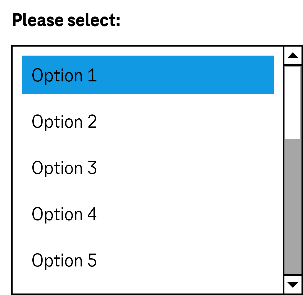
All the available options are displayed in the selection list (with scrollbars)if necessary). The current value is highlighted. The options can be grouped. The labeling of the groups cannot be selected. The focused option is identical to the selected option.
Presentation
Permalink "Presentation"| No. | Property | Description | Classification | Reference |
|---|---|---|---|---|
| 648 | Contrast | The labeling of the options in the selection list must have a contrast of at least 4.5:1. Note 1: This applies to both the selected and unselected options. Note 2: If the options are labeled with graphics rather than text, the contrast of the graphics with respect to the background and the content-bearing areas of the graphics with respect to each other must be at least 3:1. | Must | EN 301 549: 9.1.4.3, 11.1.4.3, 9.1.4.11, 11.1.4.11 |
| 649 | Contrast | If the selected option only differs from the unselected option due to its color (e.g. foreground or background color), a contrast ratio between the colors of at least 3:1 must be complied with. Note: The selected list entry does not have to be color coded or marked with color only. It can be marked with a check box, for example. In this case, the contrast requirements for the color coding are eliminated as long as the check box has sufficient contrasts. | Must | EN 301 549: 9.1.4.11, 11.1.4.11 |
| 650 | Contrast | The border of the selection list must have a contrast ratio of at least 3:1 with respect to the background. | Must | EN 301 549: 9.1.4.11, 11.1.4.11 |
| 651 | Label | The selection list must have a visible label (see Label). | Must | EN 301 549 9.3.3.1, 11.3.3.2 |
| 652 | Focus visibility | If the selection list receives the keyboard focus, the focus indicator must be visible (see Focus indicator). | Must | EN 301 549: 9.2.4.7, 11.2.4.7 |
| 653 | Focus visibility | When navigating through the options, the current option must be displayed in the visible area and as focused. | Must | EN 301 549: 9.2.4.7, 11.2.4.7 |
| 654 | Options list | It should not be necessary to scroll the list with the options horizontally, i.e. it should be at least as wide as the longest entry. | Should | DIN EN ISO 9241-143: 9.3.4 |
| 655 | Options list | Die Optionen sollen so formuliert werden, dass die relevante, zur Unterscheidung dienende Information am Anfang steht. | Should | DIN EN ISO 9241-143: 9.3.4 |
Operation
Permalink "Operation"| No. | Property | Description | Classification | Reference |
|---|---|---|---|---|
| 656 | Use of the keyboard | DIt must be possible to access, operate and exit the selection list with the keyboard (see Use of the keyboard table, below). | Must | EN 301 549: 9.2.1.1, 11.2.1.1, 9.2.1.2, 11.2.1.25 |
| 657 | Updates | When focusing and operating the selection list, no unexpected change of context may occur. Note: In particular, the change in value may not result in a loss of focus or the opening of a new screen. | Must | EN 301 549: 9.3.2.1, 11.3.2.1, 9.3.2.2, 11.3.2.2 |
| 658 | Click area | The click area of the list entries in the selection list should be at least 24 x 24 px. | Should | WCAG 2.2 |
Use of the keyboard: selection list
Permalink "Use of the keyboard: selection list"| Action | Key | Classification |
|---|---|---|
| Focusing of the selection list | TAB | Required |
| Exiting the selection list | TAB | Required |
| Operation of the selection list (selection of the previous or following value) | UP ARROW, DOWN ARROW | Required |
| Operation of the selection list (selection of the first and last value) | POS1, END | Required |
| Operation of the selection list (selection of a value before or after with a defined increment) | PAGE UP, PAGE DOWN Hinweis: Note: The increment should correspond to the amount of visible options. | Required with several list entries |
| Operation of the selection list (selection of a value which starts with a specific character string) | Entry of one or more characters (within a short time) Note: If two entries start with the same character string, the entries are navigated to one another in sequence. | Required with several list entries |
Zeigeinstrumentbedienung Auswahlliste
Permalink "Zeigeinstrumentbedienung Auswahlliste"| Action | Key | Classification |
|---|---|---|
| Value selection within the selection list | Left click on a value | Required |
Programming/interfaces
Permalink "Programming/interfaces"| No. | Property | Description | Classification | Reference |
|---|---|---|---|---|
| 659 | Role | The selection list role must be communicated to the Accessibility API (see Accessibility API). | Must | EN 301 549: 9.4.1.2, 11.4.1.2, 11.5.2.5 |
| 660 | Value | The value of the selection list must be communicated to the Accessibility API (see Accessibility API). | Must | EN 301 549: 9.4.1.2, 11.4.1.2, 11.5.2.7 |
| 661 | Desktop: Element hierarchy | The parent / child relationships of the elements within the selection list must be communicated to the Accessibility API. | Must | EN 301 549: 11.5.2.9 |
| 662 | Status | The status of the selection list must be communicated to the Accessibility API (see Elementstatus). | Must | EN 301 549: 69.4.1.2, 11.4.1.2, 11.5.2.5 |
| 663 | Name | The selection list must have a concise and expressive Accessible Name. | Must | EN 301 549: 9.2.4.6, 11.2.4.6, 9.4.1.2, 11.4.1.2, 11.5.2.5, 11.5.2.8 |
| 664 | Name | If the selection list has a description, it must be communicated as an Accessible Description. | Must | EN 301 549: 9.4.1.2, 11.4.1.2, 11.5.2.5 |
| 665 | Name | The group label of the list entries must (if available) be communicated to the Accessibility API. | Must | EN 301 549: 9.1.3.1, 11.1.3.1 |
| 666 | Operation | It must be possible to access, operate and exit the selection list with assistive technology (see Accessibility API). | Must | EN 301 549: 9.4.1.2, 11.4.1.2, 11.5.2.12, 11.5.2.17 |
| 667 | Update | Updates concerning the Accessible Name, value or status of the selection list must be communicated to the Accessibility API (see Accessibility API). | Must | EN 301 549: 9.4.1.2, 11.4.1.2, 11.5.2.15 |
| 668 | Position | The size and position of the selection list must be communicated to the Accessibility API (see Focus indicator). | Must | EN 301 549: 9.4.1.2, 11.4.1.2, 11.5.2.15 |
| 669 | Desktop: Position | The size and position of the selected elements in the selection list must be communicated to the Accessibility API (see Focus visibility) | Must | EN 301 549: 11.5.2.5, 11.5.2.13 |
Practical tip: selection list in Web applications
Permalink "Practical tip: selection list in Web applications"Screen reader output
Permalink "Screen reader output"During focusing of the selection list:
- JAWS:
- Without selected list entry: [label] list box [instruction on operation with the arrow keys]
- With selected list entry: [label] list box [value] [position] of [amount] [instruction on operation with the arrow keys]
- NVDA:
- Without selected list entry: [label] list
- With selected list entry: [label] list [value] [position] of [amount]
- Windows narrator:
- Without selected list entry: [label] selected requires selection contains [amount] items
- With selected list entry: [label] list [value] [position] of [amount] selected
When navigating through the selection list with the arrow keys:
- JAWS: [value] [position] of [amount]
- NVDA: [value] [position] of [amount]
- Windows Narrator: [value] [position] of [amount] selected
On reading with the virtual cursor:
- JAWS:
- Without selected list entry: [label] list box
- With selected list entry: [label] [value] list box items selected [position] of [amount]
- NVDA:
- Without selected list entry: [label] list clickable [first list entry]
- With selected list entry: [label] list clickable [value]
- Windows Narrator: [label] [position] of [amount] [| selected] [list entry]
Please note:
- JAWS and NVDA do not output the grouping of an HTML selection list with
<optgroup>. Windows Narrator only outputs the grouping with<optgroup>on reading with the virtual cursor. - JAWS and NVDA do not output the grouping of an ARIA selection list correctly with
role=groupgroup. Windows Narrator only outputs the grouping withrole=groupon reading with the virtual cursor. - When reading with the virtual cursor, JAWS only outputs the selected list entry, NVDA outputs the selected or first list entry, and Windows Narrator outputs all list entries.
HTML
Permalink "HTML"The selection list should be implemented with the HTML elements <select> and <option> with a value greater than 1 with the size attribut und without the multiple attribute.
The list entries can be grouped with the <optgroup> element. The grouping should be avoided, however, as many screen readers do not output the group label (which is specified with the label attribut).
The initially selected list entry can be set with the selected attribut. An initial list entry should be selected in each selection list, as keyboard users automatically make a selection when navigating through the selection list which cannot be undone. The list entry should be initially selected which is either most likely to be selected or which contains a neutral option (e.g. “not applicable”).
The label should be linked to the selection list with the <label for=ID> element.
A selection list, a group of list entries and the individual list entries can be marked as disabled (disabled), but not read-only (readonly).
A selection list can be marked as a required field with required.
Further information: 4.10.7 The select element - HTML Standard (whatwg.org)
ARIA
Permalink "ARIA"If the selection list is not implemented with the HTML element, it is also necessary to take account of the following:
- The selection list is marked with
role=listboxand contains the list entries that are marked withrole=option. - The list entries can be grouped within an element which is marked with
role=group. The group is labeled witharia-labeloraria-labelledby. - The selected list entry is marked with
aria-selected=true, all others witharia-selected=false. The selected list entry can also be communicated witharia-checked– this is not recommended for selection lists without multiple selection, however. - Alternatively, the selected list entry is not explicitly marked, but is determined automatically by the focused list entry during the operation. This is not recommended, though, because the assistive technology is not able to reliably determine the selected list entry in the non-focused state.
- The labeling of the selection list can take place with
aria-labeloraria-labelledby. - When navigating through the list entries in the selection list, these must either actually receive the focus, or reference is made to the selected list entry with
aria-activedescendant. The first variant is to be preferred. - The selection list can be marked as disabled with
aria-disabled. - The selection list can be marked as read-only with
aria-readonly. - The selection list can be marked as a required field with
aria-required. - A non-standard horizontal orientation of the selection list can be specified with
aria-orientation=horizontal. Frequently, the orientation is not output by the assistive technology, so that with horizontally oriented list entries, operation with all the arrow keys should be possible. - The presentation of the selection list should be verified in Windows High Contrast mode.
- The visible selection list and the programmatically focused element should have the same position and size.
- When navigating through the list entries, the focused list entry should be displayed in the visible area.
Further information: listbox role - Accessible Rich Internet Applications (WAI-ARIA) 1.2 (w3.org) (External Link), Listbox Pattern | APG | WAI | W3C
Information about this article
You are welcome to send feedback by email about our handout!