Synonyms: Designation, form field label, name, accessible name
See also: font, text, graphik, form, group, description, error message, required field label
Labels are used for the identification of control elements (see DIN EN ISO 9241-161: 8.21).
A label consists of a short, descriptive text or an expressive graphic and/or a combination of text and graphic. The label can be situated inside the element or adjacent to the element which is labeled.

Presentation
Permalink "Presentation"| No. | Property | Description | Classification | Reference |
|---|---|---|---|---|
| 213 | Contrast | Text labels must have a contrast ratio of at least 4.5:1 with respect to the background. Note 1: With large font (from 24 px and/or from 18.7 px in the case of bold font), a contrast ratio of at least 3:1 is sufficient. Note 2: The contrast requirements also apply when receiving keyboard focus (keyboard focus indicator) or hovering with a pointing device. | Must | EN 301 549: 9.1.4.3, 11.1.4.3 |
| 214 | Contrast | Text labels must have a contrast ratio of at least 7:1 with respect to the background. Note: With large font (from 24 px and/or from 18.7 px in the case of bold font), a contrast ratio of at least 4.5:1 is sufficient. | Should | WCAG 2.1: 1.4.6 (AAA) |
| 215 | Contrast | Graphic labels must have a contrast ratio of at least 3:1. This applies to the contrast with the background as well as to the areas of content within the graphic. This also applies when the form field has focus and when hovering with a pointing device. Note: This does not apply to layout graphics, i.e. if an equivalent text label exists in addition to the graphic | Must | EN 301 549: 9.1.4.11, 11.1.4.11 |
| 216 | Color coding | If information is conveyed using the color of the label (e.g. the form field is a required field or filled out incorrectly), this information must also be conveyed in another way, e.g. in text form. | Must | EN 301 549: 9.1.4.1, 11.1.4.1, 9.3.3.1, 11.3.3.1 |
| 217 | Resizing | It must be possible to scale the label by up to 200%. During the scaling, the label must remain completely visible and may not obscure other areas of the page or be obscured by them. | Must | EN 301 549: 9.1.4.4, 11.1.4.4.1 |
| 218 | Resizing | The label must be displayed in full without horizontal scrolling at a screen width of 320 px. | Must | EN 301 549: 9.1.4.10, 11.1.4.10 |
| 219 | Graphic | The label may not contain any (images of text) , unless they are adaptable to the user requirements (font style, font size, font color, background color). | Must | EN 301 549: 9.1.4.5, 11.1.4.5.1 |
| 220 | Graphic | The label should not contain any images of text. | Should | WCAG 2.1: 1.4.9 (AAA) |
| 221 | Comprehensibility | The label must be expressive (see Practical tip: special characters).). Note 1: To achieve this, the label should be concise and unambiguous. Note 2: In addition to the concise label, more detailed descriptions can be used. Note 3: If an element only has graphic label, a tooltip should be provided with the text alternative. | Must | EN 301 549: 9.2.4.6, 11.2.4.6, 9.3.3.2, 11.3.3.2 |
| 222 | Comprehensibility | The use of abbreviations in labels should be avoided. Alternatively, a mechanism should be available for displaying the unabbreviated form and/or the meaning of the abbreviation. | Should | WCAG 2.1: 3.1.4 (AAA) |
| 223 | Comprehensibility | The label should be in the application language. | Should | WCAG 2.1: 3.1.3 (AAA), 3.1.5 (AAA) |
| 224 | Context | A visual label must be available on every form field. Alternatively, the purpose of the form field must be clear from the context (e.g. unlabeled search field with “Search” button; unlabeled form fields in a table with expressive column and line headings). | Must | EN 301 549: 9.3.3.2, 11.3.3.2 |
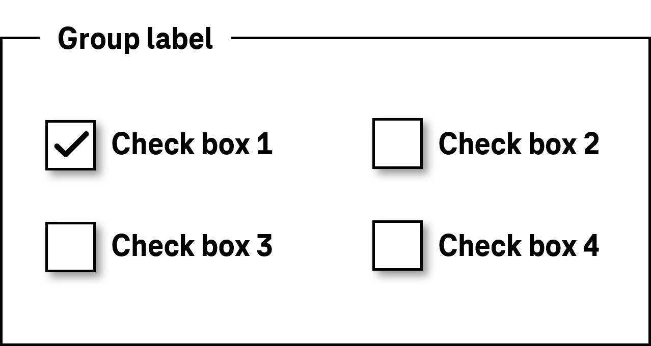
| 225 | Position | The form field label should be located to the left or above the form field, except for the case of radio buttons and check boxes. Note: In exceptional cases, the label can also enclose the form field (e.g. “Reminder in [input field] days”). However, we recommend that the label is formulated so that it can only be located in front of the form field. | Should | DIN EN ISO 9241-143: 5.3.4, 5.3.8 DIN EN ISO 9241-125: 5.1.14 |
| 226 | Position | The form field labeling of radio buttons and checkboxes should take place to the right of the form field. | Should | DIN EN ISO 9241-143: 5.3.8 DIN EN ISO 9241-125: 5.1.14 |
| 227 | Web: Consistency | Labels must be used consistently within the application. | Must | EN 301 549: 9.3.2.4 |
| 228 | Desktop: Consistency | Labels should be used consistently within the application. | Should | WCAG 2.1: 3.2.4 (AA) |
| 229 | Animation | The label may not sparkle, flash or be visually changed in any other way (see Animation). | Must | EN 301 549: 9.2.3.1, 11.2.3.1, 9.2.2.2, 11.2.2.2 |
| 230 | Animation | The label should be displayed all the time and should not be animated during operation. Note: This means that the label should not be displayed within a form field to become invisible or be positioned adjacent to the field during inputting. | Should | WCAG 2.1: 2.3.3 (AAA) |
| 231 | Keyboard shortcut, shortcut keys | If an control element has a keyboard shortcut or a shortcut key, it should be visible on the label. Note: For the identification of a shortcut key, the corresponding letter can be underlined. Keyboard shortcuts can be displayed behind the label or in a tooltip. | Should | DIN EN ISO 9241-171: 9.3.11 |
| 232 | Focus visibility | If the label receives the keyboard focus, the focus indicator must be visible (see Focus indicator). | Must | EN 301 549: 9.2.4.7, 11.2.4.7 |
Use of the pointing device: labeling
Permalink "Use of the pointing device: labeling"| Action | Key | Classification |
|---|---|---|
| Enabling of the element if the label is situated in the element | Left click on the label | Required |
| Enabling of the element if the label is situated adjacent to the element | Left click on the label Note: This is especially true for form fields with a small click area, such as radio buttons and check boxes. | Recommended |
Programming/interfaces
Permalink "Programming/interfaces"| No. | Property | Description | Classification | Reference |
|---|---|---|---|---|
| 233 | Label | Each control element must have an Accessible Name which is communicated to the Accessibility API. Note 1: This can be achieved if the control element
Note 2: This also applies if the element has no visual label because its purpose is inherent to the context. The Accessible Name should not change during operation. Exception: If the value or status of a control element is communicated as part of the Accessible Name because the value or status cannot be communicated programmatically, the Accessible Name may change. A button can therefore have the label “Text color red” or “Text color green” and/or “Show information” or “Hide information” (see Practical tip: Accessibility API). | Must | EN 301 549: 9.1.4.2, 11.4.1.2, 11.5.2.5 |
| 234 | Desktop: Label | If the visual label is not situated in the control element, the label must be programmatically linked to the control element. | Must | EN 301 549: 11.5.2.8 |
| 235 | Desktop: Label | If the visual label is not situated in the control element, the label should be programmatically linked to the control element. | Should | DIN EN ISO 9241-143: 5.3.2 |
| 236 | Label | If the purpose of a form element is not clearly identifiable from its Accessible Name, but is clear to sighted users from the visual context, the visual information must be communicated to the assistive technology
| Must | EN 301 549: 9.1.3.1, 11.1.3.1 |
| 237 | Label | If information is conveyed on the basis of the visual design of the label such as the color, font style or font size (e.g. the form field is a required field or incorrectly filled out), this information must be communicated to the Accessibility API programmatically or in text form. | Must | EN 301 549: 9.1.3.1, 11.1.3.1, 9.3.3.1, 11.3.3.1 |
| 238 | Graphic | For a graphical label only, the Accessible Name must contain an equivalent text alternative which describes the function. Note: Graphical labels include characters and letters with a graphic meaning such as “x” (for Close), “?” (for Help) or “>” (for Continue). | Must | EN 301 549: 9.1.1.1, 11.1.1.1 |
| 239 | Graphic | If a visual label contains both text and a graphic and the graphic does not communicate any additional information, the graphic must be marked as a layout graphic so that it is ignored by the assistive technology. | Must | EN 301 549: 9.1.1.1, 11.1.1.1 |
| 240 | Comprehensibility | The Accessible Name must be expressive. Note 1: To achieve this, the Accessible Name should be concise and unambiguous.. Note 2: In addition to the concise Accessible Name, more detailed Accessible Descriptions can be used. | Must | EN 301 549: 9.2.4.6, 11.2.4.6, 9.3.3.2, 11.3.3.2 |
| 241 | Comprehensibility | Abbreviations in the Accessible Name should be avoided. Alternatively, a mechanism should be available for displaying the unabbreviated form and/or the meaning of the abbreviation with assistive technology. | Should | WCAG 2.1: 3.1.4 (AAA) |
| 242 | Web: Change of language | If the Accessible Name contains foreign-language terms, the change of language must be marked. Note: The Accessible Name should contain only words in the application language. Even if the change of language is marked, in the case of Accessible Names of interactive elements, it is often the case that it is not output correctly by the assistive technology. | Should | WCAG 2.1: 3.1.4 (AAA) |
| 243 | Desktop: Comprehensibility | The Accessible Name should contain only words in the application language. Note: In the applications in which marking up the change of language is possible, the language of foreign-language Accessible Names should be marked accordingly. | Should | WCAG 2.1: 3.1.2 (AA) |
| 244 | Consistency | The visual label must match or be included in the Accessible Name. Note 1: This only applies if the visible label consists of a text label or an image of text. Note 2: If an element with a purely graphical label has a tooltip which contains a label in text form, then the tooltip text should match or be contained in the Accessible Name. | Must | EN 301 549: 11.2.5.3 |
| 245 | Keyboard shortcut, shortcut keys | If a control element has a visible keyboard shortcut or a shortcut key, this must be communicated to the Accessibility API. Note: This should take place using the corresponding characteristic of the API. If this is not possible, the keyboard shortcut or the shortcut key can be communicated as part of the Accessible Name or the Accessible Description. | Must | EN 301 549: 11.1.3.1 |
Practical tip: labeling in Web applications
Permalink "Practical tip: labeling in Web applications"Screenreader output
Permalink "Screenreader output"- JAWS: [Label] [role] [required field note] [validation note] [value] [description] [error message] [screen reader operating note] [keyboard shortcut note]
- NVDA: [Label] [role] [required field note] [validation note] [description] [keyboard shortcut note] [value]
- Windows Sprachausgabe: [Label] [role] [value] [required field note] [validation note] [keyboard shortcut note]
Please note:
- The label is output by the screen readers first, immediately before the role.
- Only one group label is output before the label, if available.
- During the reading with the virtual cursor, the label is output at the element itself or where it is located in the source code, depending on the control element. To ensure that labels can also be assigned to the control elements correctly in the case of reading with the virtual cursor, the label should be located in the source code in the element (e.g. with links and buttons), directly in front of the element (with form fields other than radio buttons and check boxes) or directly after the element (with radio buttons and check boxes).
HTML
Permalink "HTML"In HTML, the labeling method depends on the element type:
- Links, buttons (that are marked with the
<button element>are labeled using their text content or the alternative text of the graphic, - Buttons (that are marked with the
<input>element) are labeled using the value attribute. - Form elements are labeled with the
<label>element. - Form field groups (
<fieldset>) are labeled with the<legend>element. - Graphics (
<img>) are labeled with thealtattribute. - Figures (
<figure>) are labeled with the<figcaption>element. - Tables are labeled with the
<caption>element. - iFrames and regions (e.g.
<nav>and<section>) are labeled with the title attribute. Certain elements may not be labeled (e.g.<div>or<span>).
Further information: 4.10.4 The label element - HTML Standard (whatwg.org), Providing Accessible Names and Descriptions | APG | WAI | W3C, Labeling Controls | Web Accessibility Initiative (WAI) | W3C, 4. Accessible Name and Description Computation - HTML Accessibility API Mappings 1.0 (w3.org)
ARIA
Permalink "ARIA"In ARIA, it is possible to communicate labels with the attributes aria-labelledby and aria-label.
- With
aria-labelledbyreference can be made to the IDs of visible or invisible labels. - With
aria-labelthe label can be specified directly in text form. - Certain elements that are marked with ARIA roles can also be labeled with their text content. This also applies to the
button,link,checkbox,radio,optionandtab. roles. In the ARIA specification, these elements are marked with “Name From: content”. - Certain elements that are marked with ARIA roles must be explicitly labeled (generally with
aria-labeloraria-labelledby) Labeling using the text content is not possible. This also applies to the following roles:listbox,combobox,dialog,form,application,grid.In the ARIA specification, elements that have to be labeled are marked with “Accessible Name Required: True”. Whether an element can be explicitly labeled can be seen in the ARIA specification at “Name From: author”. - A label can also be marked with
role=captioncaption, and then serves the purpose of the labeling of tables (role=grid,role=table,role=treegrid) and figures (role=figure), as long as the label is the first (or withrole=figurethe final) child element of the element to be labeled. Regardless of the marking withrole=caption, reference to the label should be made witharia-labelledby. - Certain ARIA roles cannot be labeled, such as
generic,paragraph,presentation,code,insertion,deletion,emphasis,strong,subscriptandsuperscript. In the ARIA specification, these elements are marked with “Name From: prohibited”. Elements with these roles may contain text, however. - Reference can be made to hidden elements using
aria-labelledby, e.g. those that have been marked withdisplay:noneorhidden. The contents of the hidden elements are used to label the element witharia-labelledby. In such cases, however, the use ofaria-labelis recommended..
Further information: aria-label property - Accessible Rich Internet Applications (WAI-ARIA) 1.2 (w3.org) (External Link), aria-labelledby property - Accessible Rich Internet Applications (WAI-ARIA) 1.2 (w3.org) (External Link), caption role - Accessible Rich Internet Applications (WAI-ARIA) 1.2 (w3.org) (External Link)
General information
Permalink "General information"- Each control element must have a label which is communicated to the Accessibility API as the Accessible Name. This also applies if the element has no visible label.
- The label should be concise and expressive.
- The Accessible Name should not contain any change of language or structured content, as this is not perceptible with the assistive technology.
- For each element, it is only possible to communicate a label to the Accessibility API using one method. If several methods are used, only the label whose method has the highest priority is used as the Accessible Name. The priority of the methods is defined as follows:
aria-labelledby,aria-label,- HTML labeling methods (e.g.
<label>,<caption>,value,alt, if applicable to the element), - text content (if permissible for the element),
title,placeholder(only for input fields).
- Elements should not be labeled using the
title- orplaceholderattribute, as these two attributes, which are actually intended for the communication of a description and/or an input instruction, are used only as a label if no correct label is available. This is a repair mechanism which is designed to ensure that an element is not output without a label. - If the labeling of a control element occurs explicitly using an attribute (for example,
aria-label,aria-labelledby,id, which are referenced via<label for>the attribute must be situated on the element that receives keyboard focus and has the role of the element to be labeled. The control element cannot be labeled by attribute if the attribute is situated on a parent or child element. - Text content which is shown
beforeorafteras pseudo-elements using the CSS selectors are taken into account when determining the label. To avoid this, they should be marked witharia-hidden=true. - If a reference is made to a form field using
aria-labelledby, the value of the form field (not its label, however) is taken into account when determining the labeling of the element witharia-labelledby. - ARIA elements must generally be labeled with an ARIA method (e.g.
aria-labeloraria-labelledby) or using their text content (if permissible for the respective role). In this way, for example, an ARIA check box cannot be labeled with the<label>element and an ARIA graphic cannot be labeled with thealtattribute. An exception is presented by ARIA elements whose underlying HTML elements allow for the appropriate HTML labeling method. Accordingly, a combined input field (<input role=combobox>) can be labeled with the<label>element because the HTML element<input>can be labeled with the<label>element. - The visible label should not be marked with
aria-hidden=truetrue, even if an Accessible Name is available, to ensure that the text-to-speech works using the mouse. - The visible label should be used as an Accessible Name to avoid a repeated output of the label with the text-to-speech feature.
- For form fields, the Accessible Name in the source code should be immediately in front of the element, except for radio buttons and check boxes, in which case the Accessible Name in the source code should be immediately behind it. This is important, to ensure that the label can be assigned to the form fields correctly when reading with the virtual cursor of the screen reader.
⦁ Depending on the type of element, the text content of elements is also imperceptible with the virtual cursor of the screen reader if the elements are explicitly labeled (e.g. with
aria-labeloraria-labelledby).- In the case of control elements (such as links and buttons), the text content should be used as a label. It must otherwise be ensured that all the information contained in the text content is also available in the Accessible Name.
- In the case of grouping elements (such as form field groups, regions, lists, or tables), their contents are perceptible with the virtual cursor, even if they are explicitly labeled. These elements should therefore be labeled explicitly so that their purpose is recognizable.
Information about this article
You are welcome to send feedback by email about our handout!