Synonyms: Control box, control field, selection box
See also: Toggle switch, switch, radio buttons, selection list with multiple selection
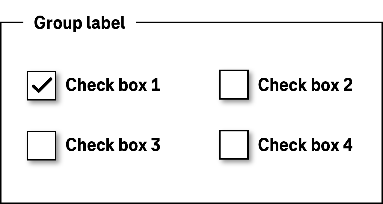
A check box serves the selection of the options “selected” or “not selected” (see DIN EN ISO 9241-161: 8.4). A check box can also relay the status of a subordinate check box group (“all selected”, “none selected” or “some selected”).
A check box consists of a square frame and an indicator (check mark) which indicates whether the check box has been selected, has not been selected, or whether some of the subordinate group have been selected.
Presentation
Permalink "Presentation"| No. | Property | Description | Classification | Reference |
|---|---|---|---|---|
| 801 | Contrast | The border of the check box must have a contrast ratio of at least 3:1 with respect to the background. | Must | EN 301 549: 9.1.4.11, 11.1.4.11 |
| 802 | Contrast | The symbol which relays the “selected” and “some selected” states (check mark) must have a contrast ratio of at least 3:1 with respect to the neighboring color. | Must | EN 301 549: 9.1.4.11, 11.1.4.11 |
| 803 | Label | The check box must have a visible label (see Label). | Must | EN 301 549 9.3.3.2, 11.3.3.2 |
| 804 | Label | The label of the check box should be on the right-hand side of the check box. | Should | DIN EN ISO 9241-125: 5.1.15 |
| 805 | Focus visibility | If the check box receives the keyboard focus, the focus indicator must be visible (see Focus indicator). | Must | EN 301 549: 9.2.4.7, 11.2.4.7 |
Operation
Permalink "Operation"| No. | Property | Description | Classification | Reference |
|---|---|---|---|---|
| 806 | Use of the keyboard | It must be possible to access, operate and exit the check box with the keyboard (see Use of the keyboard table). | Must | EN 301 549: 9.2.1.1, 9.2.1.2, 11.2.1.1, 11.2.1.2 |
| 807 | Updates | When focusing and operating the check box, no unexpected change of context may occur. Note: This means that no loss of focus must occur during or after the operation of the check box. | Must | EN 301 549: 9.3.2.1, 9.3.2.2, 11.3.2.1, 11.3.2.2 |
| 808 | Click area | The click area of the check box should be at least 24 x 24 px (see Use of the pointing device). Note: It should be possible to operate the check box by both clicking on the check box and clicking on the label (see Use of the pointing device). | Should | WCAG 2.2 |
Use of the keyboard: check box
Permalink "Use of the keyboard: check box"| Action | Key | Classification |
|---|---|---|
| Focusing of the check box | TAB | Required |
| Exiting the check box | TAB | Required |
| Operation of the check box (value change) | SPACE | Required |
| Desktop: Navigating within a check box group | LEFT/UP ARROW, RIGHT/DOWN ARROW Note: Navigation does not change the value. | Recommended |
Use of the pointing device: check box
Permalink "Use of the pointing device: check box"| Action | Key | Classification |
|---|---|---|
| Operation of the check box (value change) | Left click | Required |
Programming/interfaces
Permalink "Programming/interfaces"| No. | Property | Description | Classification | Reference |
|---|---|---|---|---|
| 809 | Role | The check box role must be communicated to the Accessibility API (see Accessibility API). | Must | EN 301 549: 9.4.1.2,11.4.1.2, 11.5.2.5 |
| 810 | Value | The value of the check box (selected, partially selected, not selected) must be communicated to the Accessibility API (see Accessibility API). | Must | EN 301 549: 9.4.1.2, 11.4.1.2, 11.5.2.7 |
| 811 | Status | The status of the check box must be communicated to the Accessibility API (see Element status). | Must | EN 301 549: 9.4.1.2, 11.4.1.2, 11.5.2.5 |
| 812 | Name | The check box must have a concise and expressive Accessible Name. | Must | EN 301 549: 9.2.4.6, 11.2.4.6, 9.4.1.2, 11.4.1.2, 11.5.2.5, 11.5.2.8 |
| 813 | Name | If the check box has a description, it must be communicated as an Accessible Description. | Must | EN 301 549: 9.4.1.2, 11.4.1.2, 11.5.2.5 |
| 814 | Operation | It must be possible to access, operate and exit the check box with assistive technology (see Accessibility API). | Must | EN 301 549: 9.4.1.2, 11.4.1.2, 11.5.2.12, 11.5.2.17 |
| 815 | Update | Updates concerning the name, value or status of the check box must be communicated to the Accessibility API (see Accessibility API). | Must | EN 301 549: 9.4.1.2, 11.4.1.2, 11.5.2.15 |
| 816 | Desktop: Position | The size and position of the check box must be communicated to the Accessibility API (see Focus indicator). | Must | EN 301 549: 11.5.2.5, 11.5.2.13 |
Practical tip: check box in Web applications
Permalink "Practical tip: check box in Web applications"Screen reader output
Permalink "Screen reader output"- JAWS: [label] check box checked | not checked | partially checked [instruction on operation with the space bar]
- NVDA: [label] check box checked | not checked | half checked
- Windows Narrator: [label] check box checked | unchecked | indeterminate
HTML
Permalink "HTML"The check box should be implemented with the HTML element <input type=checkbox>.
The initially selected status is set with the checked attribute. The “some selected” state can only be set using JavaScript with the indeterminate=true characteristic.
The labeling of the check box should be linked to the check box using the <label for=ID> element in order to expand the click area of the check box by its label.
A check box can be marked as disabled (disabled), but not as read-only (readonly).
A check box can be marked as a required field with required. This is only useful in cases where the check box has to be submitted in the “selected” (checked) status. However, if at least one check box in a group of check boxes must be selected, the check box should not be marked with required, but the required field label should be implemented in the group. As the group cannot be marked with required, the required field label should be in text form (e.g. an asterisk within the group label).
Check boxes that belong together should be positioned within a labeled Form field group. The <fieldset> element is used for the group and the <legend> element is used for the group label.
Error messages that do not relate to a single check box but to the check box group should not be linked to each individual check box but to the group.
Further information: 4.10.5.1.15 Checkbox state (type=checkbox) - HTML Standard (whatwg.org)
ARIA
Permalink "ARIA"If the check box is not implemented with the HTML element, it is also necessary to take account of the following:
- The role is communicated with
role=checkbox. - The status is communicated with
aria-checked=true|false|mixedand must be updated during the operation. - The labeling can take place by text content or
aria-labelledby. - The check box can be marked as read-only with
aria-readonly. - The presentation of the check box should be verified in Windows High Contrast mode.
- The visible check box and the programmatically focused element should have the same position and size.
Further information: checkbox role - Accessible Rich Internet Applications (WAI-ARIA) 1.2 (w3.org) (External Link), Checkbox Pattern | APG | WAI | W3C
Information about this article
You are welcome to send feedback by email about our handout!