Synonyms: Calendar date picker, calendar, calendar element, calendar control, time selector, time picker, clock, date and time selector, date-time picker
See also: Combined input field, color picker
Note: All the following statements apply equally to the time picker or to control elements for the selection of weeks, months or years.
A date picker is used for the supported entry of a date (see DIN EN ISO 9241-161: 8.9 and 8.46).
Date pickers can be implemented in different ways, e.g. as
- input field for a date combined with a button, with which it is possible to open a dialog for the selection of a date,
- read-only input field for a date combined with a button with which it is possible to open a dialog for the selection of a date,
- combined input field for a date with which it is possible to open a dialog for the selection of a date,
- table for selecting a date within a specific time period and buttons for changing the time period,
- separate input fields for entering the day, month and year, combined with a button with which it is possible to open a dialog for the selection of a date,
- separate spin buttons for entering and selecting the day, month and year,
- seperate selection lists for selecting the day, month and year,
- seperate drop-down lists for selecting the day, month and year.
The dialog for selecting a date can contain the following elements:
- Tables, buttons, radio buttons, spin buttons, selection lists or drop-down lists for selecting a date within a specific period of time (e.g. days within a month, months within a year, years within a decade),
- Buttons for selecting another period,
- visual highlighting of the days and periods (e.g. „today“, „chosen day“, „holiday day“, „public holiday“, „weekend“, „day with free appointments“). The requirements for the individual control elements within the date picker are described for the respective control element. Only the additional requirements for the whole of the element are described here.
Examples:
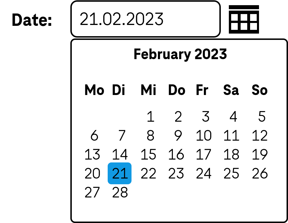
Presentation
Permalink "Presentation"| No. | Property | Description | Classification | Reference |
|---|---|---|---|---|
| 846 | Contrast | The visual highlighting of the days and time periods must have a contrast ratio of at least 3:1 between each other. Note: If this is not possible, an additional visual method must be used for the differentiation. | Must | EN 301 549: 11.1.4.1 |
| 847 | Description | A legend or tooltip should explain the meaning of visual highlighting, unless it is self-explanatory. Note: The visual highlighting of weekends and public holidays is self-explanatory, for example. | Should | DIN EN ISO 9241-143: 9.6.11 |
Operation
Permalink "Operation"| No. | Property | Description | Classification | Reference |
|---|---|---|---|---|
| 848 | Use of the keyboard | It must be possible to access, operate and exit the date picker and the elements that it contains with the keyboard (see Use of the keyboard table, below). | Must | EN 301 549: 9.2.1.1, 11.2.1.1, 9.2.1.2, 11.2.1.2 |
| 849 | Updates | When focusing and operating the date picker, no unexpected change of context may occure . | Must | EN 301 549: 9.3.2.1, 11.3.2.1, 9.3.2.2, 11.3.2.2 |
| 850 | Error message | An entered date may not be corrected automatically without an error message which must be provided in text form. Note: This does not include changes to the input, unless these change the date (such as the automatic insertion of leading zeros) | Must | EN 301 549: 9.3.3.1, 11.3.3.1 |
| 851 | focus order | The focus order in the date picker should correspond to the visual presentation. | Should | DIN EN ISO 9241-171: 9.3.18 |
| 852 | Focus order | If the date picker outside a dialog contains several control elements that receive the focus with TAB, it should be possible to skip the date picker with the keyboard (see navigtion sequence) | Should | DIN EN ISO 9241-171: 9.3.17 |
| 853 | Click area | The click area of the control elements for the date picker should be at least 24 x 24 px (see Use of the pointing device). | Should | WCAG 2.2 |
Use of the keyboard: date picker
Permalink "Use of the keyboard: date picker"| Action | Key | Classification |
|---|---|---|
| Focusing of the date picker | TAB | Required |
| Exiting the date picker | TAB Note: There can be several control elements within the date picker that have been previously focused with TAB. | Required |
| Navigating within the date picker | TAB or LEFT/RIGHT/UP/DOWN ARROW (depending on the used control element) | Required |
| Quick navigation within the selection elements for a day, a month or a year | POS1, END, PAGE UP/DOWN | Recommended |
| Activation of the control elements in the date picker | ENTER or SPACE (depending on the used control element) | Required |
Use of the pointing device: date picker
Permalink "Use of the pointing device: date picker"| Action | Key | Classification |
|---|---|---|
| Activation of the control elements in the date picker | left click | Required |
Programming/interfaces
Permalink "Programming/interfaces"| No. | Property | Description | Classification | Reference |
|---|---|---|---|---|
| 854 | Role | The role of the date picker and its control elements must be communicated to the Accessibility API (see Accessibility API). | Must | EN 301 549: 9.4.1.2, 11.4.1.2, 11.5.2.5 |
| 854 | Desktop: Element hierarchy | The parent / child relationships of the elements within the date picker must be communicated to the Accessibility API. | Must | EN 301 549: 11.5.2.9 |
| 855 | Status | The status of the date picker and its control elements must be communicated to the Accessibility API (see Element status). Note 1: This refers, for example, to the „open“ or „closed“ status with respect to the dialog, and to the „selected“ status with respect to the selected date within one of the selection elements. Note 2: Insofar as the purpose of the visual highlighting (such as public holiday, holiday) cannot be communicated as the status, this information should be communicated as part of the description. | Must | EN 301 549: 9.4.1.2, 11.4.1.2, 11.5.2.5 |
| 856 | Name | The date picker and its control elements must have a concise and expressive Accessible Name. | Must | EN 301 549: 9.2.4.6, 11.2.4.6, 9.4.1.2, 11.4.1.2, 11.5.2.5, 11.5.2.8 |
| 857 | Name | If the date picker or its control elements have a description, it must be communicated as an Accessible Description. | Must | EN 301 549: 9.4.1.2, 11.4.1.2, 11.5.2.5 |
| 858 | Operation | It must be possible to access, operate and exit the date picker and its control elements with assistive technology (see Accessibility API). | Must | EN 301 549: 9.4.1.2, 11.4.1.2, 11.5.2.12, 11.5.2.17 |
| 859 | Update | Updates concerning the Accessible Name or status of the date picker and its control elements must be communicated to the Accessibility API (see Accessibility API). | Must | EN 301 549: 9.4.1.2, 11.4.1.2, 11.5.2.15 |
| 860 | Position | The size and position of the date picker and its control elements must be communicated to the Accessibility API (see Accessibility API). | Must | EN 301 549: 11.5.2.5, 11.5.2.15 |
Information about this article
You are welcome to send feedback by email about our handout!