Synonyms: Rotary button, step forward button, spinner, spin control
See also: Input field, slider, drop-down list, combined input field, button
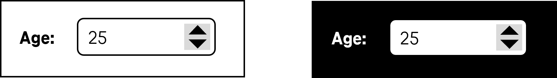
Spin buttons allow for the selection of a value from a range of values with continuous data (e.g., days of the week, years). A spin button consists of two buttons that allow for the selection of the previous value and the following value as well as an input field in order to display the value. The input field for displaying the value can be read-only or allow for the direct text input. The value range of the spin button can be limited or unlimited, i.e. it can have a minimum value, a maximum value or both (see DIN EN ISO 9241-161: 8.41).
Presentation
Permalink "Presentation"| No. | Property | Description | Classification | Reference |
|---|---|---|---|---|
| 629 | Contrast | The text in the spin button must have a contrast ratio of at least 4.5:1 with respect to the background. | Must | EN 301 549: 9.1.4.3, 11.1.4.3 |
| 630 | Contrast | The border of the spin button must have a contrast ratio of at least 3:1 with respect to the background. | Must | EN 301 549: 9.1.4.11, 11.1.4.11 |
| 631 | Contrast | The arrow icons for the selection of the previous and following value must have a contrast ratio of at least 3:1 with respect to the neighboring color. | Must | EN 301 549: 9.1.4.11, 11.1.4.11 |
| 632 | Label | The spin button must have a visible label (see label). | Must | EN 301 549 9.3.3.2, 11.3.3.2 |
| 633 | Fokus visibility | If the spin button receives the keyboard focus, the focus indicator must be visible (see Focus indicator). | Must | EN 301 549: 9.2.4.7, 11.2.4.7 |
| 634 | Focus visibility | If it is possible to enter text in the spin button, the default text cursor must be displayed (see Textcursor). | Must | EN 301 549: 9.2.4.7, 11.2.4.7, 11.5.2.13 |
Operation
Permalink "Operation"| No. | Property | Description | Classification | Reference |
|---|---|---|---|---|
| 635 | Use of the keyboard | It must be possible to access, operate and exit the spin button with the keyboard (see Use of the keyboard table, below). Note: The button for the selection of the previous and following value should not receive the keyboard focus separately | Must | EN 301 549: 9.2.1.1, 11.2.1.1, 9.2.1.2, 11.2.1.2 |
| 636 | Updates | When focusing and operating the spin button, no unexpected change of context may occur. | Must | EN 301 549: 9.3.2.1, 11.3.2.1 und 9.3.2.2, 11.3.2.2 |
| 637 | Klickbereich | If it is not possible for a value to be entered, the click area of the buttons for the selection of the previous and following values should be at least 24 x 24 px (see Use of the pointing device). | Should | WCAG 2.2 |
Use of the keyboard: spin button
Permalink "Use of the keyboard: spin button"| Action | Key | Classification |
|---|---|---|
| Focusing of the spin button | TAB | Required |
| Leaving the spin button | TAB | Required |
| Entering a value in the input field | Text input | Required (if text input is possible) |
| Navigating in the input field | RIGHT/LEFT ARROW POS1, END | Required (if text input is possible) |
| Operation of the spin button (selection of the previous or following value) | UP ARROW, DOWN ARROW | Required |
| Operation of the spin button (selection of a value before or after with a defined increment) | PAGE UP, PAGE DOWN Note: The increment depends on the amount of possible values. An increment of 10 for instance, would make sense with 100 values. | Recommended |
| Operation of the spin button (selection of the first and last value) | POS1, END | Recommended (if no text input is possible and a range of values exists) |
Use of the pointing device: spin button
Permalink "Use of the pointing device: spin button"| Action | Key | Classification |
|---|---|---|
| Placing the focus on a specific position in the input field | Left click in the input field | Required (if text input is possible) |
| Selection of the previous or following value | Left click on the corresponding button with the arrow icon | Required |
Programming/interfaces
Permalink "Programming/interfaces"| No. | Property | Description | Classification | Reference |
|---|---|---|---|---|
| 638 | Role | The spin button role must be communicated to the Accessibility API (see Accessibility API). | Must | EN 301 549: 9.4.1.2, 11.4.1.2, 11.5.2.5 |
| 639 | Value | The value of the spin button must be communicated to the Accessibility API (see Accessibility API). | Must | EN 301 549: 9.4.1.2, 11.4.1.2, 11.5.2.7 |
| 640 | Desktop: Value range | If the spin button has a minimum and maximum value, it must be communicated to the Accessibility API (see Accessibility API). | Must | EN 301 549: 11.5.2.7 |
| 641 | Status | The status of the spin button must be communicated to the Accessibility API (see Elementstatus). Note: This also applies to the “text input possible” or “text input not possible” status. | Must | EN 301 549: 9.4.1.2, 11.4.1.2, 11.5.2.5 |
| 642 | Name | The spin button must have a concise and expressive Accessible Name. | Must | EN 301 549: 9.2.4.6, 11.2.4.6, 9.4.1.2, 11.4.1.2, 11.5.2.5, 11.5.2.8 |
| 643 | Name | If the spin button has a description, it must be communicated as an Accessible Description. | Must | EN 301 549: 9.4.1.2, 11.4.1.2, 11.5.2.5 |
| 644 | Operation | It must be possible to access, operate and exit the spin button with assistive technology (see Accessibility API). | Must | EN 301 549: 9.4.1.2, 11.4.1.2, 11.5.2.12, 11.5.2.17 |
| 645 | Update | Updates concerning the Accessible Name, value or status of the spin button must be communicated to the Accessibility API (see Accessibility API). | Must | EN 301 549: 9.4.1.2, 11.4.1.2, 11.5.2.15 |
| 646 | Desktop: Position | The size and position of the spin button must be communicated to the Accessibility API (see Focus indicator). | Must | EN 301 549: 11.5.2.5 |
| 647 | Desktop: Position | If the input field is not read-only, the position of the text cursor in the input field must be communicated to the Accessibility API (see Focus visibility) | Must | EN 301 549: 11.5.2.13 |
Practical tip: spin button in Web applications
Permalink "Practical tip: spin button in Web applications"Screen reader output
Permalink "Screen reader output"- JAWS: [label] edit spin box [value] [instruction on text input and operation with the arrow keys]
- NVDA: [label] spin button | spin button editable [value]
- Windows Narrator: [label] spinner | spin button [value] minimum [minimum value] and maximum [maximum value]
Please note:
- The Windows Narrator outputs the HTML spin buttons as a “net” and the ARIA spin buttons as a “spin button”.
- The minimum and maximum values are only perceptible with the Windows Narrator.
- The difference between spin buttons with and without text input is only perceptible with NVDA.
HTML
Permalink "HTML"The spin button should be implemented with the HTML element <input type=number>
The initial value is communicated through the value attribute
The increment as well as the minimum and maximum values can be communicated with the step, min und max attributes.
The label of the spin button should be linked to the spin button with the <label for=ID> element.
A spin button can be marked as disabled (disabled) and read-only (readonly) ausgezeichnet werden. A spin button can be marked as a required field with required.
Further information: 4.10.5.1.12 Number state (type=number) - HTML Standard (whatwg.org)
ARIA
Permalink "ARIA"Please note: On mobile devices, an ARIA spin button without text input may not be operated with assistive technology, because no gesture commands for the operation of non-native spin buttons have been implemented. This applies, in particular, if the buttons for increasing and/or decreasing the value are child elements of the spin button.
In addition to this, the differences between spin buttons with and without text input are not perceptible with most screen readers. It is therefore recommended that only spin buttons with a text input option are implemented.
If the spin button is not implemented with the HTML element, it is also necessary to take account of the following:
- The role is communicated with
role=spinbutton. - If the
spinbuttonrole is located at an input field or at an element which contains an input field, it is a spin button with text input. Otherwise, it is a spin button without text input. - The labeling of the spin button can take place with
aria-labeloraria-labelledby. If the ARIAspinbuttonrole is located at an HTML input field, it can also be labeled with<label for=ID>. - The current value must be specified with
aria-valuenow. BefindetIf the ARIAspinbuttonrole is located at an HTML input field, its value is used as the current value of the spin button. aria-valuetextcan also be used to specify a value in text form which should be then output by the assistive technology instead of the value inaria-valuenow.- The minimum and maximum values can be specified with
aria-valueminandaria-valuemax. - With ARIA spin buttons, specifying an increment is not possible.
- The spin button can be marked as disabled with
aria-disabledand witharia-readonlyas read-only. - The switches used for increasing and/or decreasing the value should not receive keyboard focus separately.
- The presentation of the spin button should be verified in Windows High Contrast mode.
- The visible spin button and the programmatically focused element should have the same position and size.
Further information: spinbutton role - Accessible Rich Internet Applications (WAI-ARIA) 1.2 (w3.org) (External Link), Spinbutton Pattern | APG | WAI | W3C
Information about this article
You are welcome to send feedback by email about our handout!