Synonyms: Text field, text area, multi-line text input, multiline plain text edit control
See also: Input field (one-line), Rich Text Editor
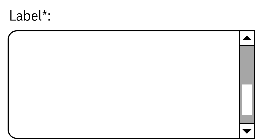
Multi-line input fields allow for the input of long text contents (see DIN EN ISO 9241-161: 8.45).
A multi-line input field is usually a rectangular area of the page that contrasts with the background due to a border, for example. The border can have a control point for the scaling of the input field. A multi-line input field can have scrollbars. The requirements of the control point and scrollbars are described in the appropriate sections.
Presentation
Permalink "Presentation"The requirements concerning the input field are described in the “input field” section. Here, only the additional requirements are described which result from the fact that it is an input field with several lines.
| No. | Property | Description | Classification | Reference |
|---|---|---|---|---|
| 606 | Value | If the display width exceeds 320 px, the multi-line input field must be displayed in such a way that its text content can be read without having to scroll horizontally. | Must | EN 301 549: 9.1.4.10, 11.1.4.10 |
Operation
Permalink "Operation"The requirements concerning the input field are described in the “input field” section. Here, only the additional requirements are described which result from the fact that it is an input field with several lines.
| No. | Property | Description | Classification | Reference |
|---|---|---|---|---|
| 607 | Use of the keyboard | If the multi-line input field cannot be exited with the TAB key (because it means TAB steps are inserted in the text), a keyboard shortcut for exiting the field must be implemented and documented in the application. | Must | EN 301 549: 9.2.1.2, 11.2.1.2 |
Use of the keyboard: multi-line input field
Permalink "Use of the keyboard: multi-line input field"| Action | Key | Classification |
|---|---|---|
| Exiting the multi-line input field | TAB or a documented keyboard shortcut | Required |
| Entering a value | [Inputting of printable characters and ENETER and/or TAB] Note: If certain characters cannot be entered, an appropriate input instruction must be available at the input field. | Required |
| Navigating in the multi-line input field | UP/DOWN/RIGHT/LEFT ARROW | Required |
| Quick navigation in the multi-line input field | POS1, END, PAGE UP, PAGE DOWN | Required |
Programming/interfaces
Permalink "Programming/interfaces"The requirements concerning the input field are described in the “input field” section. Here, only the additional requirements are described which result from the fact that it is an input field with several lines.
| No. | Property | Description | Classification | Reference |
|---|---|---|---|---|
| 608 | Role | The multi-line input field role must be communicated to the Accessibility API (see Accessibility API). | Must | EN 301 549: 9.4.1.2, 11.4.1.2, 11.5.2.5 |
| 609 | Operation | It must be possible to access, operate and exit the multi-line input field with assistive technology (see Accessibility API). Note: If it is not possible to exit the multi-line input field with TAB, in order to exit, the keyboard shortcut must be communicated to the Accessibility API. | Must | EN 301 549: 9.4.1.2, 11.4.1.2, 11.5.2.12, 11.5.2.17 |
| 610 | Update | Updates concerning the Accessible Name, value or status of the multi-line input field must be communicated to the Accessibility API (see Accessibility API). Note: This applies to an updated description of the amount of allowed characters that have been entered or are remaining, for example. | Must | 9.4.1.2, 11.4.1.2, 11.5.2.12, 11.5.2.17 |
Practical tip: multi-line input field in Web applications
Permalink "Practical tip: multi-line input field in Web applications"Screen reader output
Permalink "Screen reader output"- JAWS: [label] input field [instruction on contained value] [instruction on text input]
- NVDA: [label] multi-line input field [contents of the current line]
- Windows Narrator: [label] edit [value]
Please note:
- With JAWS, the value of the input field is imperceptible when focusing with TAB. The content is only output line by line when navigating through the field.
- With NVDA, the value of the input field is only partially perceptible when focusing with TAB, because only the current line is output. The content is only output line by line when navigating through the field.
- If the input field is empty, with JAWS and Windows Narrator, the difference between a one-line and multi-line input field is imperceptible.
- If the value of the input field contains empty lines and the text cursor is in an empty line, when focusing with TAB with NVDA, it is imperceptible that the input field contains a value because “empty” is output only.
HTML
Permalink "HTML"Note: Multi-line input fields should only be used if very long inputs are expected or if the inputting of paragraph breaks (ENTER key) must be enabled. Otherwise, a one-line input field should be used, because the accessibility of the multi-line input fields is poorer for users of screen readers.
The input field should be implemented with the HTML element <textarea>.
The initial value is communicated through the text content of the element.
The label of the input field should be linked to the input field with the <label for=ID> element.
The maximum and minimum required length of the value can be determined with maxlength and minlength. Neither of the values are perceptible visually or with the use of assistive technology. If they are used, a corresponding instruction should be provided at the input field.
The visual size of the input field can be set using the cols and rows attributes. It is recommended that the size is defined using CSS instead, so that the multi-line input field can be responsively designed to avoid horizontal scrolling at a screen width of 320 px. The initial size of the input field should be sufficiently large, as keyboard users are not able to change the size of the field – the control point automatically displayed by the browser can only be operated with a pointing device.
The placeholder attribute can be used for a placeholder. However, it is recommended to display input instructions next to the field and to link them to the input field using aria-describedby. The placeholder attribute has the following disadvantages:
- The contrasts are often insufficient (in respect to either the background or the text in the input field, which makes it difficult to distinguish between the placeholder and the value).
- The placeholder is not displayed as soon as the field contains a value.
An input field can be marked as disabled (disabled) and read-only (readonly). An input field can be marked as a required field with required.
Further information: 4.10.11 The textarea element - HTML Standard (whatwg.org)
ARIA
Permalink "ARIA"If the input field is not implemented with the HTML element, it is also necessary to take account of the following:
- The role is communicated with
role=textboxand the ARIA attributearia-multiline=true. - The labeling of the input field can take place with
aria-labeloraria-labelledby. - The value of the input field is derived from the text content of the element which is marked with
role=textbox. - The input field can be marked as a required field with
aria-required, as disabled witharia-disabled, and as read-only witharia-readonly. - For a placeholder,
aria-placeholderis used. - The presentation of the input field should be verified in Windows High Contrast mode.
- The visible input field and the programmatically focused element should have the same position and size.
Further information: textbox role - Accessible Rich Internet Applications (WAI-ARIA) 1.2 (w3.org) (External Link)
Information about this article
You are welcome to send feedback by email about our handout!