Synonyms: Input field with suggestion list, autocomplete search, auto suggestion box
See also: selection list, drop-down list, menu button, input field (one-line),, combined input field
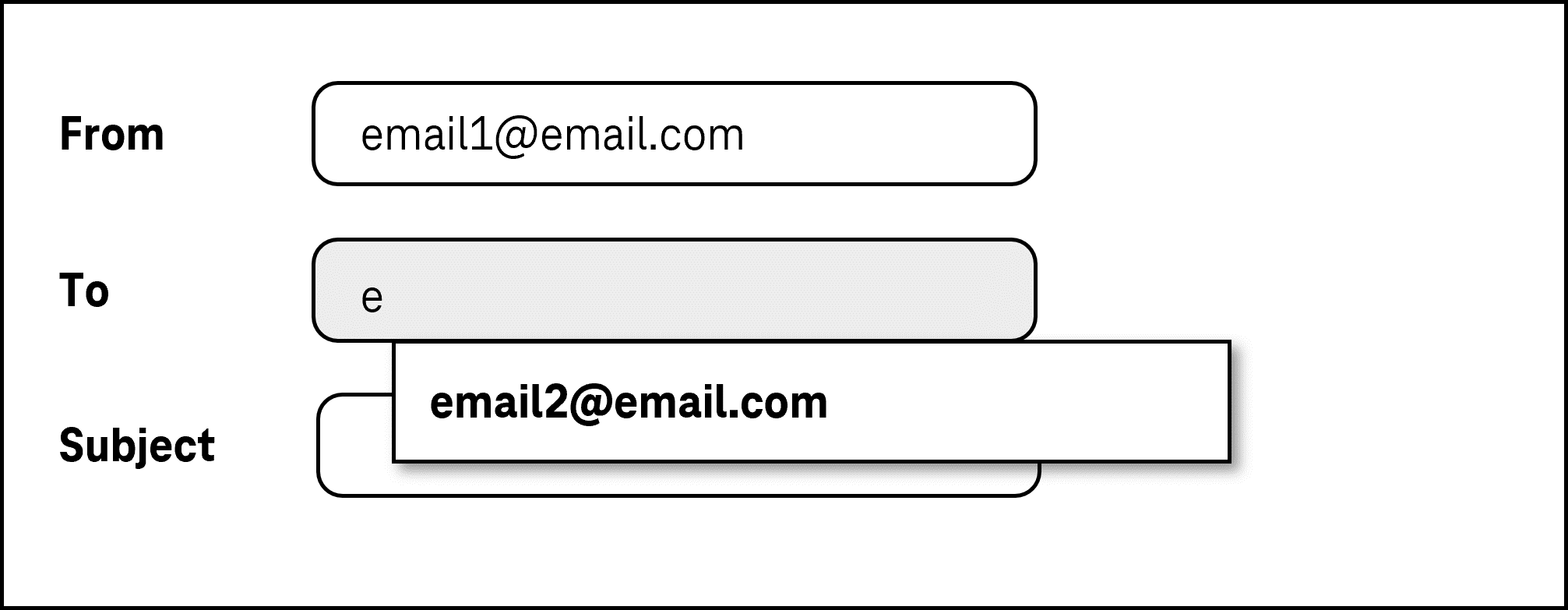
Input fields with the autocomplete function allow for text to be entered freely and the selection of options from a list, whereby the list is only opened after the text has been input.
In the closed state, an input field with autocomplete function consists of a single input field. In the opened state, a selection list is displayed underneath (possibly with a scrollbar). The options of the selection list can be grouped. The labeling of the groups cannot be selected.
Input fields with the autocomplete function can also add the first hit to the input field automatically, so that this can be adopted immediately (Inline-Autocomplete). In this case, the text cursor remains at the position of the last character entered.
Presentation
Permalink "Presentation"The requirements concerning the input field are described in the “input field” section. Here, only the additional requirements are described which result from the fact that it is an input field with autocomplete function.
| No. | Property | Description | Classification | Reference |
|---|---|---|---|---|
| 617 | Contrast | The labeling of the options in the selection list of the autocomplete function must have a contrast of at least 4.5:1. | Must | EN 301 549: 9.1.4.3, 11.1.4.3 |
| 618 | Contrast | The selected option in the selection list of the autocomplete function must have a contrast of at least 3:1 with respect to the neighboring options. | Must | EN 301 549: 9.1.4.11, 11.1.4.11 |
| 619 | Focus visibility | In the case of keyboard navigation through the list entries, the current option must be displayed in the visible area. | Must | EN 301 549: 11.2.4.7 |
Operation
Permalink "Operation"The requirements concerning the input field are described in the “input field” section. Here, only the additional requirements are described which result from the fact that it is an input field with autocomplete function.
| No. | Property | Description | Classification | Reference |
|---|---|---|---|---|
| 620 | Use of the keyboard | It must be possible to access, operate and exit the options in the selection list of the autocomplete function with the keyboard (see Use of the keyboard table, below). | Must | EN 301 549: 9.2.1.1, 11.2.1.1, 9.2.1.2, 11.2.1.2 |
| 621 | Updates | When focusing and operating the input field with the autocomplete function, no unexpected change of context may occur. | Must | EN 301 549: 11.3.2.1 und 11.3.2.2 |
| 622 | Click area | The click area of the list entries in the selection list should be at least 24 x 24 px. | Should | WCAG 2.2: 2.5.8 (AA) |
Use of the keyboard: input field with autocomplete function
Permalink "Use of the keyboard: input field with autocomplete function"| Action | Key | Classification |
|---|---|---|
| Opening of the selection list | Text input | Required |
| Closing the selection list | ENTER ESC TAB Text input that does not lead to any results from the autocomplete function | Reauired |
| Operation of the selection list (selection of the previous or following value) | UPP ARROW, DOWN ARROW | Required |
| Operation of the selection list (selection of a value before or after with a defined increment) | PAGE UP, PAGE DOWN Note: The increment should correspond to the amount of visible options. | Recommended |
Use of the pointing device: input field with autocomplete function
Permalink "Use of the pointing device: input field with autocomplete function"| Action | Key | Classification |
|---|---|---|
| Closing the selection list | Left click on a value within the open list | Required |
| Closing the selection list | Left click outside the combined input field (consisting of the input field and the selection list) | Required |
| Value selection within the selection list | Left click on a value | Required |
Programming/interfaces
Permalink "Programming/interfaces"The requirements concerning the input field are described in the “input field” section. Here, only the additional requirements are described which result from the fact that it is an input field with autocomplete function.
| No. | Property | Description | Classification | Reference |
|---|---|---|---|---|
| 623 | Role | The input field role must be communicated to the Accessibility API (see Accessibility API) Note: If the technology used does not know the input field with autocomplete function role, the input field role must be used. In this case, the description should make reference to the autocomplete function. | Must | EN 301 549: 9.4.1.2, 11.4.1.2, 11.5.2.5 |
| 624 | Desktop: Element hierarchy | The parent / child relationships of the elements within the list must be communicated to the Accessibility API. | Must | EN 301 549: 911.5.2.9 |
| 624 | Status | The status of the selection list of the autocomplete function must be communicated to the Accessibility API (see Elementstatus). Note: This applies to the “open” or “closed” status, for example. | Must | EN 301 549: 9.4.1.2, 11.4.1.2, 11.5.2.5, 1.5.2.9 |
| 625 | Name | The group label of the list entries must (if available) be communicated to the Accessibility API. | Must | EN 301 549: 9.1.3.1, 11.1.3.1 |
| 626 | Operation | It must be possible to access, operate and exit the selection list of the autocomplete function with assistive technology (see Accessibility API). | Must | EN 301 549: 9.4.1.2, 11.4.1.2, 11.5.2.12, 11.5.2.17 |
| 627 | Update | Updates concerning the Accessible Name, value or status of the combined input field must be communicated to the Accessibility API (see Accessibility API). Note: This applies in particular to the displaying of the selection list of the autocomplete function, as otherwise it is not perceptible that values are available for selection. | Must | EN 301 549: 9.4.1.2, 11.4.1.2, 11.5.2.15 |
| 628 | Desktop: Position | The size and position of the selected elements in the selection list must be communicated to the Accessibility API (see Focus indicator)) | Must | EN 301 549: 11.5.2.13 |
Information about this article
You are welcome to send feedback by email about our handout!