Synonyms: Color picker
See also: Slider, Date picker The color picker serves the selection of a color (see DIN EN ISO 9241-161: 8.6). Color pickers can be implemented in different ways, e.g. as
- Table, Drop down list or Selection list for selecting a color,
- single input field for entering a color value (e.g. HEX value),
- several input fields or spin buttons for entering single color channels (e.g. RGB, RGBA, CMYK or HSB),
- two-dimensional gradient field for selecting a value,
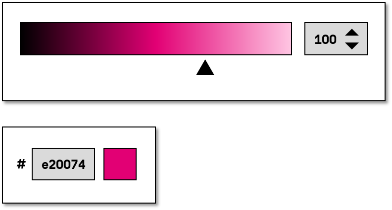
- individual slider for selecting a color,
- several sliders for selecting individual color channels (e.g. RGB, RGBA, CMYK or HSB),
- button, with which a dialog can be opened for selecting a color (the dialog contains one of the above-mentioned elements),
- a combination of the above-mentioned elements.
The requirements for the individual control elements within the color picker are described for the respective control element. Only the additional requirements for the whole of the element are described here.
Presentation
Permalink "Presentation"| No. | Property | Description | Classification | Reference |
|---|---|---|---|---|
| 861 | Color coding | The color picker must contain at least one option for selecting a color by its color name, color code (such as HEX), or values of the color channels (such as RGB). | Must | EN 301 549: 9.1.4.1, 11.1.4.1 |
| 862 | Color coding | If the selectable values or the current value are visually displayed in color, the elements should have a tooltip with the color name or the color value in text form. Note: The output of the color name should preferably be used. | Should | DIN EN ISO 9241-143: 9.6.11 |
Operation
Permalink "Operation"| No. | Property | Description | Classification | Reference |
|---|---|---|---|---|
| 863 | Use of the keyboard | It must be possible to access, operate and exit the color picker and the elements that it contains with the keyboard (see Use of the keyboard table, below). | Must | EN 301 549: 9.2.1.1, 11.2.1.1, 9.2.1.2, 11.2.1.2 |
| 864 | Update | When focusing and operating the color picker, no unexpected change of context may occure. | Must | EN 301 549: 9.3.2.1, 11.3.2.1 und 9.3.2.2, 11.3.2.2 |
| 865 | Focus order | The focus order in the color picker should correspond to the visual presentation. | Should | DIN EN ISO 9241-171: 9.3.18 |
| 866 | Focus order | If the color picker outside a dialog contains several control elements that receive the focus with TAB, it should be possible to skip the color picker with the keyboard (see navigation sequence) | Should | DIN EN ISO 9241-171: 9.3.17 |
| 867 | Click area | The click area of the control elements for the color picker should be at least 24 x 24 px (see use of the pointing device). | Should | WCAG 2.2 |
Use of the keyboard: color picker
Permalink "Use of the keyboard: color picker"| Action | Key | Classification |
|---|---|---|
| Focusing of the color picker | TAB | Required |
| Exiting the color picker | TAB Note: There can be several control elements within the color picker that have been previously focused with TAB. | Required |
| Navigating within the color picker | TAB or LEFT/RIGHT/UP/DOWN ARROW (depending on the used control element) | Required |
| Activation of the control elements in the color picker | ENTER or SPACE (depending on the used control element) | Required |
Use of the pointing device: color picker
Permalink "Use of the pointing device: color picker"| Action | Key | Classification |
|---|---|---|
| Activation of the control elements in the color picker | left click | Required |
Programming/interfaces
Permalink "Programming/interfaces"| No. | Property | Description | Classification | Reference |
|---|---|---|---|---|
| 868 | Role | The role of the color picker and its control elements must be communicated to the Accessibility API (see Accessibility API). | Must | EN 301 549: 9.4.1.2, 11.4.1.2, 11.5.2.5 |
| 869 | Desktop: Element hierarchy | The parent / child relationships of the elements within the color picker must be communicated to the Accessibility API. | Must | EN 301 549: 11.5.2.9 |
| 870 | Status, value | The value and status of the color picker and its control elements must be communicated to the Accessibility API (see Element status). Note 1: Status refers, for example, to the „open“ or „closed“ status with respect to the dialog, and to the „selected“ status with respect to the selected color within one of the selection elements. Note 2: Value refers, for example, to the selected color or the value of a color channel. Color names are to be preferred over color values. | Must | EN 301 549: 11.4.1.2, 11.5.2.5 |
| 871 | Name | The color picker and its control elements must have a concise and expressive Accessible Name. | Must | EN 301 549: 9.2.4.6, 11.2.4.6, 9.4.1.2, 11.4.1.2, 11.5.2.5, 11.5.2.8 |
| 872 | Name | If the color picker or its control elements have a description, it must be communicated as an Accessible Description. | Must | EN 301 549: 9.4.1.2, 11.4.1.2, 11.5.2.5 |
| 873 | Operation | It must be possible to access, operate and exit the color picker and its control elements with assistive technology (see Accessibility API). | Must | EN 301 549: 9.4.1.2, 11.4.1.2, 11.5.2.12, 11.5.2.17 |
| 874 | Update | Updates concerning the Accessible Name or status of the color picker and its control elements must be communicated to the Accessibility API (see Accessibility API). | Must | EN 301 549: 9.4.1.2, 11.4.1.2, 11.5.2.15 |
| 875 | Desktop: Position | The size and position of the color picker and its control elements must be communicated to the Accessibility API (see Accessibility API). | Must | EN 301 549: 11.5.2.5, 11.5.2.13 |
Practical tip: color picker in Web applications
Permalink "Practical tip: color picker in Web applications"HTML
Permalink "HTML"The color picker can be implemented with the HTML element <input type=color>.
The initial value is communicated through the value attribute. Only the hexadecimal color values starting with a diamond and followed by 6 characters are permitted as values.
The label of the color picker should be linked to the color picker with the <label for=ID> element.
The color picker can be marked as disabled, but not as a required field (required) or as read-only (readonly).
Please note: Depending on the browser and screen reader used, the HTML color picker is either not perceptible at all (e.g. JAWS with Chrome and Edge) or only partially perceptible and operable (e.g. NVDA with Chrome, Edge and Firefox). Using the HTML color picker is not recommended, unless the application is only intended to work with a browser and specific assistive technology, and accessibility can be guaranteed in this environment. Otherwise, depending on the requirement, for instance, a button, which opens a modal dialog for the color selection, one or several input fields, a drop-down list, slider or a combination of these elements can be used.
Further information: 4.10.5.1.14 Color state (type=color) - HTML Standard (whatwg.org)
ARIA
Permalink "ARIA"There is no role for color pickers in ARIA. Instead, depending on the requirement, for instance, a button which opens a modal dialog for the color selection, one or several input fields, a drop-down list, slider or a combination of these elements can be used.
Information about this article
You are welcome to send feedback by email about our handout!