Synonyms: Combination field, combo box
See also: Selection list, drop-down list, menu button, input field with autocomplete function
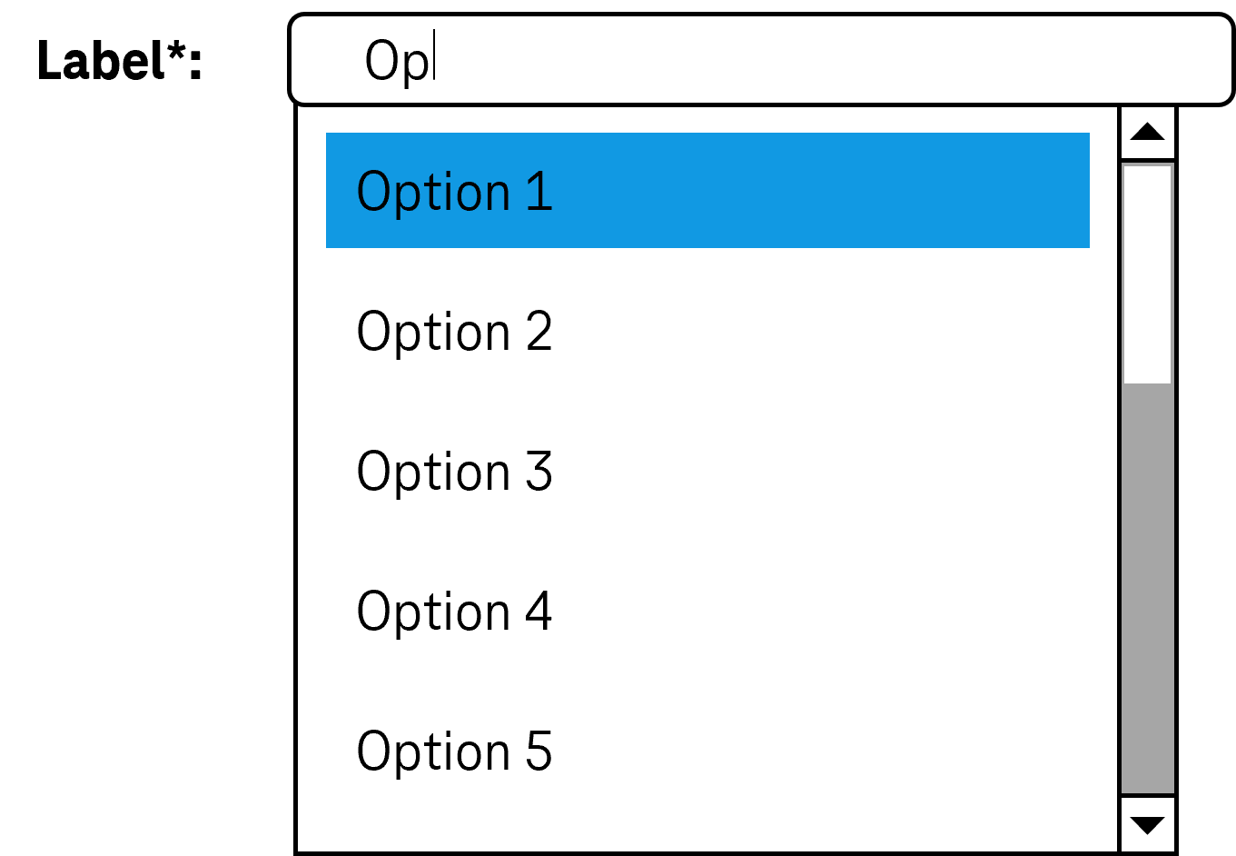
Combined input fields allow for text input and the selection of options from a list, where the list can be opened and closed (see DIN EN ISO 9241-161: 8.7).
In the closed state, a combined input field consists of an input field and a button (with arrow icon) for opening the list, which is located to the right of the input field. In the opened state, a selection list is displayed underneath (possibly with a scrollbar). The options of the selection list can be grouped. The labeling of the groups cannot be selected.
Combined input fields can be implemented very differently. The implementation variants include:
- As long as the input field is empty, in the open state, a selection list with all the options is displayed below the input field. If the input field contains text, only options that contain or begin with the text you have already entered appear in the selection list below the input field. If there are no options matching the entered text, no selection list will be displayed.
- The selection list contains certain commonly used values, regardless of the text input.
- The combined input field has two selection lists. The list entries of one list are independent of the text input; in the second list, the matching list entries are only displayed after the text input.
- The text input is used only to filter the options in the selection list. It is not possible to enter text that does not match any of the default options.
Presentation
Permalink "Presentation"The requirements concerning the input field and the selection list are described in the “input field” and/or “selection list” section. Here, only the additional requirements are described which result from the fact that a selection list can be opened with the input field.
| No. | Property | Description | Classification | Reference |
|---|---|---|---|---|
| 711 | Contrast | The arrow icon for opening and closing the list must have a contrast ratio of at least 3:1 with respect to the neighboring color. | Must | EN 301 549: 9.1.4.11, 11.1.4.11 |
Operation
Permalink "Operation"The requirements concerning the input field and the selection list are described in the “input field” and/or “selection list” section. Here, only the additional requirements are described which result from the fact that a selection list can be opened with the input field.
| No. | Property | Description | Classification | Reference |
|---|---|---|---|---|
| 712 | Use of the keyboard | It must be possible to access, operate and exit the combined input field with the keyboard (see Use of the keyboard table, below). Note: The button for showing and hiding the selection list should not receive the keyboard focus separately. | Must | EN 301 549: 11.2.1.1 und 11.2.1.2; ISO 9241-171: 9.2.1.1, 11.2.1.1, 9.2.1.2, 11.2.1.2 |
| 713 | Click area | The click area of the arrow for opening and closing the selection list should be at least 24 x 24 px (see Use of the pointing device). | Should | WCAG 2.2 |
Use of the keyboard: combined input field
Permalink "Use of the keyboard: combined input field"| Action | Key | Classification |
|---|---|---|
| Opening of the selection list | Desktop:
| Required |
| Closing the selection list | Desktop:
| Required |
Use of the pointing device: combined input field
Permalink "Use of the pointing device: combined input field"| Action | Key | Classification |
|---|---|---|
| Opening of the selection list | Left click on the arrow | Required |
| Closing the selection list | Left click on the arrow | Required |
| Closing the selection list | Left click on a value within the open list | Required |
| Closing the selection list | Left click outside the combined input field (consisting of the input field and the selection list) | Required |
Programming/interfaces
Permalink "Programming/interfaces"The requirements concerning the input field and the selection list are described in the “input field” and/or “selection list” section. Here, only the additional requirements are described which result from the fact that a selection list can be opened with the input field.
| No. | Property | Description | Classification | Reference |
|---|---|---|---|---|
| 714 | Role | The combined input field role must be communicated to the Accessibility API (see Accessibility API). | Must | EN 301 549: 11.4.1.2, 11.5.2.5 |
| 715 | Status | The status of the combined input field must be communicated to the Accessibility API (see Element status). Note: This also applies to the “open” or “closed” status. | Must | EN 301 549: 9.4.1.2, 11.4.1.2, 11.5.2.5 |
Practical tip: combined input field in Web applications
Permalink "Practical tip: combined input field in Web applications"Screen reader output
Permalink "Screen reader output"- JAWS: [label] edit combo collapsed | expanded [value] [instruction on text input and operation with the arrow keys]
- NVDA: [label] combo box collapsed | expanded [has autoc omplete] editable [value]
- Windows Narrator: [label] [value] combo edit collapsed | expanded
HTML
Permalink "HTML"The combined input field should be implemented with the HTML elements <input type=… list=ID> and <datalist id=ID> and <option>.
- The
listattribute is suitable to be used for the following values in thetypeattribute:text,search,url,tel,email. - The
listattribute may also be used according to the HTML specification with the following values in thetypeattribute. This is not supported by most browsers, however, and sometimes leads to misleading output by the screen readers:date,month,week,time,datetime-local,number,range,color.
The initial value is communicated through the value attribute at the <input> element.
The label should be linked to the combined input field with the <label for=ID> element.
The combined input field can be marked as a required field (required), as disabled (disabled) and/or as read-only (readonly).
The list entries cannot be marked as disabled or read-only. The list entries cannot be grouped.
Further information: 4.10.8 The datalist element - HTML Standard (whatwg.org), 4.10.5.3.9 The list attribute - HTML Standard (whatwg.org)
ARIA
Permalink "ARIA"Please note: As the ARIA specification regarding combobox has changed fundamentally several times in recent years, it cannot be guaranteed that the combined input fields implemented with ARIA will be correctly output by all screen readers. The use of the native combined input field is therefore recommended instead. Alternatively, the ARIA implementation should be thoroughly tested with differing browsers and screen readers.
Please note: The ARIA pattern for combined input fields is often used for input fields with autocomplete function or drop-down lists. These three elements differ in their meaning and operation, however, and should not be mixed up.
If the combined input field is not implemented with the HTML elements, it is also necessary to take account of the following:
- The role is communicated with
role=combobox. The role must be located at an input field (<input type=text>). - The value of the input field (
valueattribute) is communicated as the value of the combined input field. - The labeling of the combined input field can take place with
aria-labeloraria-labelledby. - The status of the drop-down list (closed or open = selection list visible) must be communicated with
aria-expanded. - Reference is made to the selection list from the element with
role=comboboxusingaria-controls. - The autocomplete behavior of the combined input field is communicated with
aria-autocomplete. - The selection list is marked with
role=listboxand its list entries withrole=option. - When navigating through the list entries in the selection list, these must either actually receive the focus, or reference is made to the selected list entry with
aria-activedescendant. The first variant is to be preferred. - The button with the arrow icon which is able to open the selection list does not receive the keyboard focus (
tabindex=-1), but should be marked so that it is output by the assistive technology when navigating with the virtual cursor. The button should be labeled expressively, refer to the selection list witharia-controls, and communicate the status of the selection list witharia-expanded. - The combined input field can be marked as disabled with
aria-disabled. - The combined input field can be marked as read-only with
aria-readonly. - The combined input field can be marked as a required field with
aria-required. - The presentation of the combined input field should be verified in Windows High Contrast mode.
- The visible combined input field and the programmatically focused element should have the same position and size.
- When navigating through the list entries, the focused list entry should be displayed in the visible area.
Further information: combobox role - Accessible Rich Internet Applications (WAI-ARIA) 1.2 (w3.org) (External Link), Combobox Pattern | APG | WAI | W3C
Information about this article
You are welcome to send feedback by email about our handout!