Synonyme: List field, multi-line selection list, list box
See also: Selection list, drpo-down list, check box group, tree structur
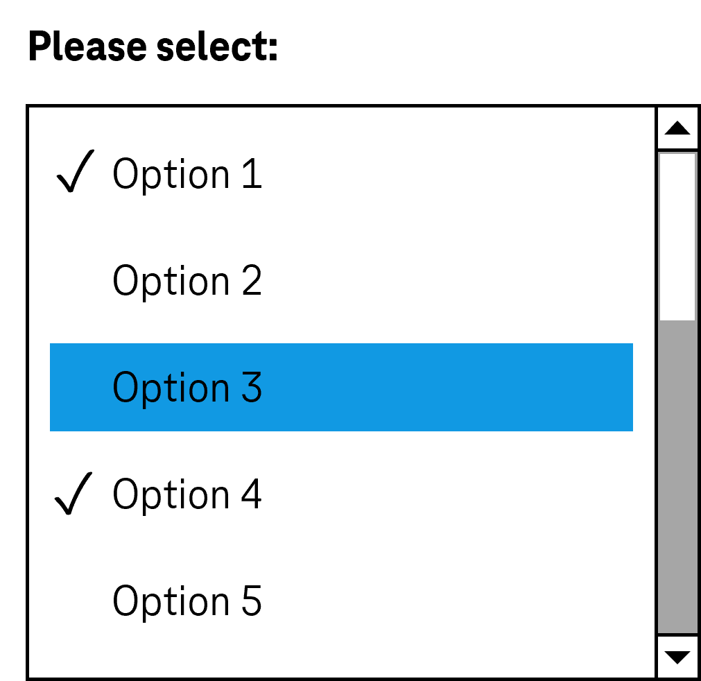
Multiple selection lists allow the selection of several options from a list (see DIN EN ISO 9241-161: 8.39).
All the selectable options are displayed in the multiple selection list (with scrollbrars if necessary). The selected options are highlighted. The options can be grouped. The labeling of the groups cannot be selected. The focused option is not automatically identical to the selected option.
Presentation
Permalink "Presentation"The requirements concerning the selection list are described in the “selection list” section. Here, only the additional requirements are described which result from the fact that it is a selection list with multiple selection.
| No. | Property | Description | Classification | Reference |
|---|---|---|---|---|
| 670 | Label | The multiple selection list must have a visible label (see Label). Note: Users should be made aware of the possibility for multiple selection. | Must | EN 301 549 9.3.3.2, 11.3.3.2 |
| 671 | Description | If the multiple selection is not possible by simply activating the list entries, the operation with the keyboard and pointing device should be explained (see Practical tip: simplified use of multiple selection). | Should | WCAG 2.1: 3.3.5 (AAA), DIN EN ISO 9241-143: 9.6.11 |
Operation
Permalink "Operation"The requirements concerning the selection list are described in the “selection list” section. Here, only the additional requirements are described which result from the fact that it is a selection list with multiple selection.
| No. | Property | Description | Classification | Reference |
|---|---|---|---|---|
| 672 | It must be possible to access, operate and exit the multiple selection list with the keyboard (see Use of the keyboard table, below). Note: This applies to the selection of neighboring and non-neighboring list entries. | Must | EN 301 549: 9.2.1.2, 11.2.1.2 |
Use of the keyboard: multiple selection list
Permalink "Use of the keyboard: multiple selection list"Note: A simplified but currently less established use of the multiple selection feature is described in the practical tip on the simplified use of multiple selection. It is recommended that the implemented operation concerning multiple selection is described in the application or the Help option, regardless of the method chosen
| Action | Key | Classification |
|---|---|---|
| Focusing of the multiple selection list | TAB | Required |
| Value selection (all other values are deselected) | [Navigation key] | Required |
| Selection of neighboring values | SHIFT+[Navigation key] | Required |
| Selection of non-neighboring values | CTRL+[Navigation key], gefolgt von CTRL+SPACE | Required |
| Deselect a selected value | CTRL+SPACE | Required |
| Select all values | CTRL+A | Required |
Use of the pointing device: multiple selection list
Permalink "Use of the pointing device: multiple selection list"Note: A simplified but currently less established use of the multiple selection feature is described in the practical tip: simplified use of multiple selection. It is recommended that the implemented operation concerning multiple selection is described in the application or the Help option, regardless of the method chosen.
| Action | Key | Classification |
|---|---|---|
| Value selection (all other values are deselected) | Left click on a valuet | Required |
| Selection of neighboring values | SHIFT+Left click | Required |
| Selection of non-neighboring values | CTRL+Left click | Required |
| Deselect a selected value | CTRL+Left click | Required |
Programming/interfaces
Permalink "Programming/interfaces"The requirements concerning the selection list are described in the “selection list” section. Here, only the additional requirements are described which result from the fact that it is a selection list with multiple selection.
| No. | Property | Description | Classification | Reference |
|---|---|---|---|---|
| 673 | Role | The multiple selection list role must be communicated to the Accessibility API (see Accessibility API). | Must | EN 301 549: 9.4.1.2, 11.4.1.2, 11.5.2.511.4.1.2, 11.5.2.5 |
| 674 | Operation | It must be possible to access, operate and exit the multiple selection list with assistive technology (see Accessibility API). | Must | EN 301 549: 9.4.1.2, 11.4.1.2, 11.5.2.12, 11.5.2.17.5.2.17 |
Practical tip: alternatives to the selection list with multiple selection
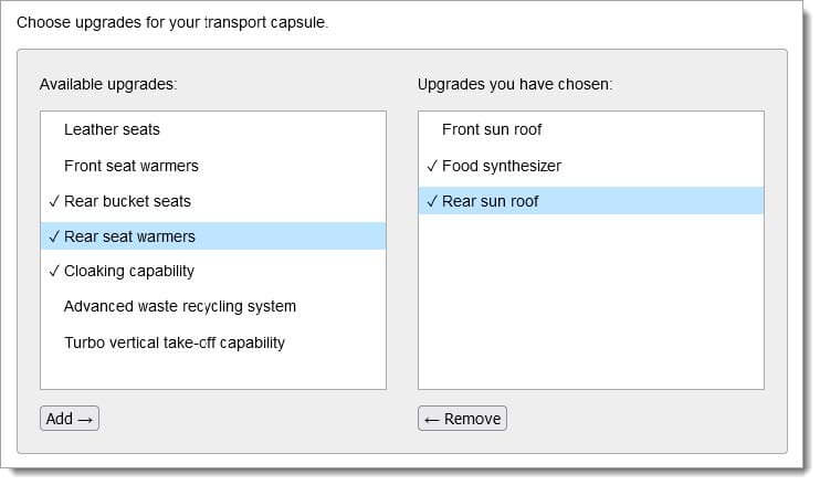
Permalink "Practical tip: alternatives to the selection list with multiple selection"The possibility for multiple selection is not generally identifiable, as the multiple selection lists do not differ visually from the selection list. Moreover, multiple selection (in particular the selection of non-neighboring values) with the keyboard and the pointing device is difficult. In addition, the selected elements are often imperceptible with the screen reader. It is therefore recommended to replace multiple selection lists with other elements, to implement them in a simple form, or to describe their function and operation. Alternatives to multiple selection lists include:
- group of check boxes, or
- two selection list or multiple selection lists side by side, with the first list showing the available values and the second list showing the selected values. Buttons can be used to move values from the first list to the second list or to remove them (see screenshot).
A simple use of multiple selection lists can be implemented as follows:
- with the pointing device: Click on a value changes the status (selected or unselected)
- with the keyboard: Enabling of a value with the SPACE bar changes the status (selected or unselected).
Practical tip: simplified use of multiple selection
Permalink "Practical tip: simplified use of multiple selection"A simple use of multiple selection lists can be implemented as follows:
- with the pointing device: Click on a value changes the status (selected or unselected)
- with the keyboard: Enabling of a value with the SPACE bar changes the status (selected or unselected).
Practical tip: multiple selection list in Web applications
Permalink "Practical tip: multiple selection list in Web applications"Screen reader output
Permalink "Screen reader output"- JAWS:
- JAWS:
- Without selected list entry: [label] ExtendedSelect ListBox [instruction on operation with the arrow keys]
- With selected list entries: [label] **ExtendedSelect ListBox ** [focused list entry] [position] of [amount] [instruction on operation with the arrow keys]
- JAWS:
- NVDA:
- Without selected list entry: [label] list
- With selected list entries: [label] list [focused list entry] [position and amount]
- Windows narrator:
- Without selected list entry: [label] selected supports multiple selection contains [amount] items
- With selected list entries: [label] list [focused list entry] [position and amount] selected.
Please note: In the form mode, the selected list entries are imperceptible with the screen reader. The possibility for multiple selection is partly imperceptible. The use of an alternative element is therefore recommended (see Practical tip: alternatives to the selection list with multiple selection).
HTML
Permalink "HTML"Please note: The use of the keyboard is also difficult for the following reasons:
- Modifier keys, which users may not be familiar with, are required for multiple selection. With old browsers, multiple selection with the keyboard is not possible and/or it is necessary for different modifier keys to be used.
- In the case of multiple selection, the selected list entries are visible, but the currently focused list entry is not.
The use of an alternative element is therefore recommended (see Practical tip: alternatives to the selection list with multiple selection).
The implementation instructions for the HTML selection list are described in the “selection list” section. Here, only the additional instructions are given, which result from the fact that it is a selection list with multiple selection.
- The multiple selection list should be implemented with the
multipleattribute. - The initially selected list entry is marked with the
selectedattribute.
ARIA
Permalink "ARIA"The implementation instructions for the ARIA selection list are described in the “selection list” section. Here, only the additional instructions are given, which result from the fact that it is a selection list with multiple selection.
- The possibility for multiple selection is communicated with
aria-multiselectable=true. - The selected list entries are marked with
aria-selected=trueoraria-checked=true, all others witharia-selected=falseand/oraria-checked=false. - When navigating through the list entries in the selection list, these must either actually receive the focus, or reference is made to the focused list entry with
aria-activedescendant. The first variant is to be preferred. In both cases, care must be taken to ensure that the navigation through the multiple selection list does not automatically change the status of the list entries (selected or unselected)
Information about this article
You are welcome to send feedback by email about our handout!