Synonyms: User settings, customization, individual adaptation, adaptation to preferences, user preferences
See also: Colors and contrasts,, font, Focus indicator
Presentation
Permalink "Presentation"| No. | Property | Description | Classification | Reference |
|---|---|---|---|---|
| 155 | User preferences | The application must comply with the platform settings for measurement units, color, contrast, font style, font size, and focus pointer (mouse and text cursors, and focus indicator), unless overridden by users. Note 1: This does not apply to applications that are isolated from the platform and do not have access to the platform settings. Note 2: The application is also able to offer an alternative mode that does not apply the platform settings. Note 3: In the case of Web applications, the browser is the platform whose settings are to be applied. The browser is also able to accept settings from the operating system. | Must | EN 301 549: 11.7 |
| 156 | User preferences | If users change the platform settings for color, contrast, font style and font size, all content must be displayed correctly, and all features must be functional. Note 1: This means, for example, that after adjusting the font style or font size, the text content is displayed in full and without overlay. Note 2: If users have adjusted the colors or contrasts and the selected colors have been applied correctly by the application, the application is not responsible for complying with the contrast ratios (see Practical tip: contrast adjustment). | Must | EN 301 549: 11.7, 9.1.4.3, 11.1.4.3, 9.1.4.4, 11.1.4.4.1, 9.1.4.5, 11.1.4.5.1, 9.1.4.10, 11.1.4.10, 9.1.4.11, 11.1.4.11, 9.1.4.12, 11.1.4.12 |
| 157 | User preferences | It should be possible to make the following settings for text blocks:
| Should | WCAG 2.1: 1.4.8 (AAA) |
Practical tip: contrast adjustment for desktop applications
Permalink "Practical tip: contrast adjustment for desktop applications"In Windows, users can customize the presentation of the colors to suit their needs (Settings > Ease of Access > High contrast). Unlike other operating systems which only allow certain color changes (such as coloring, darkening or inverting the colors), Windows allows you to freely choose the foreground and background colors. In addition to this, it is possible to define individual colors for different element types and/or their status.
With Windows Contrast Adjustment, it is possible to adjust the colors for the following elements and states:
- Text (
SystemColorWindowTextColor) - Background (
SystemColorWindowColor) - Links (
SystemColorHotlightColor) - Highlighted text, selected element (
SystemColorHighlightTextColor) - Background of highlighted text or selected elements (
SystemColorHighlightColor) - Text of control elements (außer Links) (
SystemColorButtonTextColor) - Background of control elements (außer Links) (
SystemColorButtonFaceColor) - Disabled elements (
SystemColorGrayTextColor)
For Windows Contrast Adjustment to work correctly in an application, the following must be considered:
- The foreground and background colors must be defined in such a way that they can be overwritten with Windows Contrast Adjustment. This does not apply to graphics or videos.
- Content whose foreground color is adjusted may not have a background whose color is not adjusted. This applies, for example, to text whose background is a graphic that is not adjusted. This does not apply if the font has a contour in the background color, as the visibility is then ensured through the contour.
- Graphics with a transparent background must be avoided. This does not apply if either the foreground color of the graphic can be adjusted (by using SystemColorWindowTextColor, for example), or if the content of graphic has a contour.
- For the element types Text, Links and Form Elements as well as the states Disabled, Highlighted and Selected, the corresponding information about the role and status must be communicated to the Accessibility API. Alternatively, the appropriate colors for the elements and states must be used (for example, SystemColorGrayTextColor for disabled elements).
- Images of text must be avoided. Alternatively, the foreground and background colors of the images of text must be adjustable according to the Windows settings.
- Only color-coded contents must be avoided, regardless of the contrast between the colors.
- Page areas, tooltips, pop-ups and control elements that are shown in different background colors should be given a frame so that they also stand out from the background with Windows Contrast Adjustment.
- If the application does not support Windows Contrast Adjustment, the application must offer its own possibility for adjusting the colors with the equivalent functionality. This option must be described in the application and the Help option.
- If your application only supports Windows Contrast Adjustment for a specific configuration (for example, selecting a specific color scheme), it must be described in the application and the Help option.
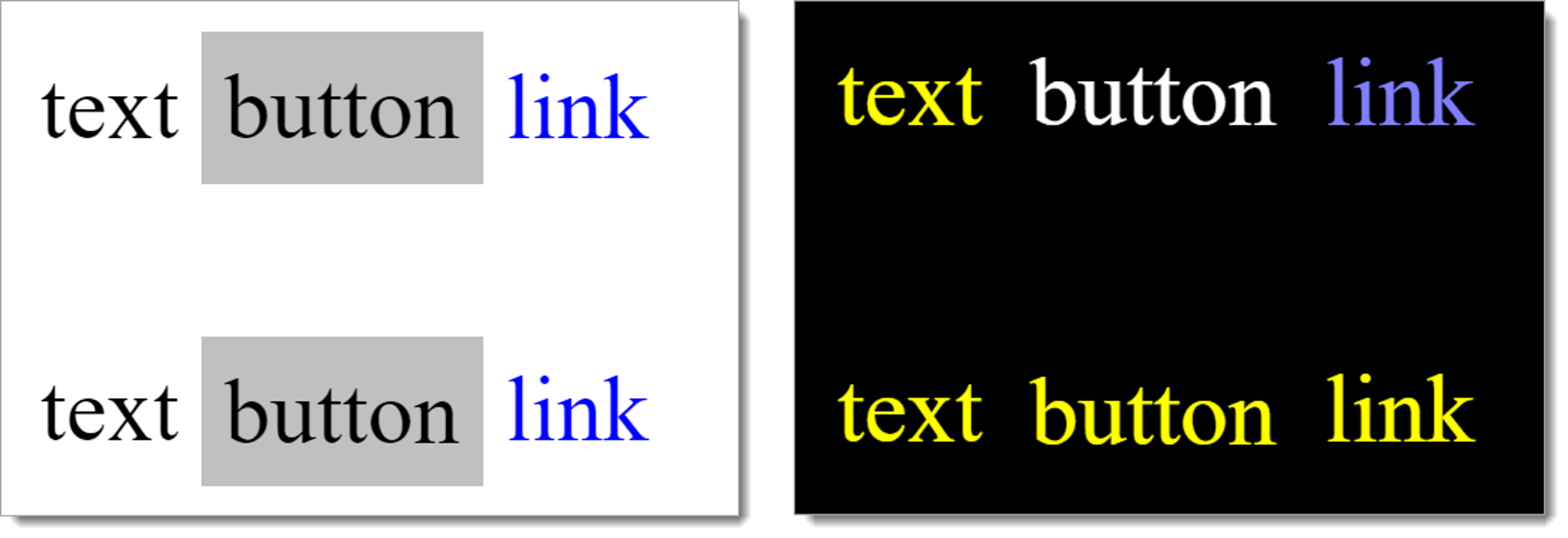
Example 1: The two following figures show two lines with two pieces of text, two buttons and two links – one in the default presentation (figure on the left), and one with the use of Windows Contrast Adjustment (Contrast no. 1).
In the figure on the left, the text, button and link are visible in both lines based on the colors used:
- Text: black font on white background,
- Button: black font on gray background,
- Link: blue font on white background.
In the figure on the right, the text, button and link can only be identified correctly in the top line, as they have been programmatically marked as text, button and link:
- Text: yellow font on black background,
- Button: white font on black background,
- Link: blue font on black background.
In the figure on the right, the text, button, and link in the bottom row are indistinguishable, as they are all displayed in the text color (yellow font on a black background). The reason for the incorrect presentation is that the button and link were not programmatically displayed as such.
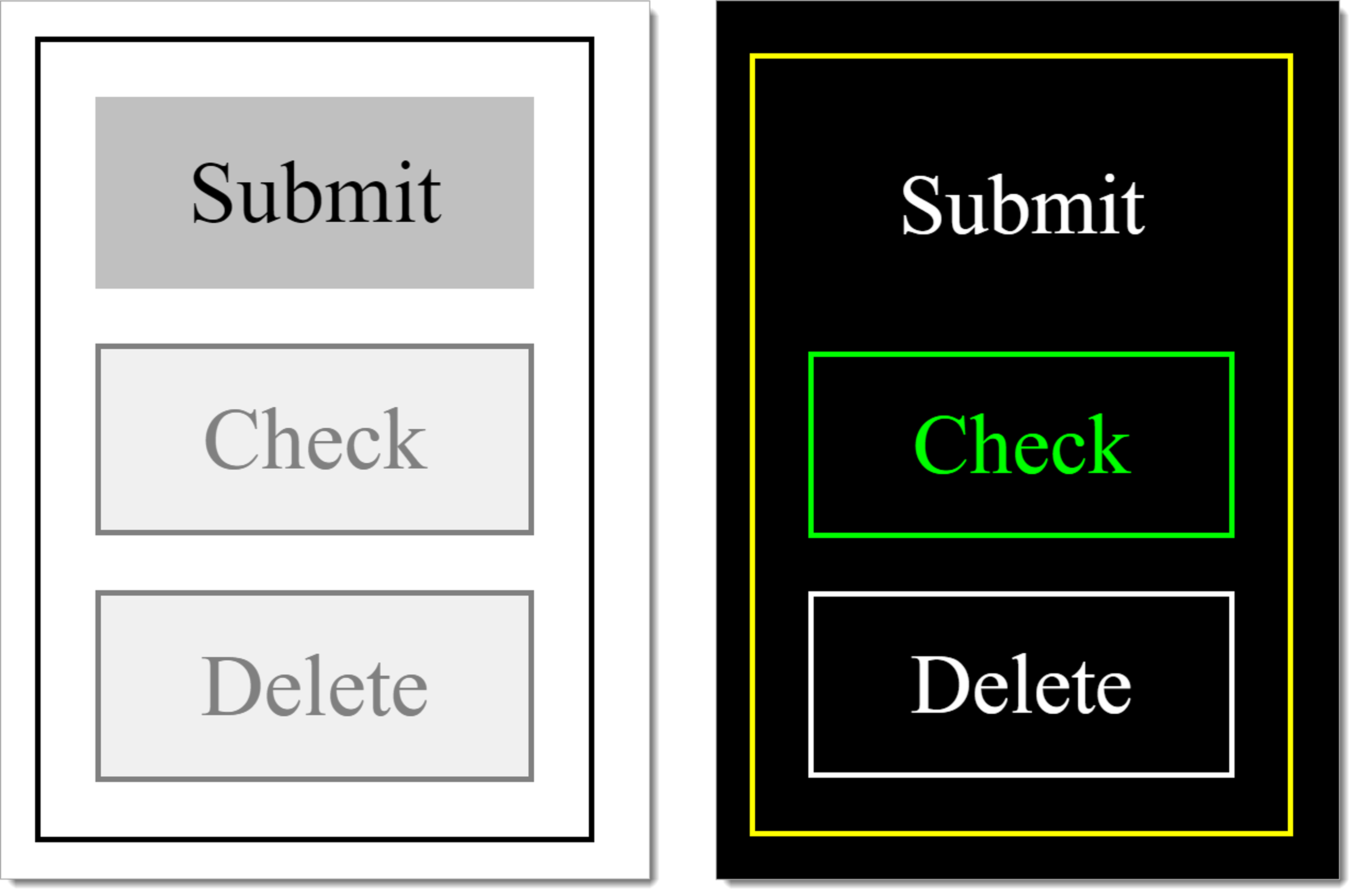
Example 2: In the two following figures, one operable button (“Send”) and two disabled buttons (“Check” and “Delete”) are shown – one in the default presentation (the figure on the left), and one with the use of Windows Contrast Adjustment (Contrast no. 1).
- In the standard presentation, the two disabled buttons can be seen to be disabled due to the grayed-out colors.
- When using Windows Contrast Adjustment, only the “Check” button is correctly visually identifiable as disabled (green font on black background).
- The “Delete” button is not identifiable as disabled when using Windows Contrast Adjustment, but is shown as operable (white font on a black background). The reason for the incorrect presentation is that it was not programmatically marked as disabled.
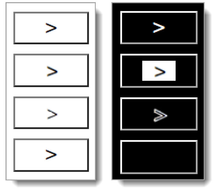
Example 3: In the two following figures, four buttons are shown that are labeled with a black icon – one in the default presentation (figure on the left), and one with the use of Windows Contrast Adjustment (Contrast no. 1).
- In the default presentation all four buttons look the same (black icon on white background).
- When using Windows Contrast Adjustment, the four buttons look different because of the different technology used for the presentation of the icon:
- The first icon is displayed correctly because a font icon was used in which the foreground and background colors are adjusted (white icon on black background). This variant is to be preferred.
- The second icon is not adjusted (black icon on white background) because it is a graphic without a transparent background. This variant is acceptable.
- The third icon is not so easy to identify because it is a graphic with a transparent background (black icon on a black background). The icon is perceptible due to its white outline, however. This variant is acceptable.
- The fourth icon cannot be seen because it is a graphic with a transparent background (black icon on a black background). This variant should not be used.
Information about this article
You are welcome to send feedback by email about our handout!