Synonyms: Option fields, selection button, radio button group
See also: Selection lists, drop-down lists, check boxes
Radio buttons are used for selecting mutually exclusive options (see DIN EN ISO 9241-161: 8.33).
A radio button consists of an indicator which indicates whether the option is selected or not selected. A radio button group consists of several radio buttons with their labels and a group label. Radio buttons must be grouped.
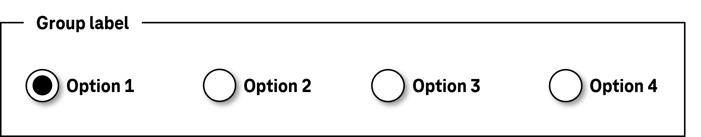
Presentation
Permalink "Presentation"| No. | Property | Description | Classification | Reference |
|---|---|---|---|---|
| 782 | Contrast | The border of the radio button must have a contrast ratio of at least 3:1 with respect to the background. | Must | EN 301 549: 9.1.4.11, 11.1.4.11 |
| 783 | Contrast | The symbol which relays the status (circle) must have a contrast ratio of at least 3:1 with respect to the neighboring color. | Must | EN 301 549: 9.1.4.11, 11.1.4.11 |
| 784 | Label | The radio buttons must have a visible label (see Label). | Must | EN 301 549 9.3.3.2, 11.3.3.2 |
| 785 | Label | The label of the radio button should be located to the right of the radio button. | Should | DIN EN ISO 9241-125: 5.1.15 |
| 786 | Label | The label of the group should be unambiguous and understandable within the context (see Group). | Should | DIN EN ISO 9241-171: 8.1.2, 8.1.3 |
| 787 | Focus visibility | If the radio button receives the keyboard focus, the focus indicator must be visible (see Focus indicator). | Must | EN 301 549: 9.2.4.7, 11.2.4.7 |
Operation
Permalink "Operation"| No. | Property | Description | Classification | Reference |
|---|---|---|---|---|
| 788 | Use of the keyboard | It must be possible to access, operate and exit the radio buttons with the keyboard (see Use of the keyboard table, below). | Must | EN 301 549: 9.2.1.1, 11.2.1.1, 9.2.1.2, 11.2.1.25 |
| 789 | Updates | When focusing and operating the radio buttons, no unexpected change of context may occur. Note: This means that no loss of focus must occur during or after the operation of the radio buttons. | Must | EN 301 549: 9.3.2.1, 11.3.2.1, 9.3.2.2, 11.3.2.2 |
| 790 | Click area | The click area of the radio buttons should be at least 24 x 24 px (see Use of the pointing device). Note: It should be possible to operate the radio buttons by both clicking on the radio button and clicking on the respective label (see Use of the pointing device). | Should | WCAG 2.2 |
Use of the keyboard: radio buttons
Permalink "Use of the keyboard: radio buttons"| Action | Key | Classification |
|---|---|---|
| Focusing of the radio button group | TAB Note: The selected radio button receives the focus. If no radio button is selected, the first radio button receives the focus. | Required |
| Exiting the radio button group | TAB | Required |
| Selecting a radio button | SPACE | Required |
| Operation of the radio button group (selecting a radio button) | UP/DOWN RIGHT/LEFT ARROW Note: In this context, the navigation must be limited to the radio button group. | Required |
| Navigation within the radio button group (without changing the selection) | CTRL + UP/DOWN RIGHT/LEFT ARROW | Recommended |
Use of the pointing device: radio buttons
Permalink "Use of the pointing device: radio buttons"| Action | Key | Classification |
|---|---|---|
| Selecting a radio button | Left click | Required |
Programming/interfaces
Permalink "Programming/interfaces"| No. | Property | Description | Classification | Reference |
|---|---|---|---|---|
| 791 | Role | The radio button role must be communicated to the Accessibility API (see Accessibility API). | Must | EN 301 549: 9.4.1.2, 11.4.1.2, 11.5.2.5 |
| 792 | Value | The value of the radio button (selected, not selected) must be communicated to the Accessibility API (see Accessibility API). | Must | EN 301 549: 9.4.1.2, 11.4.1.2, 11.5.2.7 |
| 793 | Desktop: Element hierarchy | The parent / child relationships of the elements within the radio button group must be communicated to the Accessibility API. | Must | EN 301 549: 11.5.2.9 |
| 794 | Status | The status of the radio button must be communicated to the Accessibility API (see Element status). | Must | EN 301 549: 9.4.1.2, 11.4.1.2, 11.5.2.5 |
| 795 | Name | The radio buttons must have a concise and expressive Accessible Name. | Must | EN 301 549: 9.2.4.6, 11.2.4.6, 9.4.1.2, 11.4.1.2, 11.5.2.5, 11.5.2.8 |
| 796 | Name | If the radio buttons have a description, it must be communicated as an Accessible Description. | Must | EN 301 549: 9.4.1.2, 11.4.1.2, 11.5.2.5 |
| 797 | Name | If the radio button group has a label, this must be communicated to the Accessibility API as the Accessible Name of the group (see Group). | Must | EN 301 549: 9.1.3.1, 11.1.3.1 |
| 798 | Operation | It must be possible to access, operate and exit the radio button group with assistive technology (see Accessibility API). | Must | EN 301 549: 9.4.1.2, 11.4.1.2, 11.5.2.12, 11.5.2.17 |
| 799 | Update | Updates concerning the Accessible Name, value or status of the radio buttons and radio button group must be communicated to the Accessibility API (see Accessibility API). | Must | EN 301 549: EN 301 549: 9.4.1.2, 11.4.1.2, 11.5.2.15 |
| 800 | Desktop: Position | The size and position of the radio button must be communicated to the Accessibility API (see Focus indicator). | Must | EN 301 549: 11.5.2.5, 11.5.2.13 |
Practical tip: radio buttons in Web applications
Permalink "Practical tip: radio buttons in Web applications"Screen reader output
Permalink "Screen reader output"- JAWS: [group label] [label] radio button checked | not checked [position and amount] [instruction on operation with the arrow keys]
- NVDA: [group label] grouping [label] radio button checked | not checked [position and amount]
- Windows Narrator: [label] radio button selected | not selected [position and amount]
HTML
Permalink "HTML"The radio button group should be marked with the HTML element <fieldset> and labeled with the <legend> element.
The radio buttons should be implemented with the HTML element <input type=radio> . Radio buttons that belong to the same group must have the same value in the name attribute and may not be located in different <form> elements.
The initially selected status is set with the checked attribute. An initial radio button should be selected in each radio button group, as keyboard users automatically make a selection when navigating through the radio buttons which cannot be undone. The radio button should be initially selected which is either most likely to be selected or which contains a neutral option (e.g. “not applicable”).
The label should be linked to the respective radio button using the <label for=ID> element in order to expand the click area of the radio button by its label.
A radio button and the radio button group can be marked as disabled (disabled), but not as read-only (readonly).
If a radio button is marked as a required field with required, this applies to the entire radio button group, i.e. if any radio button was selected, this is sufficient for submitting the form. To ensure that the required field label is perceptible with the assistive technology on all radio buttons, using the required attribute on all radio buttons, or alternatively, adding a required text field reference (e.g. an asterisk) in the group label (<legend>) is recommended. If a radio button is initially preselected with the checked attribute, no required field label is required.
Error messages should not be associated with each individual radio button, but with the group.
Further information: 4.10.5.1.16 Radio Button state (type=radio) - HTML Standard (whatwg.org)
ARIA
Permalink "ARIA"If the radio button group is not implemented with the HTML element, it is also necessary to take account of the following:
- The radio buttons are located in an element which is marked with
role=radiogroup. - The radio button group can be labeled with
aria-labelledbyoraria-label. - The role of the radio buttons is communicated with
role=radio. - The status is communicated with
aria-checked=true|falseand must be updated during operation. - The labeling of the radio buttons can take place using text content or
aria-labelledby. - The radio button group can be marked as read-only with
aria-readonly. The radio buttons cannot be marked as read-only. - In contrast to HTML,
aria-requiredis not used to mark the radio buttons as a required input, but the radio button group (role=radiogroup). - The presentation of the radio buttons should be verified in Windows High Contrast mode.
- The visible radio buttons and the programmatically focused elements should have the same position and size.
Further information: radio role - Accessible Rich Internet Applications (WAI-ARIA) 1.2 (w3.org) (External Link), radiogroup role - Accessible Rich Internet Applications (WAI-ARIA) 1.2 (w3.org) (External Link), Radio Group Pattern | APG | WAI | W3C, Checkbox Pattern | APG | WAI | W3C
Information about this article
You are welcome to send feedback by email about our handout!