Synonyms: Tab, tab panel
Tab groups are used to group and alternately display page areas (see DIN EN ISO 9241-161: 8.43).
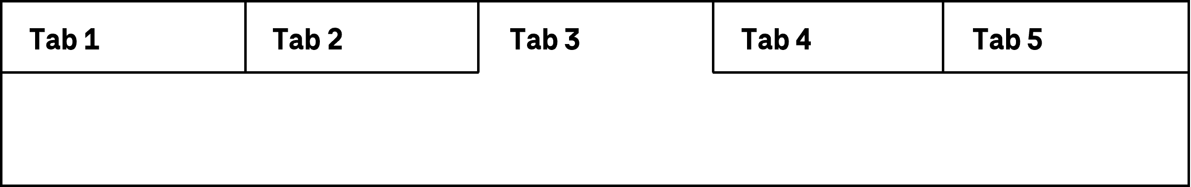
A tab group consists of several tabs, the contents of which are displayed on an alternate basis. Each tab has an tab panel with a label which is displayed all the time. The individual tabs are selected using the tab panels. The tab panels are usually arranged horizontally above the tabs. Tab panels can contain interactive elements, such as buttons for removing the tab panel and the corresponding tab.
Presentation
Permalink "Presentation"| No. | Property | Description | Classification | Reference |
|---|---|---|---|---|
| 560 | Contrast | The label of the tab panel must have a contrast ratio of at least 4.5:1 with respect to the background. | Must | EN 301 549: 9.1.4.3, 11.1.4.3 |
| 561 | Contrast | The marking of the selected tab panel must have a contrast ratio of at least 3:1 with respect to the background and/or with respect to the presentation of the unselected tab panel. | Must | EN 301 549: 9.1.4.1, 11.1.4.1, 9.1.4.11, 11.1.4.11 |
| 562 | Contrast | If the tab panels and the tabs are only identifiable as such on the basis of their color design, these colors must have a contrast ratio of at least 3:1 with respect to the neighboring colors. Note 1: A tab might be recognizable as an interactive element on the basis of its border or its background color, for example. Note 2: The requirement does not apply if the tab or the tab panel are clearly identifiable as such, because of their position, for example. | Must | EN 301 549: 9.1.4.11, 11.1.4.11 |
| 563 | Label | Each tab panel must have a visible label (see Label). | Must | EN 301 549 9.3.3.2, 11.3.3.2 |
| 564 | Focus visibility | If a tab panel receives the keyboard focus, the focus indicator must be visible (see Focus indicator). | Must | EN 301 549: 9.2.4.7, 11.2.4.7 |
| 565 | Resizing | All tab panels must be perceptible and operable with a font size adjustment of up to 400% (and a resulting display width of 320 px) (see Zoom). Note: The tab panels can, for example,
| Must | EN 301 549: 9.1.4.10, 11.1.4.10 |
Operation
Permalink "Operation"| No. | Property | Description | Classification | Reference |
|---|---|---|---|---|
| 566 | Use of the keyboard | It must be possible to access, operate and exit the tab panels with the keyboard (see Use of the keyboard table, below). | Must | EN 301 549: 9.2.1.1, 11.2.1.1, 9.2.1.2, 11.2.1.2 |
| 567 | Use of the keyboard | If the tab panels contain other interactive elements, it must be possible to use these with the keyboard. | Must | EN 301 549: 9.2.1.2, 11.2.1.2 |
| 568 | Use of the keyboard | The hidden tab fields and their contents must not receive keyboard focus. | Must | EN 301 549: 9.1.3.1, 11.1.3.1, 9.2.4.3, 11.2.4.3 |
| 569 | Updates | When the tab panels are focused and navigated through, no change of context may occur. Note: This means that when focusing on the tab panel, the focus may not be automatically placed on the tab. | Must | EN 301 549: 9.3.2.1, 11.3.2.1 |
| 570 | Click area | The click area of the tab panels should be at least 24 x 24 px (see Use of the pointing device). | Should | WCAG 2.2 |
| 571 | Click area | If the tab panels contain further interactive elements, their click area should total at least 24 x 24 px (see Use of the pointing device). | Should | WCAG 2.2 |
Use of the keyboard: tab group
Permalink "Use of the keyboard: tab group"| Action | Key | Classification |
|---|---|---|
| Focusing of the selected tab panel | TAB | Required |
| Exiting the tab panel and navigating to the first element of the selected tab | TAB | Required |
| Navigating within the list of tab panels | Desktop:
Web: UP/DOWN/RIGHT/LEFT ARROW | Required |
| Quick navigation to the first and/or last tab panel | POS1, END | Recommended |
| Switch between tabs (if the focus is in a tab) | CTRL+TAB | Recommended |
| Showing of the selected tab | ENTER, SPACE, or automatically when navigating through the list of tab panels | Required |
| Operation of interactive elements within the tab panel | The interactive elements within tab panels do not receive keyboard focus separately. The operation takes place
| Required |
Use of the pointing device: tab group
Permalink "Use of the pointing device: tab group"| Action | Key | Classification |
|---|---|---|
| Showing a tab | Left click on the corresponding tab panel | Required |
| Enabling of interactive elements within the tab panels | Left click on the element | Required |
Programming/interfaces
Permalink "Programming/interfaces"| No. | Property | Description | Classification | Reference |
|---|---|---|---|---|
| 572 | Role | The tab panel and tab role must be communicated to the Accessibility API (see Accessibility API). | Must | EN 301 549: 9.4.1.2, 11.4.1.2, 11.5.2.5 |
| 573 | Role | If the tab panels contain further interactive elements, a note regarding their operability must be communicated to the Accessibility API (e.g. with the context menu or a keyboard shortcut). | Must | EN 301 549: 9.4.1.2, 11.4.1.2, 11.5.2.5 |
| 575 | Desktop: Element hierarchy | The parent / child relationships of the tab panels within the tab group must be communicated to the Accessibility API. | Must | EN 301 549: 11.5.2.9 |
| 576 | Status | The status of the tab panels and tabs must be communicated to the Accessibility API (see Element status). Note: This also applies to the tab panel status “selected” or “unselected” insofar as the corresponding tab is not automatically shown when navigating to a tab panel. | Must | EN 301 549: 9.4.1.2, 11.4.1.2, 11.5.2.5 |
| 577 | Name | The tab panels must have a concise and expressive Accessible Name. Note 1: It is recommended that the tab is given the same Accessible Name as the corresponding tab panel. Note 2: If the tab panels and tabs have a parent label, this must also be communicated to the Accessibility API. | Must | EN 301 549: 9.2.4.6, 11.2.4.6, 9.4.1.2, 11.4.1.2, 11.5.2.5 |
| 578 | Name | If the tab panel has a description, it must be communicated as an Accessible Description. | Must | EN 301 549: 9.4.1.2, 11.4.1.2, 11.5.2.5 |
| 579 | Operation | It must be possible to access, operate and exit the tab panels with assistive technology (see Accessibility API). | Must | EN 301 549: 9.4.1.2, 11.4.1.2, 11.5.2.12, 11.5.2.17 |
| 580 | Operation | If the tab panels contain other interactive elements, it must be possible to use these with assistive technology (see Accessibility API). | Must | EN 301 549: 9.4.1.2, 11.4.1.2, 11.5.2.12, 11.5.2.17 |
| 581 | Update | Updates concerning the Accessible Name or status of the tab panels must be communicated to the Accessibility API (see Accessibility API). | Must | EN 301 549: 9.4.1.2, 11.4.1.2, 11.5.2.15 |
| 582 | Desktop: Position | The size and position of the tab panels and tabs must be communicated to the Accessibility API (see Accessibility API). | Must | EN 301 549: 11.5.2.5, 11.5.2.13 |
Practical tip: tab groups in Web applications
Permalink "Practical tip: tab groups in Web applications"Screen reader output for tab panel
Permalink "Screen reader output for tab panel"- JAWS: [label of the tab bar] group [label of the tab panel] tab [ | selected] [position] of [amount]
- NVDA: [label of the tab bar] tab control [label of the tab panel] tab [ | selected] [position] of [amount]
- Windows Narrator: [label of the tab bar] tab [label of the tab panel] tab item [position] of [amount] [ | selected]
Screen reader output for tabs
Permalink "Screen reader output for tabs"- JAWS: tab panel start [label]… tab panel end
- NVDA: -
- Windows Narrator: [label] tab panel … end [label] tab panel
Note: With NVDA, the start and end of the tab is not perceptible. The tabs or content after this should be labeled as regions, so that which specific content is located inside and outside the tabs is perceptible with the screen reader.
HTML
Permalink "HTML"There is no element for tab groups in HTML. Instead, the following can be used:
- Allocation of the information to different pages that are linked with each other,
- Accordion,
- Use of the corresponding ARIA roles.
ARIA
Permalink "ARIA"With tab groups, the following should be taken into account:
- The tab panel bar is marked with
role=tablist, while the individual tab panels that are located inside the bar as child elements are marked withrole=tab. - The tab panel bar may not contain any elements apart from the tab panels.
- If the tab panels contain other control elements besides their labeling, it should be noted that these are imperceptible and not operable with the assistive technology. These elements should not be able to receive the keyboard focus. An alternative form of operation should be implemented and documented instead. If the tab panels contain a button for removing a tab, it is possible for the deletion to be enabled with the DELETE key.
- The tab panels are marked with
role=tabpanel. The tabs are located in the source code immediately after the area which is marked withrole=tablist. Due to this and the preceding reason, a tab group may not be used for accordions. - The active tab panel, the tab of which is visible and which receives the focus with TAB, is marked with
aria-selected=true. All of the other tab panels are marked witharia-selected=false. Reference can be made to the ID of the tab from the tab panel usingaria-controls. - The labeling of the tab panels should take place using text content. The bar of the tab panels and tabs can be labeled with
aria-labeloraria-labelledby. - A non-standard vertical orientation of the tab bar can be specified with
aria-orientation=vertical. Frequently, the orientation is not output by the assistive technology, so that with a vertically oriented tab bar, operation with all arrow keys should be possible. - The tab bar should also be visually recognizable as such, so that sighted keyboard users are able to recognize the operation with the arrow keys.
- The tab group should contain at least two tabs.
- The tab panels can be marked as disabled with
aria-disabled. It is recommended that disabled tab panels are left in the keyboard accessibility with the arrow keys. - The selected tab (
role=tabpanel) can be marked astabindex=0so that it receives the focus after the active tab panel, even if a specific tab is not a control element. - The presentation of the tab group should be verified in Windows High Contrast mode. In this respect, the tab panels and tabs should have a border and the visual indicator for the active tab panel should not just be conveyed with color.
- The visible tab panels and the programmatically focused elements should have the same position and size.
Further information: tab role - Accessible Rich Internet Applications (WAI-ARIA) 1.2 (w3.org) (External Link), tablist role - Accessible Rich Internet Applications (WAI-ARIA) 1.2 (w3.org) (External Link), tabpanel role - Accessible Rich Internet Applications (WAI-ARIA) 1.2 (w3.org) (External Link), Tabs Pattern | APG | WAI | W3C
Information about this article
You are welcome to send feedback by email about our handout!