Synonyme: Letters, characters, numbers, font
See also: Text, contrast, label, heading
The font is used for the presentation of text information.
Presentation
Permalink "Presentation"| No. | Property | Description | Classification | Reference |
|---|---|---|---|---|
| 169 | User preferences | The application must accept the font style, size, and color settings from the platform software or provide a mode in which the settings are applied. Note 1: If the settings of the platform software are not applied automatically, the corresponding mode must be explained in the information on accessibility. Note 2: The application can also offer a mode in which users can choose their preferences for the font style, size, color and any other possible font attributes directly in the application. Note 3: The requirements concerning the contrasts only apply as long as the users have not adjusted the colors to their requirements. | Must | EN 301 549: 11.7 und 12.1.1 |
| 170 | User preferences | It should be possible to make the following settings for text blocks:
| Should | WCAG 2.1: 1.4.8 (AAA) |
| 171 | Contrast | All text content must have a contrast ratio of at least 4.5:1 with respect to the background. Note: With large font (from 24 px and/or from 18.7 px in the case of bold font), a contrast ratio of at least 3:1 is sufficient. | Must | EN 301 549: 9.1.4.3, 11.1.4.3 |
| 172 | Color | If information is communicated using different font colors, the contrast ratio between the colors must be at least 3:1 (see Practical tip: color coding). Note: This applies if the colors themselves have no meaning, but only the color difference does. | Must | EN 301 549: 9.1.4.1, 11.1.4.1 |
| 173 | Color | If information is conveyed using a particular font color, this information must also be conveyed in another way (see Practical tip: color coding). Note: This applies when the color itself has a meaning, such as “green” for correct and “red” for incorrect, or “black” for a positive number and “red” for a negative number. | Must | EN 301 549: 9.1.4.1, 11.1.4.1 |
| 174 | Spacing | If users are able to adjust the spacing between the lines, paragraphs, letters and words, then in this context, no content or functions may be lost. Note: This applies to the following spacing:
| Must | EN 301 549: 9.1.4.12, 11.1.4.12 |
| 175 | Spacing | The line spacing of continuous text should be 1.5 times the font size. | Should | WCAG 2.1: 1.4.8 (AAA) |
| 176 | Abstand | The paragraph spacing for continuous text should be 1.5 times the size of the line spacing, i.e. 2.25 times the font size. | Should | WCAG 2.1: 1.4.8 (AAA) |
| 177 | Reference to sensory properties | Information which serves the understanding or the operation of the application may not make exclusive reference to the written formatting of the described elements. | Must | EN 301 549: 9.1.3.3, 11.1.3.3 |
| 178 | Line length | A line of text in continuous text should not exceed 80 characters. | Should | WCAG 2.1: 1.4.8 (AAA) |
| 179 | Orientation | Justify should be avoided in continuous text. Note: Justify is the orientation of the text to the left and right margins. | Should | WCAG 2.1: 1.4.8 (AAA) |
Programming/interfaces
Permalink "Programming/interfaces"| No. | Property | Description | Classification | Reference |
|---|---|---|---|---|
| 180 | Character set | To encode the font characters, a character set must be used whose characters can be output correctly by the assistive technology for the text-to-speech output. Note: Currently, only letters that occur in the application language should be used, as other letters are not usually supported. | Must | EN 301 549: 9.1.3.1, 11.1.3.1 |
| 181 | Special characters | Special characters may only be used if they are output correctly by the assistive technology. Note: This applies to font icons and ligations, for example. Alternatively, these special characters must be marked so that they are ignored by the assistive technology. The information conveyed by the characters must then be communicated in text form or programmatically (see Practical tip: special characters). | Must | EN 301 549: 9.1.1.1, 11.1.1.1, 9.1.3.1, 11.1.3.1 |
| 182 | Hyphenation | The hyphenation requires the use of a character which is not output by the assistive technology. Otherwise, the hyphenation must be dispensed with. Note: This does not apply if the hyphenation has to be perceptible, e.g. in a dictionary in which the possible hyphenations are specified. | Must | EN 301 549: 9.1.3.2, 11.1.3.2 |
| 183 | Spaces, punctuation marks | The word boundary must be perceptible, with the use of a space, hyphen or punctuation mark, for example. | Must | EN 301 549: 9.1.3.2, 11.1.3.2 |
| 184 | Spaces | A word may not contain any spaces or line breaks. | Must | EN 301 549: 9.1.3.2, 11.1.3.2 |
| 185 | Formatting | If font formatting is used to communicate information, this information must also be communicated to the Accessibility API in text form or programmatically. Note: For example, an important piece of text which is highlighted in bold can also be preceded with “Note: ” or given a separate heading. | Must | EN 301 549: 9.1.3.1, 11.1.3.1, 9.1.4.1, 11.1.4.1, 11.5.2.10 |
Practical tip: special characters
Permalink "Practical tip: special characters"When using special characters, different use cases must be distinguished between in terms of the communication of the characters to the Accessibility API:
Decorative special characters
Permalink "Decorative special characters"Purely decorative special characters are marked so that they are not communicated to the Accessibility API. The same rules apply to them as to layout graphics.
Examples:
- Button with the label “Next »”: The two forward arrows are purely decorative. The button should have the Accessible Name “Next”.
- Form field label “- - Location - -”: The dashes are purely decorative. The form field should have the Accessible Name “Location”.
Non-purpose-related special characters that contain content
Permalink "Non-purpose-related special characters that contain content"Special characters which are not used according to their meaning are to be accompanied by an expressive alternative text. The same rules apply to them as to graphics.
Examples:
- Button with the label »: The two forward arrows visually convey the information “Next”. The button should have the Accessible Name “Next”.
- Button with the label x: The multiplication symbol visually conveys the information “Close”. The button should have the Accessible Name “Close” (possibly with an indication of what is being closed, e.g. “Close window”).
Note: If used as a required field label, the asterisk (“*”) is not considered to be non-purpose-related.
Purpose-related special characters that contain content
Permalink "Purpose-related special characters that contain content"Special characters which are used according to their meaning can be used, provided the character is output correctly using the assistive technology. Otherwise, it should be accompanied by expressive alternative text.
Examples:
- Mathematical formula “3+5 > 5-3”: The two arithmetic operators as well as the larger character are output correctly by the assistive technology and can therefore be used.
- Text with the ordinal characters “ª” and “º”: The assistive technology does not output the two characters at all and/or does not do so correctly, and therefore the two characters require an alternative text.
- The word “guest” with a ligation of s and t. Most screen readers do not know the ligation, and instead of “guest”, only state “gu” and a space.

Special-purpose characters should be used sparingly. It is recommended to use a character which is output in concise form by the assistive technology.
Examples:
- A quote can be given different quotation marks. The “ character is output by the assistive technology, for example, as “typographical quotation mark, top” or “typographical quotation mark, right”. The " character, by contrast, is output as “inverted commas” or “quotation mark”, and is therefore to be preferred.
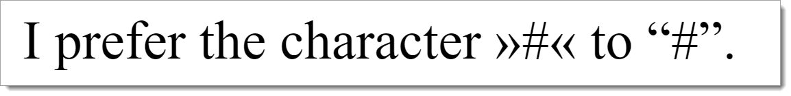
- The sentence “I prefer the character »#« to “#”” (see the following figure) is output by the screen reader, for example, as “I prefer the double bracket black hashtag with white X double bracket character to lower typographical quotation mark 3D narrow right-pointing arrow head inverted commas”.
Practical tip: font style and text formatting
Permalink "Practical tip: font style and text formatting"To make texts easy to read, a legible font style and text formatting should be chosen. In this respect, the following should be taken into account:
- The most readable fonts are those from the humanist sans serif category.
- Ligations should be avoided.
- The minimum font size for text blocks should be 22px.
- The minimum font size for additional text (e.g. footnotes) should be 17px.
- Narrow and wide fonts should be avoided.
- Small and large character spacing should be avoided.
- Thin and thick font styles should be avoided.
- The line spacing should be at least 120% of the font size.
- Upper and lower case lettering should be used according to the orthography rules. The exclusive use of upper or lower case lettering should be avoided.
- Upper and lower case lettering should be used according to the orthography rules. The exclusive use of upper or lower case lettering should be avoided.
- Small caps should be avoided.
- Highlighting should be used sparingly. A bold font style should be used for highlighting.
- Italic font styles or underlining should be avoided. Note: Links should be underlined.
- The text should be left-aligned. The use of justify should be avoided.
You can find more information at: https://www.leserlich.info (External Link).
Information about this article
You are welcome to send feedback by email about our handout!