See also: List, Hierarchical table
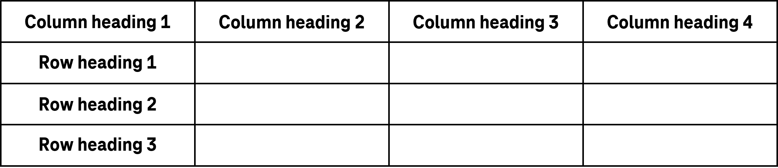
A table is used for the structured display of data (see DIN EN ISO 9241-161: 8.44).
A table consists of cells which are arranged in columns and rows. In most cases, the first row contains the column headings and the first column frequently contains the row headings. Tables can also contain various functionalities, e.g.
- sorting and filtering of the cell contents (e.g. through the column headings),
- scaling of the column and row size,
- showing or hiding of columns and/or changing the order of columns,
- showing and hiding of subordinate table rows (see: Hierarchical table),
- displaying sum total rows at the end of the table,
- in-line editing of cell contents (hereinafter referred to as editing mode),
- external editing of the cell content, e.g. using a toolbar above the table or a button within the table cells,
- Selection of table rows, e.g. by check box (multiple selection) or radio button (single selection),
- Selection of table cells, e.g. by mouse or keyboard selection,
- Browsing or scrolling through the records, if necessary, with pagination.
The requirements for the individual control elements within the table are described for the respective control element. Only the additional requirements for the whole of the element are described here.
Presentation
Permalink "Presentation"| No. | Property | Description | Classification | Reference |
|---|---|---|---|---|
| 390 | Contrast | The text content of the table cells must have a contrast ratio of at least 4.5:1 with respect to the background. | Must | EN 301 549: 9.1.4.3, 11.1.4.3 |
| 391 | Contrast | The graphic content of the table cells must have a contrast ratio of at least 3:1 with respect to the background. | Must | EN 301 549: 9.1.4.11, 11.1.4.11 |
| 392 | Contrast | Graphically communicated differences in status between the table cells shall have a contrast ratio of at least 3:1 compared with the background or the cells with a different status. Note: This applies to the status “selected”, “sorted” or “editable”, etc. | Should | EN 301 549: 9.1.4.1, 11.1.4.1, 9.1.4.11, 11.1.4.11 |
| 393 | Contrast | If the table cells are only identifiable as such on the basis of their color design, the color must have a contrast ratio of at least 3:1 with respect to the neighboring colors. Note 1: A cell might be recognizable as such on the basis of its border or its background color, for example. Note 2: The requirement does not apply if the cells are clearly identifiable as such, because of the spacing between them, for example. | Should | EN 301 549: 9.1.4.11, 11.1.4.11 |
| 394 | Label | The columns and rows must be labeled using column and row headings. Note: The whole of the table can also be labeled. | Must | EN 301 549: 11.5.2.6 |
| 395 | Value | Tables should not have rows or columns that only have empty cells. | Should | EN 301 549: 11.5.2.7 |
| 396 | Resizing | To make its contents perceptible without horizontal scrolling, no table cell may be wider than 320 px with 400% zoom. | Must | EN 301 549: 9.1.4.10, 11.1.4.10 |
| 397 | Focus visibility | If a table cell or an element in it receives the keyboard focus, the focus indicator must be visible (see Focus indicator). | Must | EN 301 549: 9.2.4.7, 11.2.4.7 |
Operation
Permalink "Operation"| No. | Property | Description | Classification | Reference |
|---|---|---|---|---|
| 398 | Use of the keyboard | It must be possible to access, operate and exit all control elements in the table with the keyboard (see Use of the keyboard table, below). Note 1: This also applies to functions that can be initialized from the column headings, such as the sorting of the cell contents or the adjusting of the column width through the section separators between the column headings. Note 2: Alternatively, the control elements outside the table can also be used to enable the table functionality. Note 3: If keyboard shortcuts are used to enable the use of the keyboard, they must be described in the application and the Help option. Note 4: The operation of the elements may not conflict with the navigation through the table. If the table can be navigated through with the use of the arrow keys, for example, the table may not contain any control elements that can be operated with the arrow keys unless it is possible to switch to the edit mode. | Must | EN 301 549: 9.2.1.1, 11.2.1.1, 9.2.1.2, 11.2.1.2 |
| 399 | Click area | The click area of the control elements in the table should total at least 24 x 24 px (see Use of the pointing device). | Should | WCAG 2.2 |
Use of the keyboard: table (in an application that supports the virtual cursor)
Permalink "Use of the keyboard: table (in an application that supports the virtual cursor)"With applications that support the virtual cursor, neither the tables nor their cells receive the keyboard focus. It should only be possible for interactive elements within the table cells to be accessed and operated with the keyboard. This only applies if the table is not marked with role=grid. Tables with role=grid are operated like tables in applications without the virtual cursor (see following section).
| Action | Key | Classification |
|---|---|---|
| Focusing interactive elements in the table | TAB | Required |
| Exiting interactive elements in the table | TAB | Required |
| Operating interactive elements in the table | Corresponding to the respective element | Required |
Use of the keyboard: table (in an application that does not support the virtual cursor)
Permalink "Use of the keyboard: table (in an application that does not support the virtual cursor)"With applications that do not support the virtual cursor and with tables that have been marked with role=grid, each table cell must be able to receive the focus so that its contents are perceptible with the assistive technology (e.g. screen reader). It is not sufficient if it is only possible to navigate through the table only one row at a time, for example.
For tables in applications that do not support the virtual cursor, a distinction is made between the navigation and edit mode:
- In the navigation mode, the arrow keys can be used to navigate between the cells.
- In edit mode, the interactive elements within a cell are operable. If the cell contains multiple interactive elements, it is possible to navigate between the elements in the edit mode.
| Action | Key | Classification |
|---|---|---|
| Focusing of the table | TAB | Required |
| Exiting the table | TAB | Required |
| Cell-based navigation within the table in navigation mode | UP/DOWN/LEFT/RIGHT ARROW | Required |
| Horizontal quick navigation in navigation mode (navigation to the first and/or last cell in the current row) | POS 1, END | Required with several columns |
| Vertical quick navigation in navigation mode (with a defined increment) | PAGE UP/DOWN Note: The increment should match the amount of visible rows. | Required with several rows |
| Quick navigation in navigation mode (navigation to the first and/or last cell in the current row) | CTRL+POS 1, CTRL+END | Required with several rows and columns |
| Quick navigation in navigation mode (navigation to the first and/or last cell in the table) | CTRL+POS 1, CTRL+END | Recommended |
| Change to the edit mode | F2, ENTER, [text input with input fields] | Required if edit mode available |
| Change to the navigation mode | F2, ENTER, ESC Note: With ESC, the changes made in the table cell should be discarded. | Required if edit mode available |
| Navigation within the cell in edit mode | TAB | Required if edit mode available |
| Operation of interactive elements in edit mode | Corresponding to the respective element | Required if edit mode available |
| Operation of an interactive element in navigation mode (if the cell only contains this element and the element is not operated using the arrow keys) | According to the respective element (e.g. ENTER for links and SPACE for buttons or check boxes) Note: Elements that are operated with the arrow keys cannot be located in tables without edit mode because the arrow keys are used for navigating through the table. | Required if no edit mode available |
| Operation of an interactive element in navigation mode (if the cell only contains this element and the element is not operated using the arrow keys) | According to the respective element (e.g. ENTER for links and SPACE for buttons or check boxes) | Recommended if edit mode available |
| Selecting table cells, rows, columns |
Note: The selection of neighboring and non-neighboring cells, rows or columns is carried out as described at the multiple selection list element. | Required if selection is possible |
Table 1: Use of the pointing device: table
Permalink "Table 1: Use of the pointing device: table"| Action | Key | Classification |
|---|---|---|
| Operation of interactive elements | Corresponding to the respective element | Required |
| Selecting table cells, rows, columns |
Note: The selection of neighboring and non-neighboring cells, rows or columns is carried out as described at the multiple selection list element. | Required if selection is possible |
Programming/interfaces
Permalink "Programming/interfaces"| No. | Property | Description | Classification | Reference |
|---|---|---|---|---|
| 400 | Role | The table, table label, table row, column header, row header and table cell roles must be communicated to the Accessibility API (see Accessibility API). | Must | EN 301 549: 9.1.3.1, 11.1.3.1, 9.4.1.2, 11.4.1.2, 11.5.2.5 |
| 401 | Role | The individual roles for tables can only be used for data tables. Layout tables that are solely for the visual design and not for the display of table data must not be assigned these roles. | Must | EN 301 549: 9.1.3.1, 11.1.3.1 |
| 402 | Role | Content which is associated with the table, but does not contain table data (such as the pagination) must not be located within the table. | Must | EN 301 549: 9.1.3.1, 11.1.3.1 |
| 403 | Name | The table must have a concise and expressive Accessible Name. | Must | EN 301 549: 9.2.4.6, 11.2.4.6, 9.4.1.2, 11.4.1.2, 11.5.2.5 |
| 404 | Name | If the table has a description, it must be communicated as an Accessible Description. | Must | EN 301 549: 9.4.1.2, 11.4.1.2, 11.5.2.5 |
| 405 | Status | The status of the table must be communicated to the Accessibility API (see Element status). Note: This applies, for example, to the “editable”, “sortable” or “selectable” status, provided that these functions are not perceptible using focusable control elements. | Must | EN 301 549: 9.4.1.2, 11.4.1.2, 11.5.2.5 |
| 406 | Status | The status of the table cells must be communicated to the Accessibility API (see Element status). Note: This applies, for example, to the status “selected”, “sorted” or “disabled”. | Must | EN 301 549: 9.4.1.2, 11.4.1.2, 11.5.2.5 |
| 407 | Value | The content of the table cells must be communicated to the Accessibility API (see Accessibility API). | Must | EN 301 549: 9.4.1.2, 11.4.1.2, 11.5.2.7 |
| 408 | Column and row headings | If the table has column and row headings, these must be communicated to the Accessibility API for each cell. | Must | EN 301 549: 9.1.3.1, 11.1.3.1, 11.5.2.6 |
| 409 | Desktop: Element hierarchy | The parent / child relationships of the elements within the table must be communicated to the Accessibility API. | Must | EN 301 549: 11.5.2.9 |
| 410 | Operation | It must be possible to access, operate and exit the table and/or the interactive elements that it contains with assistive technology (see Accessibility API). | Must | EN 301 549: 9.4.1.2, 11.4.1.2, 11.5.2.12, 11.5.2.17 |
| 411 | Update | Updates regarding the contents of tables and the status of the table cells must be communicated to the Accessibility API (see Accessibility API). | Must | EN 301 549: 9.4.1.2, 11.4.1.2, 11.5.2.15 |
| 412 | Desktop: Position | The size and position of the table cells and the interactive elements they contain must be communicated to the Accessibility API (see Focus indicator). | Must | EN 301 549: 11.5.2.5 |
Practical tip: tables in desktop applications
Permalink "Practical tip: tables in desktop applications"Tables in list form
Permalink "Tables in list form"Some programming languages for desktop applications do not allow for the creation of tables which fulfill the navigation requirements within the table (with the use of the arrow keys). Instead of this, the table can only be navigated one row at a time. Therefore, for example, the table cannot be perceived in a structured way with a screen reader (because the entire row is output, in some cases without the corresponding column headings). In addition, in most cases, the control elements in the table cannot be operated with the keyboard.
In the following exceptional cases, the use of these tables is acceptable if the technology used does not offer an alternative:
- the table only contains two columns or
- the table contains a maximum of five columns and the column headings and cell contents are short (maximum of one to two words or numbers), and
- the column headings are output when navigating through the rows, or the output is not necessary because the purpose of the columns is determined by the context (e.g. the cell content), and
- the rows and column headings do not contain control elements and/or all control elements are perceptible with assistive technology (role, purpose, status) and are operable with the keyboard and/or assistive technology.
If these requirements cannot be met, a different form of presentation must be chosen for the data.
Interactive elements in the table
Permalink "Interactive elements in the table"Some programming languages for software do not allow for the creation of tables which fulfill the requirements referred to here regarding the operation of interactive elements within tables. In this case, interactive elements within the tables should be avoided. Instead of this, the tables should only be used to display data and the associated interactive elements should be located outside the table. Examples:
- One or more control elements can be inserted in front of the table to manage the sorting of the table contents.
- A form can be inserted above the table to filter the table contents.
- Above the table, a button can be added with which a modal dialog can be opened. In the modal dialog, the table can be fully configured using the keyboard (by adjusting the column widths, for instance).
- Above the table, there is a toolbar with which the selected table rows can be edited or deleted.
Alternatively, keyboard shortcuts or context menus can be used to enable the use of the keyboard. In this case, this alternative form of operation must be referred to in the application and the Help option.
With the control elements in the table that may be inaccessible, another option is to ensure the accessible operation with the use of control elements outside the table.
Information about this article
You are welcome to send feedback by email about our handout!