Synonyms: Quick info, info tip, mouse over
See also: Description, tooltip, modal dialog
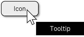
The purpose of a tooltip is to display an additional piece of information dynamically, e.g. the label, or context-specific Help. (see DIN EN ISO 9241-161: 8.50). Tooltips are displayed during the focusing of the corresponding UI element. Tooltips do not contain any interactive elements.
Presentation
Permalink "Presentation"| No. | Property | Description | Classification | Reference |
|---|---|---|---|---|
| 326 | Visibility | The tooltip should be displayed at the respective element. | Should | DIN EN ISO 9241-161: 8.50 |
| 327 | Contrast | The text in the tooltip must have a contrast ratio of at least 4.5:1 with respect to the background. With large font (from 24 px and/or from 18.7 px in the case of bold font), a contrast ratio of at least 3:1 is sufficient. | Must | EN 301 549: 9.1.4.3, 11.1.4.3 |
| 328 | Resizing | All content of the tooltip must be perceptible and operable with a font size adjustment of up to 400% (and a resulting display width of 320 px), in the sense that they wrap and can be vertically scrolled if necessary. | Must | EN 301 549: 9.1.4.10, 11.1.4.10 |
Operation
Permalink "Operation"| No. | Property | Description | Classification | Reference |
|---|---|---|---|---|
| 329 | Use of the keyboard | It must be possible to open and close the tooltip with the keyboard (see Use of the keyboard table, below). | Must | EN 301 549: 9.2.1.1, 11.2.1.1 |
| 330 | Use of the keyboard | The tooltip may not contain control elements as these cannot be keyboard-operable unless an alternative form of operation is documented in the Help option and the application (by keyboard shortcut, for instance). | Must | EN 301 549: 9.2.1.1, 11.2.1.1 |
| 331 | Use of the keyboard | If the tooltip is shown while navigating with the keyboard, it must be possible to close the tooltip again with the keyboard without moving the keyboard focus away (e.g. with ESC), unless
Note: This does not apply to tooltips that are shown by the platform software by default. | Must | EN 301 549: 9.1.4.13, 11.1.4.13 |
| 332 | Use of the keyboard | If the tooltip is shown when navigating with the keyboard, the tooltip must be displayed until the keyboard focus is moved away from the triggering element and/or the tooltip, unless
Note: This does not apply to tooltips that are shown by the platform software by default. | Must | EN 301 549: 9.1.4.13, 11.1.4.13 |
| 333 | Use of the pointing device | If the tooltip is shown when hovering with a pointing device, it must be possible to hide the tooltip again without moving the pointing device away, unless:
Note 1: This does not apply to tooltips that are shown by the platform software by default. Note 2: The automatically-shown content can be hidden with ESC or clicking on the triggering element, for instance, as long as no other actions are triggered. | Must | EN 301 549: 11.1.4.13 |
| 334 | Use of the pointing device | If the tooltip is shown when hovering with a pointing device, the tooltip must be displayed until the pointing device is moved away from the triggering element and/or the tooltip, unless
Note: This does not apply to tooltips that are shown by the platform software by default. | Must | EN 301 549: 9.1.4.13, 11.1.4.13 |
| 335 | Use of the pointing device | If a tooltip is shown when hovering with a pointing device, it must then be possible to move over the tooltip with the pointing device, i.e. the tooltip may not be hidden as soon as the pointing device is no longer positioned over the triggering element. Note: This does not apply to tooltips that are shown by the platform software by default. | Must | EN 301 549: 11.1.4.13 |
Use of the keyboard: tooltip
Permalink "Use of the keyboard: tooltip"| Action | Key | Classification |
|---|---|---|
| Opening the tooltip | Navigating to the element | Required |
| Closing the tooltip | ESC | Required |
Use of the pointing device: tooltip
Permalink "Use of the pointing device: tooltip"| Action | Key | Classification |
|---|---|---|
| Opening the tooltip | Hovering | Required |
Programming/interfaces
Permalink "Programming/interfaces"| No. | Property | Description | Classification | Reference |
|---|---|---|---|---|
| 336 | Name | If the tooltip contains a description, this must be communicated to the Accessibility API as the Accessible Description (see Description). | Must | EN 301 549: 9.1.3.1, 11.1.3.1, 11.5.2.5 |
| 337 | Name | If the tooltip contains a label of a graphical element, this should correspond to the Accessible Name or be contained in it. | Should | EN 301 549: 9.2.5.3, 11.2.5.3 |
| 338 | Name | The tooltip should not contain any structured or long text content. Note: For structured or long text content, a display format should be chosen in which it is possible for the text to be read with the virtual cursor of the screen reader. | Should | EN 301 549: 9.1.3.1, 11.1.3.1 |
| 339 | Keyboard shortcut | If the tooltip contains a keyboard shortcut for the respective control element, this must be communicated to the Accessibility API. | Must | EN 301 549: 9.1.3.1, 11.1.3.1 |
Information about this article
You are welcome to send feedback by email about our handout!