Synonyms: Toggle button
See also: Button, check box, menu button, switch
Toggle switches are used to select the “pressed” or “not pressed” states (see DIN EN ISO 9241-161: 8.48).
A toggle switch consists of a text or graphic label and a visual indicator in order to identify the toggle switch as such. A border is usually used as a visual indicator for toggle switches. The toggle switch also has a visual indicator of the state, such as a different background color.
Presentation
Permalink "Presentation"The requirements concerning buttons are described in the “buttons” section. Here, only the additional requirements are described which result from the fact that it is a button that is able to have two states.
| No. | Property | Description | Classification | Reference |
|---|---|---|---|---|
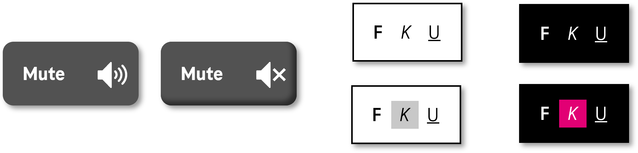
| 515 | Contrast | If the state of the toggle switch (pressed, not pressed) is only communicated with a different color, the contrast ratio of the colors must be at least 3:1. Note: To ensure that the status of the toggle switch is visible when using Windows Contrast Adjustment, it should not only be communicated in color. An icon or border effect can be used to communicate the status instead. | Must | EN 301 549: 9.1.4.1, 11.1.4.1 |
Operation
Permalink "Operation"The requirements concerning buttons are described in the “buttons” section. Here, only the additional requirements are described which result from the fact that it is a button that is able to have two states.
| No. | Property | Description | Classification | Reference |
|---|---|---|---|---|
| 516 | Updates | When focusing and operating the toggle switch, no unexpected change of context may occur. | Must | EN 301 549: 9.3.2.2, 11.3.2.2 |
Use of the keyboard: toggle switch
Permalink "Use of the keyboard: toggle switch"| Action | Key | Classification |
|---|---|---|
| Operation of the toggle switch (status change between “pressed” and “not pressed”) | SPACE | Required |
| Operation of the toggle switch (status change between “pressed” and “not pressed”) | ENTER | Recommended |
Use of the pointing device: toggle switch
Permalink "Use of the pointing device: toggle switch"| Action | Key | Classification |
|---|---|---|
| Operation of the toggle switch (status change between “pressed” and “not pressed”) | Left click | Required |
Programming/interfaces
Permalink "Programming/interfaces"The requirements concerning buttons are described in the “buttons” section. Here, only the additional requirements are described which result from the fact that it is a button that is able to have two states.
| No. | Property | Description | Classification | Reference |
|---|---|---|---|---|
| 517 | Role | The toggle switch role must be communicated to the Accessibility API (see Accessibility API). | Must | EN 301 549: 9.4.1.2, 11.4.1.2, 11.5.2.5 |
| 518 | Status | The status of the toggle switch must be communicated to the Accessibility API (see Element status). Note: This also applies to the “pressed” or “not pressed” status. | Must | EN 301 549: 9.4.1.2, 11.4.1.2, 11.5.2.5 |
Practical tip: toggle switch in Web applications
Permalink "Practical tip: toggle switch in Web applications"Screen reader output for toggle switch with aria-pressed
Permalink "Screen reader output for toggle switch with aria-pressed"- JAWS: [label] toggle button [ not pressed | pressed] [note on operation with the Space bar]
- NVDA: [label] toggle button [ not pressed | pressed]
- Windows Narrator: [label] button [off | on]
Screen reader output for toggle switch with aria-expanded
Permalink "Screen reader output for toggle switch with aria-expanded"- JAWS: [label] button [collapsed | expanded] [note on operation with the Enter key]
- NVDA: [label] button [collapsed | expanded]
- Windows Narrator: [label] button [collapsed | expanded]
HTML
Permalink "HTML"There is no element for toggle switches in HTML. Instead of this, buttonsthat have alternative labeling (e.g. “Select” and/or “Cancel selection”), check boxes or the ARIA toggle switch can be used.
Toggle switches which have the purpose of showing and hiding areas should be marked with <details> and <summary> (
4.11.1 The details element - HTML Standard (whatwg.org) (External Link),
4.11.2 The summary element - HTML Standard (whatwg.org) (External Link)). According to the HTML specification, the <summary> element may contain links, headings, input fields and many other elements – it is important to remember, however, that all the elements which are located within <summary> are imperceptible and cannot be operated with the screen reader, as the <summary> element is communicated to the Accessibility API as a button. Therefore, the <summary> element should only contain a concise and expressive label in text form.
ARIA
Permalink "ARIA"With toggle switches, the following should be taken into account:
- with a button (e.g.
<button>orrole=button), the role is communicated with thearia-pressedattribute. - toggle switches that have the purpose of showing and hiding areas can instead be marked with the
aria-expandedattribute. In this case,aria-controlscan be used to make reference to the ID of the area that is shown or hidden. - The status (
aria-pressed=true|falseoraria-expanded=true|false) must be updated during operation. - The labeling can take place using text content or
aria-labelledby. - The toggle switch can be marked as disabled with
aria-disabled. - A toggle switch cannot be marked as read-only with
aria-readonlyor as a required field witharia-requiredbecause, in contrast to a switch, it is not considered to be a form element. - The presentation of the toggle switch should be verified in Windows High Contrast mode. In this respect, the toggle switch should have a border and the visual indicator for the status should not just be conveyed with color.
- The visible toggle switch and the programmatically focused element should have the same position and size.
Further information: aria-pressed state - Accessible Rich Internet Applications (WAI-ARIA) 1.2 (w3.org) (External Link), aria-expanded state - Accessible Rich Internet Applications (WAI-ARIA) 1.2 (w3.org) (External Link), Button Examples | APG | WAI | W3C, Disclosure (Show/Hide) Pattern | APG | WAI | W3C
Information about this article
You are welcome to send feedback by email about our handout!