Synonyms: Symbols bar, toolbox, command bar tab
See also: Menu, group, menu button
Toolbars serve the grouping of interactive elements for the editing of content or data (see DIN EN ISO 9241-161: 8.49).
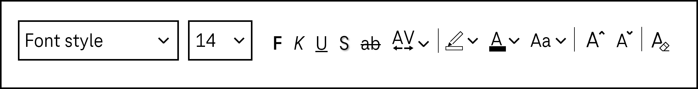
A toolbar contains interactive elements (in most cases, buttons or toggle switches) that are grouped visually with a border, for example. The contents of the toolbar are usually arranged horizontally above or below the area, the contents of which are edited with the elements of the toolbar. The elements of the toolbar can be arranged in several lines. For toolbars with several buttons, icons are often used to label the buttons due to space-related constraints.
Presentation
Permalink "Presentation"Only those requirements that are directly related to the toolbar are described below. Requirements regarding interactive elements within the toolbar are described at the respective element.
| No. | Property | Description | Classification | Reference |
|---|---|---|---|---|
| 350 | Resizing | All elements of the toolbar must be perceptible and operable with a font size adjustment of up to 400% (and a resulting display width of 320 px),
| Must | EN 301 549: 9.1.4.10, 11.1.4.10 |
| 351 | Grouping | To make the use of the keyboard visible, the toolbar should be designed in such a way that its elements can be identified as belonging together. Note: This can take place, for example, with a border or position and arrangement. | Should | DIN EN ISO 9241-125: 5.1.8 |
Operation
Permalink "Operation"| Nr. | Eigenschaft | Beschreibung | Klassifizierung | Referenz |
|---|---|---|---|---|
| 352 | Use of the keyboard | It must be possible to access, operate and exit the interactive elements in the toolbar with the keyboard (see Use of the keyboard table, below). | Must | EN 301 549: 9.2.1.1, 11.2.1.1, 9.2.1.2, 11.2.1.2 |
| 353 | Use of the keyboard | The toolbar may not contain any control elements that are operated by the keys designed for navigation through the toolbar. Note 1: This can affect input fields and drop-down lists, for example, as they are operated with the arrow keys. Note 2: Alternatively, keyboard shortcuts must be implemented and documented with which it is possible to exit the control elements. | Must | EN 301 549: 11.2.1.1 |
| 354 | Use of the keyboard | If the toolbar is only accessible by keyboard shortcut , keyboard shortcut must be documented in the application and the Help option. | Must | EN 301 549: 9.2.1.1, 11.2.1.1 |
| 355 | Use of the keyboard | The toolbar should be accessible by keyboard shortcut. Frequently used interactive elements within the toolbar should also be given a keyboard shortcut. The keyboard shortcuts should be documented in the Help option and application. | Should | DIN EN ISO 9241-171: 9.3.10 |
| 356 | Updates | When focusing and operating the interactive elements within the toolbar, no unexpected change of context may occur. | Must | EN 301 549: 9.3.2.1, 11.3.2.1 |
| 357 | Updates | Changing the value of the form elements within the toolbar may not cause unexpected changes of context. | Must | EN 301 549: 9.3.2.2, 11.3.2.2 |
| 358 | Updates | No loss of focus may occur when the control elements within the toolbar are enabled. Note: Therefore, after operating a button, the focus must remain on the button or be placed on the element which is controlled by the button (e.g. input field of a Rich Text Editor or modal dialog which is opened). | Must | EN 301 549: 9.2.4.3, 11.2.4.3 |
| 359 | Click area | The click area of the interactive elements in the toolbar should total at least 24 x 24 px (see Use of the pointing device). | Should | WCAG 2.2 |
Use of the keyboard: toolbar
Permalink "Use of the keyboard: toolbar"| Action | Key | Classification |
|---|---|---|
| Focusing of the toolbar (first or last focused element) | TAB Note: Alternatively, toolbars can be accessed by the area navigation or by keyboard shortcut. | Required |
| Exiting the toolbar | TAB Note: Alternatively, toolbars can be exited by the area navigation or an expected change of context after the operation of an element in the toolbar. | Required |
| Navigating within the toolbar |
| Required |
| Quick navigation to the first and/or last element within the toolbar | POS1, END | Recommended |
Programming/interfaces
Permalink "Programming/interfaces"| No. | Property | Description | Classification | Reference |
|---|---|---|---|---|
| 360 | Role | The toolbar role must be communicated to the Accessibility API (see Accessibility API). | Must | EN 301 549: 9.4.1.2, 11.4.1.2, 11.5.2.5 |
| 361 | Desktop: Element hierarchy | The parent / child relationships of the elements within the toolbar must be communicated to the Accessibility API. | Must | EN 301 549: 11.5.2.9 |
| 362 | Orientation | The orientation of the toolbar (vertical or horizontal) must be communicated to the Accessibility API. | Must | EN 301 549: 9.2.4.6, 11.2.4.6, 9.4.1.2, 11.4.1.2, 11.5.2.5, 11.5.2.8 |
| 363 | Name | If the toolbar has a label or description, these must be communicated as the Accessible Name and/or Accessible Description (see Label and Description). Note: If the page contains several toolbars, they must have a concise and expressive Accessible Name. | Must | EN 301 549: 11.2.4.6, 11.4.1.2, 11.5.2.5, 11.5.2.8 |
| 364 | Keyboard shortcut | If the toolbar or control elements within the toolbar have visible keyboard shortcuts, these must be communicated to the Accessibility API. | Must | EN 301 549: 9.1.3.1, 11.1.3.1 |
| 365 | Operation | It must be possible to access, operate and exit the elements of the toolbar with assistive technology (see Accessibility API). | Must | EN 301 549: 9.4.1.2, 11.4.1.2, 11.5.2.12, 11.5.2.17 |
Practical tip: toolbar in Web applications
Permalink "Practical tip: toolbar in Web applications"Screen reader output
Permalink "Screen reader output"With TAB navigation:
- JAWS: [label] toolbar bar
- NVDA: [label] tool bar
- Windows Narrator: [label] tool bar
With the virtual cursor:
- JAWS: Toolbar with [amount] controls … toolbar end
- NVDA: Toolbar … out off the toolbar
- Windows Narrator: tool bar … -
HTML
Permalink "HTML"There is no element for toolbars in HTML. Instead of this, buttons and other control elements can be grouped in a list (<menu> and <li>), a labeled region (e.g. <section>) or form field group (<fieldset>, labeled with <legend>). The navigation between the elements then takes place with the TAB key and not the arrow keys. To support the efficient keyboard navigation, it should be possible to skip the region and/or form field group (see practical tip on efficient navigation).
Further information: 4.4.7 The menu element - HTML Standard (whatwg.org) (External Link), 4.3.3 The section element - HTML Standard (whatwg.org) (External Link) 4.10.15 The fieldset element - HTML Standard (whatwg.org)
ARIA
Permalink "ARIA"When implementing toolbars, the following should be taken into account:
- The role is communicated with
role=toolbar. - The toolbar should be labeled with
aria-labeloraria-labelledby. - A non-standard vertical orientation of the toolbar can be specified with
aria-orientation=vertical. Frequently, the orientation is not output by the assistive technology, so that with a vertically oriented toolbar, operation with all arrow keys should be possible. - The toolbar should also be visually recognizable as such, so that sighted keyboard users are able to recognize the operation with the arrow keys.
- The toolbar should contain at least three control elements.
- The visible elements within the toolbar and the programmatically focused element should have the same position and size.
Further information: toolbar role - Accessible Rich Internet Applications (WAI-ARIA) 1.2 (w3.org) (External Link), Toolbar Pattern | APG | WAI | W3C
Information about this article
You are welcome to send feedback by email about our handout!